LLBLGen Pro v5.0 CTP 1 released!
We’ve released LLBLGen Pro v5.0 CTP 1! It’s a Community Technical Preview (CTP) of the upcoming v5.0 which is in development since fall 2014. The CTP is open for all v4.x customers (it’s in the customer area, in the v4.2, betas section) and comes with a time-limited license which expires on June 1st, 2015. As this isn’t a full beta, (much) more features are added before beta hits.
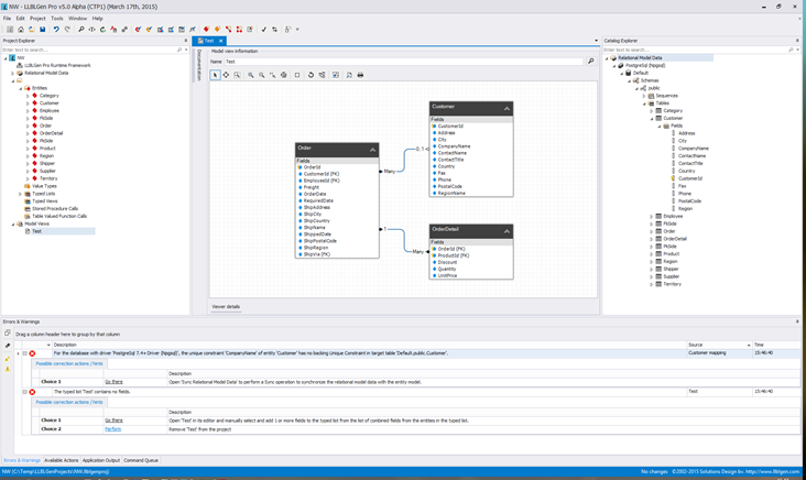
Below I’d like to show some of the new features in action. Click the screenshots for a bigger version.
New, skinnable UI
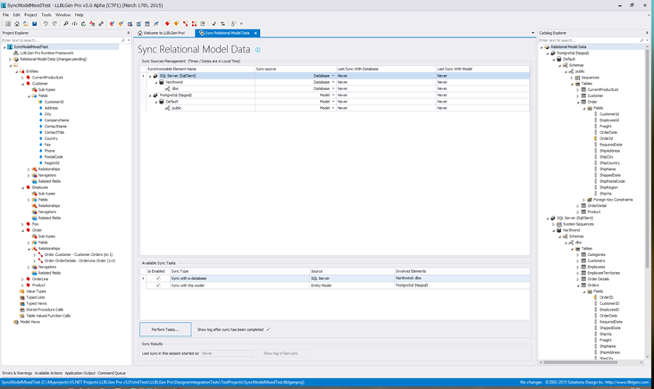
A new UI was long overdue. The current (v4.2) version still uses VS.NET 2008 like toolbars/controls and it looks just… dated. So, we ported the complete UI to DevExpress controls (still winforms though) as some of our controls were already based on those. The screenshots below show the default VS.NET 2013 white theme.
New Relational Model Data Sync System
In short: the Sync system. Sync replaces both database first related actions like refresh catalog and model first related actions like auto-map and adjust relational model data. It allows a sync source to be set for a schema which controls the source from where table related relational model data is obtained from: the database or the entity model. Stored procedures/views/tvfs are always obtained from the database. Everything is managed from a single tab, the Sync Relational Model Data tab, which is opened by clicking the sync button on the toolbar or menu item in the project menu.
A big benefit from the new system is that it will function even when the project contains errors: it's no longer necessary to correct project elements before a refresh. It also doesn't adjust relational model data on database synced schemas, so it's no longer required to export DDL SQL before code generation because the validation adjusted some fields based on a change.
Revamped Home tab
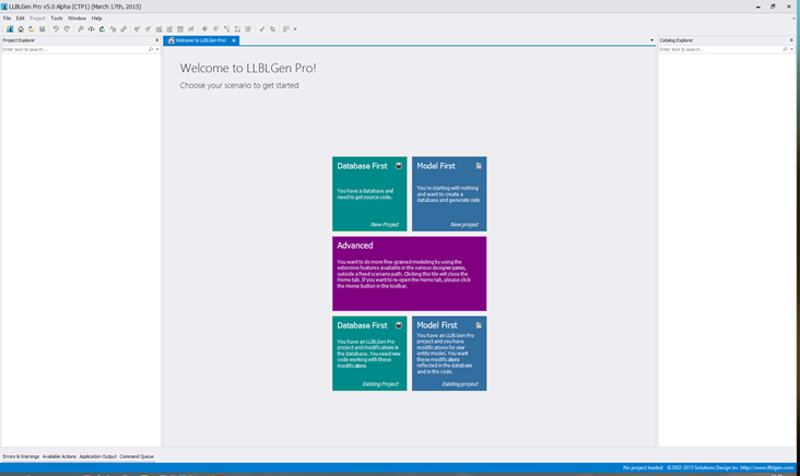
The Home tab now shows active tiles the user can click to navigate through one of the scenarios (database first / model first and new / existing project). Which tiles are shown depends on what the user did last and the state of the designer.
It's an easy way to get started with the designer and replaces the webpage based home tab which was static.
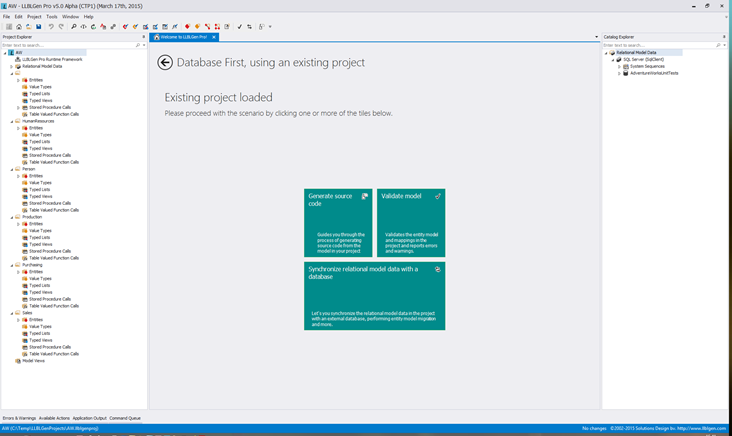
It acts like a wizard in disguise: you can do the basic tasks right from the home tab, by clicking tiles. Here I’ve opened a Database first project and the state of the designer now shows different tiles with different actions.
Search in Project Explorer / Catalog Explorer
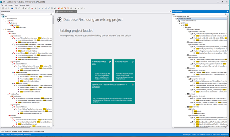
Directly available in the Project Explorer and Catalog Explorer are the search boxes: type in any string and the nodes matching the string are kept, all other nodes are filtered out. This allows finding elements with ease. Removing the search replaces the tree as it was before the search. In the below screenshot I’ve searched for ‘Sales’ in both the project explorer and the catalog explorer. It shows all nodes matching the string specified, including parent nodes (to give context) and hiding other nodes. The more advanced, LINQ query based search is still available in the designer, but this dedicated search on the two explorer panes is easier to use and requires no extra forms to navigate.
Real Time Validation
The designer got a real time system to schedule and run tasks at will through several dedicated dispatch queues. This greatly helps offload work from the UI thread while not having to mess with multi-threading as it utilizes the .NET 4.5 Task Parallel Library. Configuring work is as easy as defining an event, a handler and which dispatch queue to run the handler call and the system takes care of the rest, including overflow protection (so only a limited number of calls are allowed per interval).
The real-time validation in action:
So these are the highlights of this CTP (there are many tiny improvements under the hood too). We’ve much more in store for v5.0, so stay tuned ![]()
