Is Your IDE Hot or Not?
Interesting: Devs posting their font and color settings to a website (http://idehotornot.ning.com).
Most of the themes are pretty dark, seems like people either have fond memories of their first PC or watched too many Hollywood “hacker” movies (no offense guys, just kidding ;-). Right now reading the tag cloud is like “tag tag tag tag DAAAHAAAAARK!!!! tag tag tag light” (note that due to the dynamic nature of the website this may no longer be the case at the time you’re reading this).
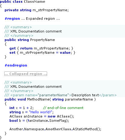
Long time readers of my blog know that I’m a proponent of proportional width fonts for editing source code, and I like to play around with all the customization features of the IDE (e.g. bold fonts for certain elements). I published the results of my experiments last year a blog post, now I’ve uploaded my settings for Visual Studio 2005 to the “IDE hot or not” website where you can review and rate it.
Update 2007–07–28: The “IDE hot or not” website has downscaled my original image showing the color scheme down to a point where it’s hard too see anything. So I’ll post the image here:
