Archives
-
UI/UX for Devs: An Illustrated Mental Model for Empathy
In a previous blog post I wrote about how mental models help you understand how something works. These models in your mind explain what did happen in the past and provide a reasonable (but not always reliable) prediction for will happen in the future. Interestingly, mental models can do that even though they are simplified, incomplete, and often enough simply wrong.
Empathy also has been a topic on my blog; I wrote about what it is and why it is important and why it is good for you, too.
In this article, I combine the two topics and present you my personal mental model of empathy. Note that it is a mental model, not the mental model for empathy. As such, it is, well… simplified, incomplete, and probably wrong. Still, it is “good enough” for many purposes and hey, it comes with pictures!
To start things off, imagine you have developed a non-trivial application as a single developer.
You, the developer
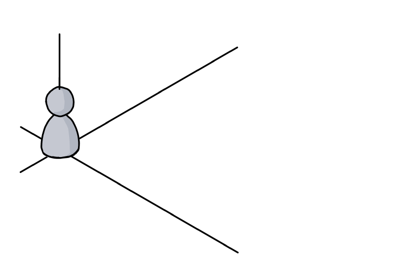
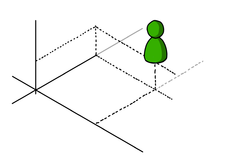
Here you are, living in your frame of reference, depicted as a nondescript coordinate system:
(I learned at university that axes without units are the worst. Have I told you how mental models are likely to be incomplete?)
Your knowledge about the application
This is what you, the developer, could theoretically know about the application:
You, the user
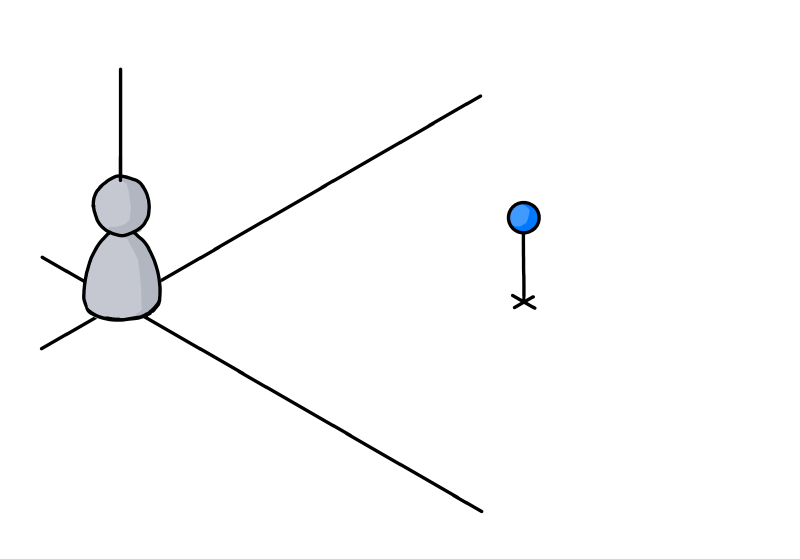
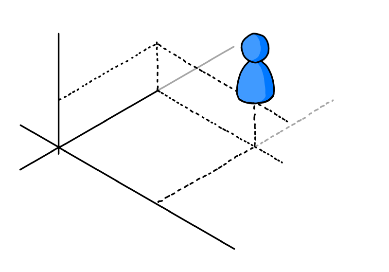
Now you try to imagine “the user”. Not being the developer of the application, the user is in a different situation:
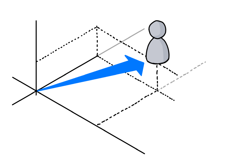
A first step is trying to put yourself in the other person’s shoes:
The user’s knowledge about the application
You assume that not being the developer means that you cannot have knowledge of the inner workings. As a user, you only have the UI, the manual and other public sources at your disposal for understanding the application. This means that the user inevitably must know less about the software:
Next you are trying to employ some empathy. You think that it is unrealistic that user has read and understood all publicly available information. So most likely the user will know less than theoretically possible:
(Let’s ignore the relative sizes, you get the idea)
But: You are not the user
Always be aware that it is not you, but somebody else in the situation you are looking at:
This person could be highly motivated to use your application. Never underestimate the amount of work people will put into learning something if they feel it enables them to create results that are worth it. Just think how deep some people dig into Adobe After Effects or Microsoft Excel.
But in general, users most likely acquire just enough knowledge to get the job done. This means that they will know next to nothing about some features. At the same time, they can be very proficient in other features if a task at hand demands it.
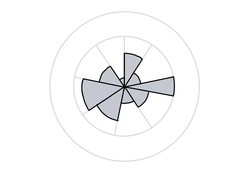
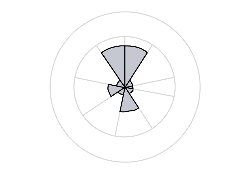
So the graph depicting the user’s knowledge could look like this, with the sectors standing for parts of the application or large features:
Another user
A different person…
…may use the application for other purposes.
He or she may have more or less experience, in different areas:
A good start, but not quite there, yet
At this point, we have established that you are not the user and that different users have different needs and thus varying levels of knowledge.
But we are still stuck in our own point of view. For instance, we assess the user’s knowledge in terms of the application’s structure as we see it from a developer’s perspective. Even if we consider scenarios during development, we still tend to think in application parts as well as larger or smaller features.
Next: Stop thinking in your frame of reference
The next step is to acknowledge that users have a different frame of reference. As developers, we work on our software for long periods of time, which gives it a high importance in our daily life.
For users, our software is just another application. For them, is is not exactly the center of the universe.
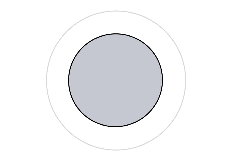
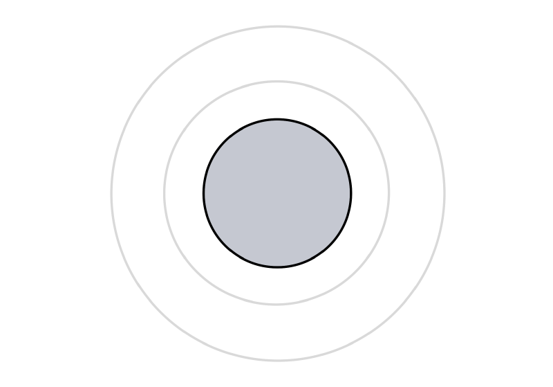
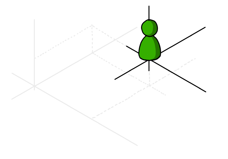
Or, in other words, they live in their own coordinate system:
As an experiment, try to watch yourself how you use and experience the software you did not develop yourself. How different applications, tools and utilities have different importance. And how some software simply does not excite you enough to really learn more than the absolute basics about it.
Now capture that feeling. Be assured, some user out there will feel the same towards your application. A user like this may never become a big fan of your software, but if you design for them, you automatically help everybody else.
If you…
- lead the eye to the right points (by visual design, not a way-too-long onboarding experience)
- write clear UI texts (that even people can understand who do not want to read) and
- design features that are not simply thin UI layers over existing APIs (because users do not think in APIs),
everybody wins.
Using the software vs. getting the job done
Some application features map directly to a user scenario, some scenarios may span multiple features.
But be aware that “real world” scenarios do not necessarily start and finish inside your software. Users may start with ideas, thoughts, purpose, constraints, raw data, etc. outside your application. The work done inside the application may be a first step towards something very different (which means that e.g. a simple CSV export feature can be more important than the fancy result display that you developed). And in between, the scenario may take the users to use other software.
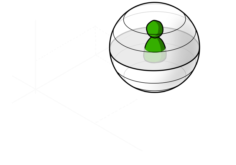
A person in the situation of achieving a specific goal will likely have a different view of the world. To visualize this, think of a coordinate system that looks very different from yours:
Things to remember
- The way you view your application is influenced by your knowledge of application parts and individual features.
Other people may view it in a different way, based on what they see along their path through the user interface. - Assume that people do not actually want to use your software, they want to achieve a specific goal.
If that aligns with your software, good for everybody. - Be aware that even though you and your users have the software as a connection point, your world view may be very different
As a visual reminder, imagine yourself in a cartesian coordinate system and the user in a spherical coordinate system with a different origin. Neither of you lives in the “correct” or “better” coordinate system, they are just different. But the other coordinate system surely does not have your software as the center of the world, that is for sure…
P.S.
If you are interested in a (non-technical) example of completely different coordinate systems, take a look at my post “Exercise in Thinking: Do Racing Stripes Make a Car Go Faster?”.
