Archives
-
The Search for a Proportional Font for Developers
Text editors and IDEs usually use monospaced, i.e. non-proportional, fonts by default. This may seem like an obvious choice – after all, how else do you line up characters horizontally?
The disadvantage of a monospaced font is that text lines can become relatively wide, because by definition, all characters have to have the same width as the character that requires the most space (the uppercase “W”).
Back in the 80ies and early 90ies, with identifier names like “strnicmp()”, this wasn’t much of an issue. But then libraries grew and identifier names got longer and longer. At the same time, in my IDE the source code editor on one hand and an increasing number of additional panes on the other hand were competing for screen space. In the editor, I usually had a ton of unused whitespace behind short text lines, but when a line contained a slightly longer identifier, it often got clipped.
That was the point when I asked myself how important exact horizontal alignment of characters was to me. Less horizontal scrolling and better readability for long names in return for giving up full control looked like deal good enough to give proportional fonts a try.
The Switch
I don’t quite remember the exact time when I switched; the blog post ”My Transition from Fixed to Proportional Width Fonts for Editing Source Code” is from 2004, years after the fact.
What I do remember, though, is that it was the Verdana font that made the switch final. Verdana is a sans-serif font, except for serifs for the uppercase “I” to make it easily distinguishable from the lowercase “L”.
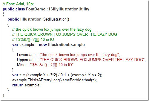
Here’s a (wildly exaggerated) code example to demonstrate why this is important, first in Arial:
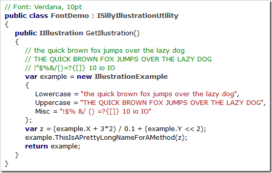
…and here in Verdana:
In Arial’s defense, I must say that I like Arial’s bold text much better than Verdana’s. And, for my personal taste, Verdana is a bit too wide (especially at larger font sizes).
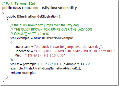
Its cousin Tahoma, on the other hand, is slightly too narrow:
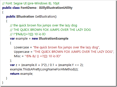
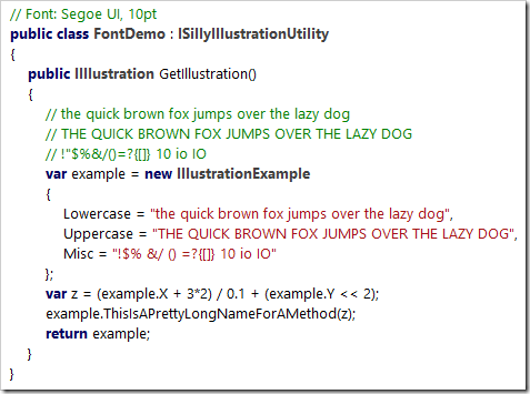
In the end I learned to live with Verdana, but when Segoe UI was introduced along Windows Vista, I switched immediately:
Like Verdana and Tahoma, the bold version of Segoe UI is pretty thick, but I like keywords and class names being shown in bold (even if it’s too heavy).
Noooooo…!
After I upgraded my computer from Windows 7 to Windows 10 (I skipped Windows 8.x), I noticed Segoe UI had changed. The most dramatic change: The uppercase “I” lost its serifs (see: Segoe UI gets a subtle facelift in Windows 8)!
Which means that the code example now looks like a soup of vertical bars:
Searching for Alternatives
With Segoe UI no longer suitable for source code and going back to Verdana not exactly an attractive option, I searched the web for alternatives. So far, I’ve come across the following fonts (in no particular order):
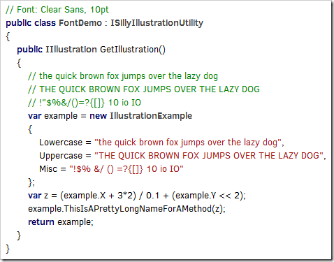
Clear Sans
(Intel, https://01.org/clear-sans)
Clear Sans doesn’t seem to be hinted well enough for rendering at 10pt on a screen at around 96 pixel per inch, at least with ClearType on Windows (I don’t have a Mac for comparison). While it looks rather ugly on my machine, Clear Sans turns out pretty nice at 20pt or when I scale Visual Studio’s editor to 200%, so it may be a good choice for users with a HiDPI display.
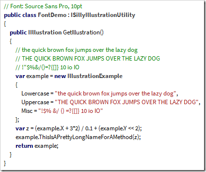
Source Sans Pro
(Adobe, https://github.com/adobe-fonts/source-sans-pro)
What I wrote about Clear Sans in regard to hinting is also valid for Source Sans Pro. For my personal taste, though, the difference between the uppercase “I” (without serifs) and the lowercase “L” (with only a small tail at the bottom) is too subtle, regardless of font size.
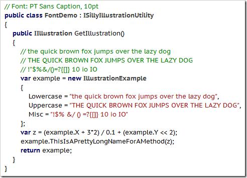
PT Sans
(ParaType, http://www.paratype.com/public/)
PT Sans Caption has serifs for the uppercase “I” and a tail at the bottom of the lowercase “L”, which is a bit too much in my opinion – and doesn’t look any better at larger sizes.
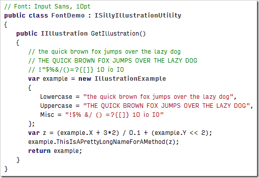
Input Sans
(Font Bureau, http://input.fontbureau.com)
Input is not a single font, but a whole family of both monospaced and proportional fonts and font variants. Selecting your favorite is easy, using a nice configuration tool (http://input.fontbureau.com/preview).
I played around with the configuration utility for a long time, but I couldn’t get any results that were pleasant to my eyes. At larger font sizes you can see that a lot of thought about maximum readability of individual characters went into the design. But I don’t need a font for labeling the controls of a nuclear power plant, I need a font that doesn’t hurt my reading flow – in that regard, Input Sans just doesn’t work for me.
An Unexpected Discovery: Ebrima
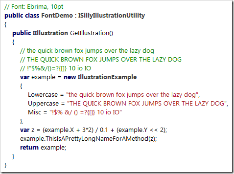
In a typical case of “why didn’t I do that earlier?”, I copied some source code into Microsoft Word and tried all the fonts I had on my computer using the font live preview (selecting all text and moving through the font list with the down arrow key). That’s how I came across Ebrima… and it looked just like the old Segoe UI:
But why is that? And where did it come from? From the Wikipedia entry: “Ebrima is an OpenType font designed to support African writing systems. It [...] is part of the Windows 7 operating system. [...] Its Latin alphabet is based on the Segoe font”.
I have Ebrima on my machine because I did an upgrade installation from Windows 7 to Windows 10 and I can use it because I don’t need the more special Unicode characters. Lucky me!
Where from here?
So for now, I finally have a font for Visual Studio. As I mentioned, the bold text is a bit too heavy, but you can’t always have it all. At some point in the future I surely will have a HiDPI display, then I may give Clear Sans another chance.
What about you? Have you found your “perfect” proportional font yet?

