Roland Weigelt
Born to Code
-
Anmeldung zur dotnet Cologne ab 18. März um 12:00 Uhr
Am Mittwoch, 18. März 2015, wird um 12:00 Uhr die Anmeldung zur dotnet Cologne 2015 freigeschaltet.
Die größte deutsche Community-Konferenz für Entwickler im Microsoft-Umfeld war im letzten Jahr in 30 Minuten ausverkauft. Also: Das Mittagessen einen Moment warten lassen und sich ein Ticket sichern!
-
dotnet Cologne 2015 am 8. Mai 2015
Ein neues Jahr, eine neue dotnet Cologne: Am 8. Mai 2015 findet bereits zum siebten Mal die größte deutsche Community-Konferenz für Entwickler im Microsoft-Umfeld statt. Für dieses Jahr erwarten wir 400 Teilnehmer im KOMED Veranstaltungszentrum im Kölner Mediapark.
Wir, das sind Stefan Lange und Melanie Eibl (dotnet Köln/Bonn e.V.), Albert Weinert (.net user group Köln) und ich (Bonn-to-Code.Net). Zusammen mit Sprechern, Sponsoren und Helfern vor Ort organisieren wir die dotnet Cologne als eine Konferenz, die sich jeder leisten kann und die wir selbst gerne besuchen würden.
Und anscheinend finden auch andere Leute die dotnet Cologne ganz nett – im letzten Jahr waren in weniger als 30 Minuten alle Plätze ausverkauft!
Wann kann man sich anmelden?
Die Freischaltung der Anmeldung ist für März geplant, der Termin wird frühzeitig auf der Website, auf Twitter und Facebook bekanntgegeben.
Was wird es kosten?
Unser Ziel ist es, die Preise vom Vorjahr anzubieten, insbesondere den Super-Early-Bird für nur 25,- Euro.
Sprecher gesucht!
Eine erste Runde des “Call for Papers” ist bereits gelaufen und die ersten Sprecher und Vorträge sind online. Wir sind aber weiter auf der Suche, um die sechs Tracks mit interessanten Sessions zu füllen. Von der Einführung bis zum Deep Dive, vom Mainstream bis zum Spezialthema – wer Interesse hat, die dotnet Cologne 2015 mitzugestalten, findet hier alle Infos dazu.
Sponsoren gesucht!
Es macht uns schon ein wenig stolz, wenn Sponsoren kurz nach einer Konferenz bereits ihre Teilnahme für das nächste Jahr ankündigen. Insbesondere die Sponsoren mit Ständen im Ausstellungsbereich zeigen sich begeistert von den Möglichkeiten, mit den Teilnehmern ins Gespräch zu kommen und nicht zuletzt davon, wie qualifiziert das Publikum ist.
Wer 400 Entwicklern sein Produkt, seine Dienstleistung oder ggf. seine Firma als Arbeitgeber vorstellen möchte, kann sich an Melanie Eibl (Melanie.Eibl [at] dotnet-koelnbonn.de) für weitere Informationen über die vielfältigen Sponsoring-Möglichkeiten wenden.
-
Emaroo 2.2.0 Released
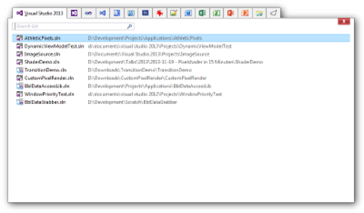
Emaroo is a free utility for browsing most recently used (MRU) lists of programs like Visual Studio, Word, Excel, PowerPoint and more. Quickly open files, jump to their folder in Windows Explorer, copy them (and their path) to the clipboard - all with just a few keystrokes or mouse clicks.
You can download Emaroo 2.2.0 on www.roland-weigelt.de/emaroo.
Getting Started
- Download, unzip and run the MSI
- Start Emaroo (e.g. by hitting the Windows key, typing “Emaroo” and pressing Enter)
- Tip: Right-click the “Emaroo” task bar item and choose “Pin this program to the task bar” from the context menu. If you drag the task bar item to the left-most position, you can start Emaroo anytime by hitting Win+1.
- Press F1 for a quick reference of the features.
What’s New?
- Added: Files can be dragged outside the application window (e.g. to copy them to a folder or open them in another application). This will not affect the most recently used list.
- Fixed: Context menu not updating items to match the "always open as administrator" option when using the menu key on the keyboard.
- Fixed: Bitmap cache files of old versions not being removed.
You can read the complete version history on the Emaroo website.
-
Emaroo 2.1.0 Released
Emaroo is a free utility for browsing most recently used (MRU) lists of programs like Visual Studio, Word, Excel, PowerPoint and more. Quickly open files, jump to their folder in Windows Explorer, copy them (and their path) to the clipboard - all with just a few keystrokes or mouse clicks.
You can download Emaroo 2.1.0 on www.roland-weigelt.de/emaroo.
Getting Started
- Download, unzip and run the MSI
- Start Emaroo (e.g. by hitting the Windows key, typing “Emaroo” and pressing Enter)
- Tip: Right-click the “Emaroo” task bar item and choose “Pin this program to the task bar” from the context menu. If you drag the task bar item to the left-most position, you can start Emaroo anytime by hitting Win+1.
- Press F1 for a quick reference of the features.
What’s New?
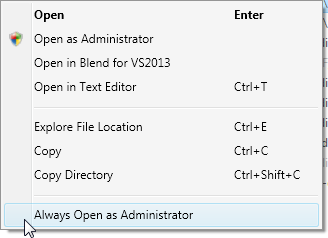
Version 2.1.0 adds an option in the context menu for Visual Studio solutions to always open a solution as administrator:
Checking the option adds a small file to the directory where the solution is located; if the solution is named e.g. Example.sln, the marker file will be named Example.sln.openAsAdmin. So this transfers to other systems when you check the file into source control. Unchecking the option deletes the file (and vice versa).
You can read the complete version history on the Emaroo website.
-
Emaroo 2.0.0 Released
Emaroo is a free utility for browsing most recently used (MRU) lists of applications like Visual Studio, Word, Excel, PowerPoint and more. Quickly open files, jump to their folder in Windows Explorer, copy them (and their path) to the clipboard - all with just a few keystrokes or mouse clicks.
Emaroo 2.0.0 adds support for Illustrator (CS6/CC/CC2014), lets you now open files in a text editor, copy files to the clipboard (for pasting them into an Explorer window) and fixes some UI glitches on systems with high DPI settings.
You can download Emaroo 2.0.0 on www.roland-weigelt.de/emaroo.
For examples of how Emaroo can speed up working with files, take a look at the “Why Emaroo?” section of the blog post announcing version 1.4.0.
-
UI/UX-Workshop auf der GUI&DESIGN 2014 in Berlin
Vom 9.-10. Dezember findet in Berlin die GUI&DESIGN 2014 statt, eine Fachkonferenz rund um grafische Bedienoberflächen im Microsoft-Umfeld.
Im Rahmen des zugehörigen Workshop-Tags am 8. Dezember halte ich einen Workshop mit dem Titel
Von Null auf GUI - Praxiswissen für Entwickler
Dieser Workshop vermittelt Entwicklern ohne UI/UX-Vorkenntnisse in einem Crash-Kurs sowohl ein Grundverständnis für die Materie, als auch das notwendige Handwerkszeug, um selbst ansprechende Bedienoberflächen gestalten zu können. Vortragsteile und praktische Übungen wechseln sich dabei ab, um das Erlernte in Einzel- und Gruppenarbeiten direkt vertiefen zu können.
Diesen Workshop habe ich schon einige Male gehalten, u.a. auf der GUI&DESIGN 2013. Es hat jedesmal sehr viel Spaß gemacht und besonders die Übungen sind immer wieder spannend, wenn die Teilnehmer in kleinen Gruppen nach und nach komplexere Aufgaben lösen.
Einige der Themen:
- Menschliche Wahrnehmung: Warum ist man manchmal einfach "blind", wenn man einen Button in einer GUI sucht, aber nicht findet?
- Visuelles Design für Nicht-Designer: Ein paar Grundregeln, um auch mit wenig Talent zu brauchbaren Ergebnissen zu kommen.
- User Experience: Wie Gefühle das Handeln von Anwendern bestimmen und wie das Wissen darüber hilft, bessere Bedienoberflächen zu gestalten.
- Das passende Werkzeug zur richtigen Zeit: Mit Stift und Papier Zeit und Geld sparen - auch wenn man gar nicht zeichnen kann.
- Selbstverständliches abstrakt betrachten: Mit einem scharfen Blick auf Daten und ihre Eigenschaften Erkenntnisse für die GUI-Gestaltung gewinnen.
Wer sich als Entwickler wünscht, bessere GUIs gestalten zu können, sich aber bisher die Frage nach einem Einstieg mit verwertbaren Erkenntnissen für den Alltag gestellt hat, für den ist dieser Workshop genau das Richtige.
Alle Infos zur Konferenz: http://gui-design.ppedv.de
-
.NET Rocks! – on Fusion!
I’ve been following the “.NET Rocks!” podcasts of Carl Franklin and Richard Campbell for many years now. They’ve had virtually all well-known names of the .NET development community on the show and hearing the podcasts is a good way to kill time on a flight, in the gym or elsewhere.
From time to time they feature so-called “GeekOut” shows on topics other than software development. In recent months they had three shows on fusion science:
- Show #1013: Fusion Power GeekOut
- Show #1022: Fusion Power GeekOut #2
- Show #1037: Cold Fusion GeekOut
The two shows on “hot” fusion were both fascinating and sobering at the same time, as the promise of “clean” energy seems to be far away – not only for “we haven’t figured that details out yet” reasons, but because of some very hard-core problems that are more or less being pushed back and ignored in order not to disturb the big machinery that is “Big Science”.
The third show looks back at the circumstances of the original announcement and mentions current work by Mitsubishi that is not about producing energy, but basic research on nuclear reactions at low temperatures.
Of course, a podcast can only scratch the surface of such heavy topics, but if you want something entertaining apart from software development that is interesting, yet easy to consume on the treadmill, give these episodes a listen.
-
How to Create a Thumbnail for a File in Windows
Recently I had to create thumbnails for various file types and it took me some time to search the web for a solution that works and doesn’t require the discontinued Windows API Code Pack.
Daniel Peñalba‘s answer to a question titled “Extract thumbnail for any file in Windows” on StackOverflow works beautifully (tested on Windows 7 and 8.1): http://stackoverflow.com/questions/21751747/extract-thumbnail-for-any-file-in-windows .
I didn’t find it immediately because of the use of the word “Extract” instead of “Create”, so maybe I can give it some more Google juice with this blog post.
-
Emaroo 1.6.0 Released
Emaroo is a free utility for browsing most recently used (MRU) lists of various applications. Quickly open files, jump to their folder in Windows Explorer, copy their path - all with just a few keystrokes or mouse clicks.
Emaroo 1.6.0 adds support for Photoshop CC 2014 and fixes an issue with the MRU list of Notepad++.
You can download it now on www.roland-weigelt.de/emaroo.
For examples of how Emaroo can speed up working with files, take a look at the “Why Emaroo?” section of the blog post announcing version 1.4.0.
-
Looking Back at UX Lx 2014
The User Experience Lisbon (short: UX Lx) is a three-day conference taking place in Lisbon, Portugal (Lisbon’s abbreviation “Lx” is derived from the former Arabic name al-Lixbûnâ used in the early middle ages, by the way).
The conference consists of two days of hands-on workshops and a day of talks. Featuring internationally renowned speakers, the UX Lx draws attendees from all over the world. According to the organizers 40 countries were represented in this year’s UX Lx 2014 that took place from June 4 to June 6 and marked the third time I attended.
Day 0
The traditional welcome party on the evening before the first day is good way to meet other attendees. Because not all tickets sold are actually for all three days and some attendees attending the first day come to Lisbon in the morning, the party isn’t crowded. And with the very open atmosphere of the UX Lx in general, it doesn’t take much time to somehow get involved in a conversation.
Day 1
Workshop: Designing for Change
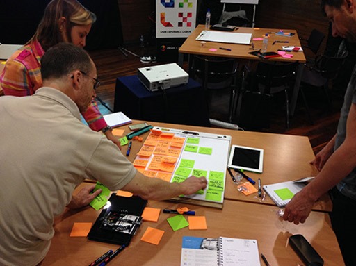
Christina Wodtke spoke about the psychology of change, why users resist it and how to introduce changes to a software and its feature set without steamrolling over the existing user base. In the hands-on part, groups worked on designing a new feature to a travel application. It is always interesting when you start working on a common goal with complete strangers, each of which brings a very different background to the table. For me, that’s a very important aspect of the UX Lx.
The first workshop uncovered one general problem of the UX Lx conference, the half-day format of the workshops. Year after year it seems that many speakers usually give full-day workshops at other occasions and strip them down to fit into three hours at UX Lx. At three of four workshops I attended, the speakers ran into time problems and noted something along the lines “usually this workshop is longer…”.
Lightning Talk: From Lo-fi to Hi-fi - A walk-through of prototypes
Péter Polgár presented various types of prototypes and did a solid job overall. The use of a zooming mind map presentation tool felt a bit gimmicky though and didn’t really help the talk.
Workshop: Experts Reviews for Experts
It’s always great to hear a speaker whose experience is measured in decades, not years or even months. Rolf Molich is one of these few. His workshop was well-prepared, perfectly timed and he even brought his own evaluation forms. Molich gave an introduction to “experts reviews”, where UI/UX experts (with enough actual experience in the field) review a user interface. He also presented studies that have shown that these experts reviews can deliver good results (i.e. can find serious usability issues) in comparison to usability tests and are very competitive in terms of manpower and time.
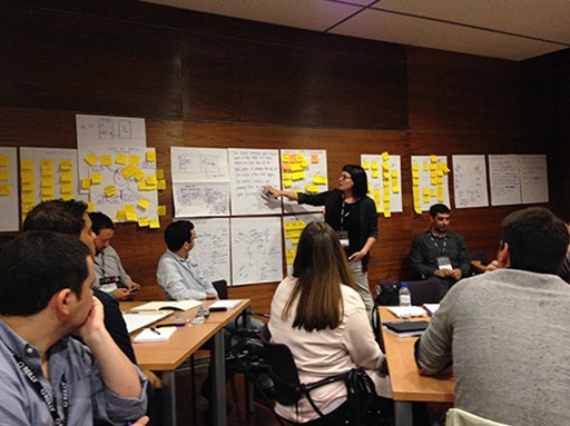
In various exercises we analyzed user interfaces of growing complexity and discussed and prioritized our findings in work groups.
Conference Dinner: Buffalo Grill
During my first visit I didn’t book any of the conference dinners, last year I found out that I missed a great opportunity to talk with other attendees. This year, I again booked all three of them.
The barbecued meat at the Buffalo Grill was really great. The restaurant itself turned out to be a bit loud because of the bare walls, though. And some attendees single-handedly raised the noise-level by being audible across the whole room, causing everybody else to raise their voice. Still, I had some very interesting conversations.
Day 2
Workshop: Collaborative Research
The workshop by Erika Hall mainly dealt with techniques for interviewing (potential) users and how to gather insight from the statements of the users. In the exercises we practiced this by interviewing each other, switching roles along the way.
Interesting how (in my opinion) I really totally sucked at conducting the interview compared to the others in my group, but at the same time how I was much better able to extract the core insights, dividing seemingly related but in fact orthogonal statements. A sign how different the backgrounds of the attendees were. Everybody I talked to during the conference was really smart, yet excelled at different abilities.
Lightning Talk: Fun, Confusion, Fear and Basketball
What a strange title – who, right in their mind, would give a talk such a strange title? Oh wait, it was me.
In my first session in English at an international conference I spoke about my hobby project of writing software for rear projection screens and LED advertising system. The “confusion and fear” part of the title alluded to the usability problems that I ran into while using the software in high-pressure situations in the arena – situations that were notably different from the calm atmosphere of testing the software at home.
My talk about stumbling blocks and lessons learned was well-received and it’s nice when people walk up to you even a day later and tell you how much they liked it.
The slides can be found here: http://www.slideshare.net/RWeigelt/fun-confusion-fear-and-basketball-ux-lx-2014
Workshop: Designing for Discovery with Faceted Navigation
This workshop with Jim Kalbach about faceted navigation started out really promising and I’m sure that the full-day version rocks. I really enjoyed the talk parts and the many examples, starting from early history (even though in the back in may head I knew that the timing was off). The half-day version turned out OK, but exercises had to be cut towards the end.
Conference Dinner: Populi
The restaurant on the second day was in downtown Lisbon; transportation to the Populi was provided via buses, the way back wasn’t a problem either with a Metro station in front of the restaurant. Also a bit loud, but again lots of interesting conversations.
Day 3
The third day of the UX Lx conference featured the following sessions:
Mike Monteiro: How Designers Destroyed the World
A passionate talk about the responsibility towards “the world” that designers have when they design a feature (that e.g. breaks the user’s trust), an advertising campaigns (cigarettes, anyone?) or something else that may do harm.
Kate Rutter: How Designers Can Build a new World
Designers and entrepreneurship – a well-delivered talk that didn’t really catch me, partly because I don’t envision myself to be part of the target audience for this talk.
Russ Unger: Things I've learned from leading UX Designers
Not exactly my area of interest, but very honest presentation. Slides are here: http://de.slideshare.net/runger/ux-lisbon-things-ive-learned-and-am-still-learning-from-leading-ux-designers.
Jason Grigsby: Adaptive Input
Great talk about the challenges of unifying user interfaces to be used by mouse or touch at the same time. The key sentence: Input matters more than screen size. The slides: https://speakerdeck.com/grigs/adaptive-input-uxlx.
Christina Wodtke: The Mechanics of Magic
Christina spoke about the power of games to create emotions, and at the same time warned about the dangers of gamification. The hunt for badges and a place on a leaderboard may initially provide some sort of incentive to use a system. In the end the metrics will either make people game the system – or no longer care. In both cases the original intrinsic motivation is finally killed off, with the end result being highly undesirable.
Bill DeRouchey: History of the Button
I really enjoy everything related to the history of computing in general, and looking back at the history of something as simple as a button is a really worthwhile topic. A talk that explains a (mechanical) button as an “abstraction of movement” definitely hits a certain vibe with me. An inexcusable lapse though was presenting the Mac in 1984 as the starting point of the button in user interfaces (or at least giving the impression on the slides). Not cool.
Jess McMullin: Citizen Experience Design and You!
Well-presented, but didn’t really work for me.
Margot Bloomstein: Content strategy for slow experiences
The talk started out a bit slow (how fitting) before it came to the point and suddenly it all made sense. Increasing the perceived performance of a system is one point. But there are actual use cases for creating deliberately slow experiences that people perceive as thorough and valuable, for example when buying specific equipment (cameras, outdoor clothing).
The slides: http://slideshare.net/mbloomstein/content-strategy-for-slow-experiences-at-uxlx
Steve Baty: (Re)framing - The first step towards innovative ideas
The three days finally took their toll and it seems my mind wandered off during that talk, right now I cannot remember what it was about. I only remember that when the talk was finished, I wondered whether the next talk could keep me awake. Little did I know.
Jared Spool: UX Strategy Means Business
My personal highlight of the day and a strong way to end the day. This was exactly the kind of session for broadening the personal horizon I am looking for when visiting the UX Lx conference.
Robert Sterry blogged about the session, the slides by Jared Spool are available as a PDF file.
Sunset Boat Cruise
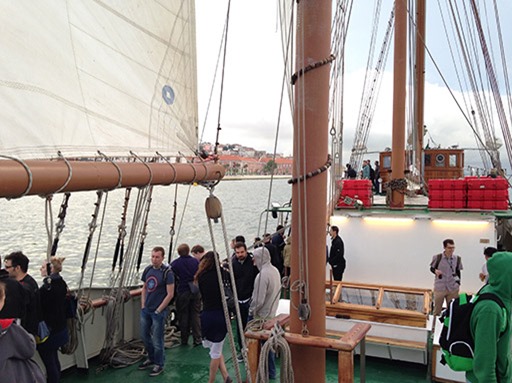
Like last year, the weather didn’t like us. But also like last year, at least it stopped raining towards the end. And it was a lot of fun nevertheless.
Conference Dinner: Portugália
The weakest of the three restaurants; not just my personal opinion, but also of others I talked to. When a woman makes a remark about the not exactly huge portion size, you know something went wrong. And many of those who chose the chocolate mousse for dessert simply didn’t get it (no longer available, sorry).
The conversations at the table I sat at weren’t so much about UX, but more about topics ranging from the upcoming FIFA World Cup or Basketball in Germany and Lithuania up to the fall of the iron curtain and how it was experienced by people from different nations. I enjoyed it very much.
Final Thoughts
In a time of virtually endless content on the Internet, it becomes increasingly harder to justify a (physical) visit to a conference. In the case of the UX Lx, it’s not just about the pure content. It’s also about getting inspired (which is much harder viewing a video on a computer screen) and communicating with other attendees. The evening activities give you enough time for longer conversations that go beyond what is possible at the lunch table or during the breaks. And the openness of the attendees makes it really easy.
So will I attend next year? If time permits, yes.


