Roland Weigelt
Born to Code
-
UWP Community Toolkit 1.1 Released
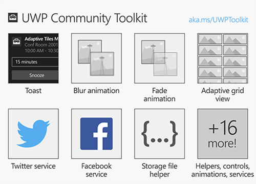
Back in August I blogged about How to Search Twitter from Your UWP App using the then-new UWP Community Toolkit. Of course, the toolkit offers much more than that. It has now been updated to version 1.1, with quite a list of improvements and fixes. A small, but nice addition is the GridSplitter, which was one of the first things I was missing when moving from WPF to UWP.
The release also sends a strong signal about the future of the UWP Community Toolkit. It is now part of the .NET Foundation (which brings a move of the documentation to a new location) and has promising community activity. While this may not be a guarantee for longevity, at least the signs point into the right direction.
-
“Mini-DevCon” der DevGroup Göttingen/Kassel am 21.10.2016
Die .NET DevGroup Göttingen/Kassel veranstaltet am 21.10.2016 ab 17:30 in Hann. Münden-Laubach ihr 202. Treffen, das als “Mini-DevCon”, also im Prinzip eine Halbtags-Konferenz, konzipiert ist.
Es hat mich sehr gefreut, als ich in meiner Eigenschaft als Mitglied des Sprecherbüros von INETA Deutschland angefragt wurde. Ich habe gerne zugesagt und werde in meinem Vortrag praxisrelevante Grundlagen in den Bereichen Visual- und User Interface-Design sowie User Experience vermitteln.
Das Programm der Veranstaltung sieht aktuell wie folgt aus:
- 17:30 – 17:45 Begrüßung und Keynote (Joachim Bieler)
- 17:45 – 18:30 Industrie 4.0 für zuhause – IoT für Otto Normalentwickler (Martin Roppert)
- 18:45 – 19:45 Design/UI/UX-Grundlagen für Entwickler (Roland Weigelt)
- 19:45 – 21:00 Abendessen und Verlosung
- 21:00 – 21:45 PRISM 6 (Jürgen Goschke)
Die Teilnahme ist kostenlos, um Anmeldung wird gebeten.
-
How to Disable Warnings in Generated C# Files of UWP Apps
The first time I moved my UWP development beyond writing “throwaway code for learning purposes”, I did what I always do when starting a new “real” project: On the “Build” tab of the project properties, I switched the setting “Treat warnings as errors” to “All” and set the checkmark at “XML documentation file”.
Nasty surprise: When compiling the UWP app, the compiler stumbled over missing XML doc comments in code that was generated in the background.
Fortunately, I quickly found a solution on StackOverflow that automatically added a
#pragma warning disabledto the generated files using MSBuild. That worked well for me until recently, when I created a new solution configuration that had a name containing spaces. Digging a bit into MSBuild, and with the help of another StackOverflow answer, I was able to figure out the following build target (which I’ll add as an answer to the original StackOverflow question):<Target Name="PragmaWarningDisablePrefixer" AfterTargets="MarkupCompilePass2"> <ItemGroup> <GeneratedCSFiles Include="**\*.g.cs;**\*.g.i.cs" /> </ItemGroup> <Message Text="CSFiles: @(GeneratedCSFiles->'"%(Identity)"')" /> <Exec Command="for %%f in (@(GeneratedCSFiles->'"%(Identity)"')) do echo #pragma warning disable > %%f.temp && type %%f >> %%f.temp && move /y %%f.temp %%f" /> </Target>
How to use this:
- Unload and edit your “.csproj” file in Visual Studio (or open it in Notepad if Visual Studio is closed)
- Copy-and-paste the task just before the closing
</Project>tag - Save and (re)open in Visual Studio
-
How to Search Twitter from Your UWP App
Yesterday, the UWP Community Toolkit was released, “a new project that enables the developer community to collaborate and contribute new capabilities on top of the SDK.”. The toolkit “includes new capabilities (helper functions, custom controls and app services) that simplify or demonstrate common developer tasks”.
One thing that caught my eye was the support for social media like Twitter and Facebook. I had read the docs at https://dev.twitter.com/ and I had a twitter app configured at https://apps.twitter.com/ some months ago, but I never got around to actually choose a Twitter access library and use it.
But the few lines of sample code in the announcement (how to post a tweet) looked so simple I couldn’t resist trying to perform a Twitter search.
- Follow the “Getting Started” instructions in the article. (I chose the packages Microsoft.Toolkit.Uwp and Microsoft.Toolkit.Uwp.Services)
-
Put a button on the form, create a click handler with the following code:
private async void HandleButtonClick(object sender, RoutedEventArgs e) { TwitterService.Instance.Initialize( // change (1) - (3) for your app "(1) ConsumerKey", "(2) ConsumerSecret", "(3) CallbackUri"); await TwitterService.Instance.LoginAsync(); tweets = await TwitterService.Instance.SearchAsync("hello world"); foreach (var tweet in tweets) { Debug.WriteLine(tweet.Text); } } - And that’s all it is to search Twitter for e.g. “hello world”!
Things to note:
- Even though the API is really easy, it doesn’t mean that you can avoid reading or at least scanning the Twitter documentation altogether – you need to know just enough the get the required information for login.
- Storing the ConsumerKey and ConsumerSecret in an app as plain text doesn’t sound like a good idea – I’ll have to read up on what best practices are in regard to security.
-
My UWP Link List
I’m still at the beginning of my journey into the world of Universal Windows Platform (UWP) apps. In this blog post (which will be updated over time) I’ll collect various links to resources I found interesting and/or helpful – maybe they are of use for other people, too.
Basics
- The Windows Dev Center (dev.windows.com) is the starting point for Windows development. Documentation, downloads, samples – it’s here.
- Get started with Windows apps contains everything to, well, get started. I doubt you’ll find a more clear and concise information about how to do it than this page and its sub-pages (in the past, people actually made it their job to extract information out of wordy Microsoft articles).
- Back in the Windows 8.x days, side-loading didn’t sound too attractive. Much has changed in Windows 10 and this article sums it up: Sideload LOB apps in Windows 10
- And things are looking to get even better soon: App Installer! (via Universal Windows App Deployment blog)
- I wanted a code-signing certificate (not only for my future UWP apps), in the end I chose KSoftware who are an official partner of Comodo.
Debugging
Resources
General
- Blog: Building Apps for Windows (by the Windows Apps Team)
- Article: The Lifecycle of a UWP App
- Article: The path from a desktop app to a Universal Windows Platform (UWP) app
- Article: Optimizing your XAML app for performance (10 by 10)
- Website: Develop UWP apps – How-to articles for UWP apps on Windows 10 (“Instructions and code examples for all kinds of tasks, such as using geolocation services, transferring data over a network, and porting apps to Windows 10”)
Architecture
- Template 10 is a set of Visual Studio project templates that take care of boilerplate stuff like navigation and suspension
- Visual Studio Extension: Template 10 Template Pack
- Wiki: Documentation
- Video: Getting Started with Template 10 (on Microsoft Virtual Academy)
App Services
App Services are a very interesting concept for UWP applications that are more than just a simple self-contained “app”.
- Create and consume an app service
- Convert an app service to run in the same process as its provider
- Calling an App Service from a WPF/WinForms Win32 App
- Launch a Universal App from a WPF App contains the important part of how to reference Windows 10 APIs. When copying the XML code snippet in the blog post, leave out the reference to System.Runtime.dll and make sure you replace the typographical quotes (
“example”) with plain quotes ("example").
App Services in a Network
Personal Interests
My main motivation to start with UWP apps is to use the graphics and video capabilities that look much more attractive than what WPF has to offer.
Graphics and Animations
- Blog: robmikh blog (“A development blog about all things UWP and Composition”)
- Blog: Mike Taulty (“I do some developer stuff for Microsoft UK”)
- Articles on composition: https://mtaulty.com/category/composition/
- Articles on Win2D: https://mtaulty.com/category/win2d/
- Article: Windows 10 Anniversary Update–Fun with Composition and Video
- Website: Windows UI Dev Labs on github (“the place for getting the latest code samples and demos using Windows.UI.Xaml and Windows.UI.Composition to make beautiful Universal Windows Platform applications”)
- Article: How to prevent screen locks in your UWP apps
- Article: Creating a FluidBanner control using Windows Composition
- Library: CompositionProToolkit on github (“Collection of Helper classes and controls (using Win2d) for Windows.UI.Composition”)
MediaPlayer
- API reference
- Article on Windows Dev Center
- Video Shenanigins (article by Make Taulty)
Troubleshooting
Solutions for issues I ran into:
- How to disable “Missing XML comment” warning for auto generated code in Windows Store app? (StackOverflow)
-
The Search for a Proportional Font for Developers
Text editors and IDEs usually use monospaced, i.e. non-proportional, fonts by default. This may seem like an obvious choice – after all, how else do you line up characters horizontally?
The disadvantage of a monospaced font is that text lines can become relatively wide, because by definition, all characters have to have the same width as the character that requires the most space (the uppercase “W”).
Back in the 80ies and early 90ies, with identifier names like “strnicmp()”, this wasn’t much of an issue. But then libraries grew and identifier names got longer and longer. At the same time, in my IDE the source code editor on one hand and an increasing number of additional panes on the other hand were competing for screen space. In the editor, I usually had a ton of unused whitespace behind short text lines, but when a line contained a slightly longer identifier, it often got clipped.
That was the point when I asked myself how important exact horizontal alignment of characters was to me. Less horizontal scrolling and better readability for long names in return for giving up full control looked like deal good enough to give proportional fonts a try.
The Switch
I don’t quite remember the exact time when I switched; the blog post ”My Transition from Fixed to Proportional Width Fonts for Editing Source Code” is from 2004, years after the fact.
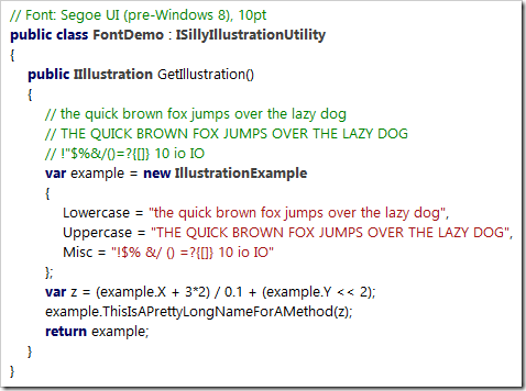
What I do remember, though, is that it was the Verdana font that made the switch final. Verdana is a sans-serif font, except for serifs for the uppercase “I” to make it easily distinguishable from the lowercase “L”.
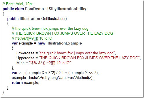
Here’s a (wildly exaggerated) code example to demonstrate why this is important, first in Arial:
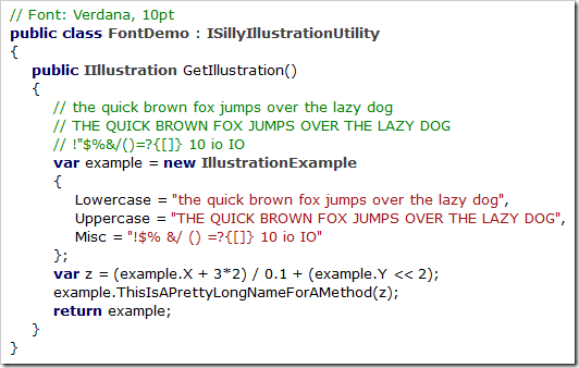
…and here in Verdana:
In Arial’s defense, I must say that I like Arial’s bold text much better than Verdana’s. And, for my personal taste, Verdana is a bit too wide (especially at larger font sizes).
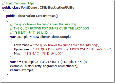
Its cousin Tahoma, on the other hand, is slightly too narrow:
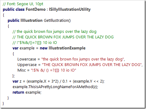
In the end I learned to live with Verdana, but when Segoe UI was introduced along Windows Vista, I switched immediately:
Like Verdana and Tahoma, the bold version of Segoe UI is pretty thick, but I like keywords and class names being shown in bold (even if it’s too heavy).
Noooooo…!
After I upgraded my computer from Windows 7 to Windows 10 (I skipped Windows 8.x), I noticed Segoe UI had changed. The most dramatic change: The uppercase “I” lost its serifs (see: Segoe UI gets a subtle facelift in Windows 8)!
Which means that the code example now looks like a soup of vertical bars:
Searching for Alternatives
With Segoe UI no longer suitable for source code and going back to Verdana not exactly an attractive option, I searched the web for alternatives. So far, I’ve come across the following fonts (in no particular order):
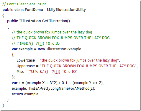
Clear Sans
(Intel, https://01.org/clear-sans)
Clear Sans doesn’t seem to be hinted well enough for rendering at 10pt on a screen at around 96 pixel per inch, at least with ClearType on Windows (I don’t have a Mac for comparison). While it looks rather ugly on my machine, Clear Sans turns out pretty nice at 20pt or when I scale Visual Studio’s editor to 200%, so it may be a good choice for users with a HiDPI display.
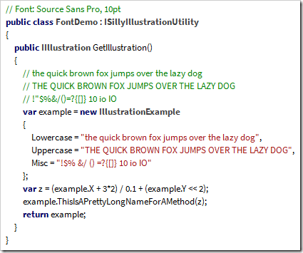
Source Sans Pro
(Adobe, https://github.com/adobe-fonts/source-sans-pro)
What I wrote about Clear Sans in regard to hinting is also valid for Source Sans Pro. For my personal taste, though, the difference between the uppercase “I” (without serifs) and the lowercase “L” (with only a small tail at the bottom) is too subtle, regardless of font size.
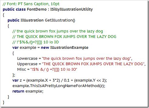
PT Sans
(ParaType, http://www.paratype.com/public/)
PT Sans Caption has serifs for the uppercase “I” and a tail at the bottom of the lowercase “L”, which is a bit too much in my opinion – and doesn’t look any better at larger sizes.
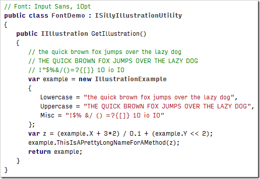
Input Sans
(Font Bureau, http://input.fontbureau.com)
Input is not a single font, but a whole family of both monospaced and proportional fonts and font variants. Selecting your favorite is easy, using a nice configuration tool (http://input.fontbureau.com/preview).
I played around with the configuration utility for a long time, but I couldn’t get any results that were pleasant to my eyes. At larger font sizes you can see that a lot of thought about maximum readability of individual characters went into the design. But I don’t need a font for labeling the controls of a nuclear power plant, I need a font that doesn’t hurt my reading flow – in that regard, Input Sans just doesn’t work for me.
An Unexpected Discovery: Ebrima
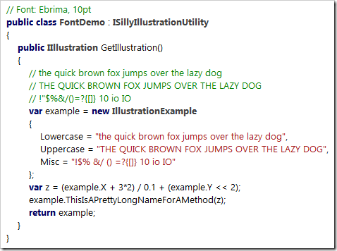
In a typical case of “why didn’t I do that earlier?”, I copied some source code into Microsoft Word and tried all the fonts I had on my computer using the font live preview (selecting all text and moving through the font list with the down arrow key). That’s how I came across Ebrima… and it looked just like the old Segoe UI:
But why is that? And where did it come from? From the Wikipedia entry: “Ebrima is an OpenType font designed to support African writing systems. It [...] is part of the Windows 7 operating system. [...] Its Latin alphabet is based on the Segoe font”.
I have Ebrima on my machine because I did an upgrade installation from Windows 7 to Windows 10 and I can use it because I don’t need the more special Unicode characters. Lucky me!
Where from here?
So for now, I finally have a font for Visual Studio. As I mentioned, the bold text is a bit too heavy, but you can’t always have it all. At some point in the future I surely will have a HiDPI display, then I may give Clear Sans another chance.
What about you? Have you found your “perfect” proportional font yet?
-
programmingfonts.org – THE Resource for Monospace Fonts
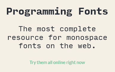
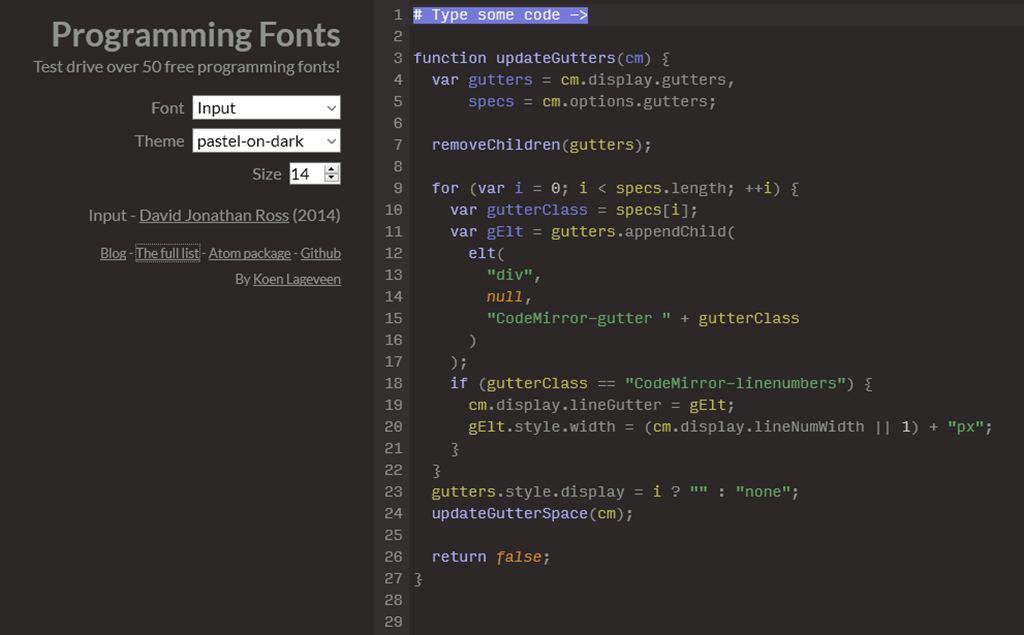
While preparing an upcoming blog post about proportional fonts for programmers, I came across a tweet by Val Head (@vlh), pointing me to programmingfonts.org. The website boasts the slogan “The most complete resource for monospace fonts on the web” and looking at the list of fonts, I’m inclined to believe it.
I browsed the site for a while until finally saw the link “Try them all online right now” which was hidden in plain sight directly in front of me:
The link opens a nice web application that lets you test drive a huge number of fonts, using a text of your choice. The available themes are a matter of personal taste, but this is mainly about getting an idea whether a font looks good before spending more time on it.
-
Nice Time Saver: Windows Universal App Image Scaler
Recently I took my first steps into the world of Universal Windows Platform (UWP) apps after many years of WPF. What came a bit as a shock to me was the sheer number of required/recommended tile and icon assets.
Most of the images are versions of the same image, scaled to different sizes. Of course, creating these images is something that can and should be automated, starting from a sufficiently large image.
One way to handle this is via Photoshop Actions, but when looking for a simpler solution I came across the Windows Universal App Image Scaler. This is a Visual Studio extension that adds a context menu entry to the Solution Explorer. You simply right-click an image file, choose “Scale image for Windows Universal app…” and specify the kind of images you want to create. When you press “Ok”, the output will be written to the directory that contains the source image, and that’s it!
You find this nice extension
- in the “Extensions and Updates” dialog inside Visual Studio (via the “Tools” menu) by clicking “Online”, “Visual Studio Gallery” and searching for “app image scaler”,
- on the Visual Studio Gallery website: https://visualstudiogallery.msdn.microsoft.com/824f5375-b0c7-4d79-b9bf-04653876ba53
- or on GitHub: https://github.com/spadapet/universal-image-scaler
-
Anmeldung zur dotnet Cologne 2016 am 16.3.2016 um 12:00
Am Mittwoch, 16. März 2016, wird um 12:00 Uhr die Anmeldung zur dotnet Cologne 2016 am 13. Mai in Köln freigeschaltet. Die 400 Tickets für die letztjährige Konferenz waren in weniger als 4 Minuten verkauft, es gilt also pünktlich am Rechner zu sitzen!
Dass diese Community-Konferenz, die Stefan Lange und Melanie Eibl (dotnet Köln/Bonn e.V.), Albert Weinert (.net user group Köln) und ich (Bonn-to-Code.Net) seit 2009 zusammen organisieren, so erfolgreich ist, macht uns schon ein wenig stolz.
Gleichzeitig gilt weiterhin unsere Philosophie, dass die dotnet Cologne eine Konferenz sein soll, wie wir sie selber gerne besuchen würden. Und dazu gehört für uns nicht zuletzt, dass wir am 13. Mai möglichst viele aktive Mitglieder der deutschsprachigen .NET Community treffen möchten.
Damit dies nicht vollständig dem Zufall überlassen bleibt, haben wir uns entschlossen, einen Teil der Karten zu blocken und für Leiter und Stellvertreter von .NET User Groups, MVPs, Betreiber von Community-Foren etc., aber auch für Sprecher früherer dotnet Cologne Konferenzen und unserer User Group Treffen in den letzten 12 Monaten zu reservieren.
Weitere Infos zu dieser Aktion gibt es auf http://dotnet-cologne.de/CommunityTicket.ashx
Also: Man sieht sich am 13. Mai!
-
The Importance of Empathy, pt2: It’s Good for You, Too!
In my recent blog post I described empathy as a valuable skill e.g. for UI design. But empathy is more than just “that UX soft skill thing”, “for making other people’s lives better”.
In this post I’ll give two real-life examples where a lack of empathy significantly reduced the chances of success in a competitive situation – which should give food for thought even to the most selfish person.
Example 1: Programming Contest Entries
In 2004 I entered a competition for Visual Studio add-ins organized by Roy Osherove. Surprise #1: I won. Surprise #2: The blog entry “About the add-in contest results” by Frans Bouma, one of the judges.
He wrote: “As a judge in the add-in contest, I had to test all the add-ins submitted, and judge them on quality and if they deserved any of the big prizes available. I can tell you it was hard. Not because there were so many good entries, but because it was often very hard to even get the submitted code to run, left alone to find any documentation what to do, how to get started.”
Two years later I was in Frans’ shoes when I was a judge on a German contest for “code snippets” (more in the vein of small classes and helper methods than typical Visual Studio snippets e.g. for defining a constructor or a dependency property). I had to wade through more than 120 entries, with many lacking an easy to understand description of “what does it do”, “how do I use it”, etc.
In both contests, not nailing the basics substantially influenced the judgement and thus prevented some of the entries from ranking higher.
What went wrong?
One possible short answer: People were lazy. They did the fun part (writing code), but skipped on the non-fun part (writing docs, taking care of setup, etc.). But on the other hand, people tend to overcome their laziness if they feel some kind of urgency.
In the case of the contest, it seemed that many of the participants didn’t think that the out-of-the-box experience would be a factor in the review – which hints at a lack of empathy. Because with a bit of empathy, they would have thought about the situation of a contest judge.
Let’s imagine that you are a judge for a programming contest. You unpack the ZIP file containing a contest entry and you get a bunch of files you’ve never seen before.
What would be your first questions? Surely something like:
- Where do I start?
- Is there some kind of README?
- Is there a short introduction, maybe an elevator pitch for this?
- What is actually the problem this thing is trying to solve?
- What are the first steps that I should take?
- Can I simply follow the directions or are there prerequisites that aren't mentioned?
- Is there a simple way to achieve at least something in the software quickly before I dig deeper into it?
Imagine you have to review not only one or two, but dozens and dozens of entries. Wouldn’t you be thankful for any entry that addresses these questions proactively?
Now, after looking at a judge’s perspective: Would you, as the author of a contest entry, assume that a judge instantly sees how awesome your software is, without any explanation beyond a few words? And that none of the other contestants would come up with the idea to make things easier for the judges and thus make a good first impression?
If you can now almost feel the pressure of competition – there’s the urgency required to overcome the laziness and the reluctance to do the things that are not fun.
Example 2: Conference Session Proposals
I’m one of the organizers of the community conference “dotnet Cologne” which is wildly successful and has become the largest conference of its kind in Germany. One of the many things to do for the organizers in the months before the conference is to review a huge number of session proposals entered during the “call for papers”. We have a web application where potential speakers enter their bio and the abstracts for their talks, which makes reviewing and comparing the entries pretty easy.
Unlike the first example, this is not so much of a time problem, even for a large number of entries. It’s more a problem of ”guesstimating” the scope and the quality of the session if a speaker isn’t one of the rock stars who consistently deliver a certain level of quality. After all, an abstract is just a declaration of intent, not the actual talk. And in many cases, the talk is not even fully fleshed out at the time of the call for papers.
Each year, there are a number of speakers who provide incomplete or very low-quality information and who in consequence are cut first while narrowing down the selection.
What went wrong?
The speakers somehow must have thought that the information they entered was good enough to be selected. Or that, if necessary, more information could be provided on demand at a later time.
Imagine you are in the situation where you have to judge a large number of speakers and their session proposal by reviewing the available information.
- What impression would no or low-quality text in a speaker bio leave on you?
- What would you think about a “more text upon request” in a session abstract?
- Or a “coming later…” that never gets updated?
The larger the number of session proposals, the higher the chances that several speakers propose a session about the same topic (or at least have a large overlap of content). In this case there’s simply no reason to choose the speaker with the lower quality bio and abstract.
Now switch the perspective to that of a speaker: Wouldn’t you wonder what effect providing incomplete information would have? Especially if you compare it to the many speaker bios and session abstracts that you can read (for previous years) on the website of the exact conference that you want to speak at? And wouldn’t you want to avoid the impression that you either don’t have enough time to prepare the talk, or worse, aren’t able to present information in a compact and structured way?
Wrapping up
Empathy is not necessarily about being a nice person. It’s about being professional. Putting yourself in other people’s shoes, even if just for a moment, is always a good idea in general, but even more so in situations where you want something from someone else.
