Fear and Loathing
Gonzo blogging from the Annie Leibovitz of the software development world.
-
The Big Dummies Guide for Windows Phone Developer Resources
Windows Phone apps are growing in popularity as does the
50,00060,000 apps in the marketplace today. Microsoft has done a great job at putting together some resources for developers including full documentation. When you first land on App Hub there’s all kind of samples, toolkits, and quick starts to get you going.This post is to fill in some gaps and direct you to some additional resources that I’ve built up over the last couple of years of building phone apps. I won’t regurgitate the Microsoft resources here, you can get all of those at the App Hub itself. Instead these are other resources that will hopefully be useful.
Toolkits and Utilities
What you get out of the box is a lot but there is a lot more to offer out there that others have come up with. Here are a few.
Here’s a collection of utilities put together by the Dutch Windows Phone developer community. A lot of great small classes here that you can leverage in your app with some cool controls and new behaviours. It even has NuGet Support so adding it to your project is a no-brainer.
This is a nice little set of classes and while not as all-encompassing as others, does have a couple of killer things you must have on your phone. Namely an error reporting system (Little Watson) and a system to let users know of new versions and features. Must have!
I’m always writing code to call HttpRequest (or WebClient), download data from a site, deal with callbacks, then deal with updating my ViewModel. Agfx takes the heavy lifting out of a lot of this and tosses in free caching (with policies you specify like auto-refresh) making it a breeze. Highly recommended for any Windows Phone project that needs data.
Silverlight Toolkit for Windows Phone
This is from the Windows team and again, open source, providing you with a dozen or so controls including a frame system that lets your apps look and behave like the core ones, just with one line of code and a few lines of XAML markup on each page.
I’ve always had to write classes and plumbing code when dealing with tombstoning (saving the state of your app). This helper comes as a NuGet package that you can handle all your tombstoning needs with 1 line of code. Simple and easy.
We all hate writing the same boring get/set code for our MVVM properties. Enter this tool. It adds a custom MS Build task to your project and will take care of that for you. Now you just write POCO classes and the rest is handled for you. You're welcome.
Tired of writing about dialogs and screens? Install this (via NuGet of course!) and call it with one line of code. Viola. A complete A bout page with your own user definable pivots, license information, credits, etc. You can even load pages remotely and if there’s no network connection no problem, the library will handle it.
Another great about page, this one is driven from local resources and requires no coding, just configuration. I use this on some of my apps where I want to programatically hide/show sections of the above page (for example showing a "buy" button but only for trial apps). Nice!
Another useful library with a smattering of great controls, helpers, and converters. Drop in, use, profit (okay, the last part might take some work).
Silverlight apps on Windows Phone 7 greatly benefit from databinding and not the databinding you learned to hate in VB6. This is true, two-way databinding that lets you separate your concerns with your app correctly. MVVM Light is one library that helps do this (you can just use IPropertyNotify on your own classes) but provides other things like behaviours that can be bound to properties for eventing. Very useful.
Another MVVM library that works great with Windows Phone 7 (be sure to get the latest code, the NuGet package at the time of this writing didn’t support Mango and needs to be updated).
This is a great add-on that will help you deal with checking if the phone is in trial mode or not which will let you toggle different features or parts of the UI. An added feature is a simple toggle in your App.xaml file will let you put the app into Trial mode to test things out before sending to the marketplace. I packaged this up into a NuGet package so you can add it to any project quickly but check out the documentation on the project site as to how to use it (it's really easy).
Design
Design is a huge part of Windows Phone apps looking to capitalize on the Metro Design Language.
All kinds of icons and images go into just the basic Windows Phone app. Don't worry, it's not complex but it helps having a slick design. Look at getting one from any of the many low-price services out there (check out places like GraphicRiver for some people that would be more than happy to do some work for you). My first few apps I picked up some icons cheap ($5) from sites. Other places are creative commons licensed photos if you need them (make sure you include the proper credits in your About dialog). Microsoft has put together this page for you and while it won't make your app look awesome, it will tell you what graphics you need and where they're used.
This is a simple class that overlays a series of translucent boxes, all evenly spaced, on your app during debug time. It’s invaluable to check the lining up of those controls and titles. By Jeff Wilcox and the Windows Phone team.
31 Weeks of Windows Phone Design
The UX design team got into the habit of posting detailed articles on the Metro design language and it's nuances. It's a fascinating deep dive with a ton of great ideas around how the design of Metro apps works and provides some excellent insight into the design process that you can use in your apps.
Microsoft offers a design guide which is great but Jeff Wilcox turns it up to 11 with this post, covering all kinds of implementation tips developers should use before submitting an app.
Cheryl Simmons on the Windows Phone team has a great cheatsheet to follow here for all Windows Phone developers. Great tips on a variety of subjects.
Resources
Games for sure need music but nothing stopping you from putting original music into an app. Here are some royalty free resources you can use.
Hundreds of great looking Windows Phone icons you can use in your app, app bar, etc. all licensed under Creative Commons.
Development
Jeff Blanketburg took it upon himself to post 31 days of Windows Phone tips that covers all the basics you need to get going. Each post is deep on each topic and a recommended read to get into any of the core controls and features for building WP7 apps.
The last update for Windows Phone called Mango added all kinds of great new features like live tiles, search integration, running under lock screens, etc. Jeff comes back with 31 more days for Mango specific features.
MessageBox and Application Lifecycle
This can be tricky when you’re trying to not only pass certification but manage popups and screens. Here’s a post to help you through that.
Jesse Liberty, another huge name in the Windows Phone arena, has a whole set of tutorials focused on single tasks (currently over 30 of them). Great stuff and very useful!
Adam Nathan did the community a solid by creating 101 Windows Phone apps, then writing two books on it (there’s only enough room in a single book). Each app is detailed in a separate blog post on his site and covers various types of apps you would build with WP7 like stop watches, calendars, to do lists, and more.
Internationalization
Windows Phone is everywhere, not just English speaking nations!
A nice post on how your app can be more recognizable and (perhaps) popular in the Japanese markets. With Nokia phones hitting the marketplace, this tip is invaluable to reach out beyond your own backyard.
Globalization and Localization for your Phone
A great MSDN article (actually a series of them) that walks you through setting up localization for multiple languages. It’s easy and even if you only support one language, do this so all your strings are in a resource file and not hard coded for easy updates.
Achievements
If you’re building a game or even want to incorporate leaderboards and achievements into your phone app look no further.
This is a free and open source solution with a back-end server to keep track of your own user defined leaderboards and achievements. You define it on the site and with a few simple calls in your code, upload scores and award achievements to users and display global leaderboards in your app. Silverlight and XNA samples available to get you started.
Marketing
Building your app is just part of the process, then comes getting it out to the masses and keeping the word out.
Windows Phone 7 App Site Template
This is a complete one-page site template that’s completely data driven. You just make some modifications to the app name, provide some screenshots, deep links, etc. and you’re good to go. There’s even integrated Twitter and Uservoice support.
Adam Nathan puts together his own personal tips for submitting to the marketplace. Feel free to use this as a checklist. I do.
Training
No, this isn’t a link to some overpriced course. It’s a link to over 20 hours of free video training put together by Peter Kuhn. The videos include complete source code and walk through all the aspects of building Windows Phone apps from soup to nuts.
Tools
Tools are any part of a good developers kit and there’s no shortage of them for Windows Phone developers.
Think of it as Firebug for your phone. Why are you still reading this?
Wondering if you’re writing the right thing to your phone or want to take a look at where things are going in your app? This tool lets you peek inside the storage system for you.
This is an awesome tool and installs with ClickOnce so you always have the latest version. It lets you take screenshots effortlessly with or without an emulator skin so you can do cool shots for your blog and take the final images for the marketplace.
Bored with the out of the box emulator every time you launch it from Visual Studio? This tool let’s you change up the skin to something more sexy and fun, all with the click of a button. Be the cool kid at your next Windows Phone presentation and amaze your friends!
Monetization
Microsoft Advertising Services
Microsoft has continued to expand it’s monetization services by offering up ads in new markets (and markets are being added regularily). Various reports have different successes with these services but they’re baked into the Mango SDK and easy to setup and use.
This is by far a complete list so please leave a comment with more links, suggestions, and corrections as you see them. I’ll update the post as quickly as I can.
Now, go get building your first Windows Phone app!
-
Visual Studio Achievements - Remember Kids They're Just For Fun
I followed a neat project for the last couple of months which today became a reality, Visual Studio Achievements. Achievements are something the gaming world are very familiar with. They're milestones of recognition to meet like "Blowing up 30 Enemies with 1 Grenade" or "Destroy a Super Tank playing the Classic Game". There are a lot of sites around the Internet to track them including one dedicated to just XBox 360 ones here.
They're fun and you get a bit of an internal high when you see this on your screen:

The Visual Studio Achievements follows the same idea and, once installed, are based on your activity as you work. Achievements are measured and discovered in the background when you compile. And hey, it's cool and fun to see this after a compile:

However when you look through the list of achievements one thing jumps out to those that try to follow good coding practices. These are certainly not that. In fact if I caught you writing a class with 10 levels of inheritance I would rip you a new one at the next daily stand up that would make even the likes of Gordon Ramsay shake in his knees.
Ahh but you say these are for fun. Yes, yes they are and far from me to be the party pooper. What sparked me to write this blog response is to emphasize F-U-N and not practice. Seriously you won't believe (or maybe you will) how many developers I talked to around me that thought this was a cool thing to install in their work environment.
Wait. Let's think about this for a minute.
-
Install achievemnts add-on in work environment.
-
Do work
-
Get achievment
Okay, the first step is fine. The second step is what we do. The third step? Hang on. Didn't I just say that having 10 levels of inheritance is a bad thing? So if you get the achievement during your daily work it should be a *bad* thing, not something to celebrate.
It's like breaking the build (which we all do at some point and certainly people get ridiculed for it, it's all fun right). Breaking the build is a bad thing but it's a good spin. It means we recognize something went wrong and whatever mechanism you have to let you know (since everyone on the team should get notified) means you get up, rally around, and fix the problem. Good stuff. Build fixed, work continues.
Where's the rallying here? The only thing that will happen is the dev will see the achievement, pat himself on the back and have a chuckle then what? What *should* happen if you installed this and got an achievment should be:
-
Do work
-
Get achievement
-
Chuckle
-
Silently say "Oh shit"
-
Fix problem
-
Lather, Rinse, Repeat
Hopefully this is the case, but again I've asked a few people and they miss the point of the fun aspect here. This shouldn't be something you strive to achieve, the achievements here (as they stand currently) should be something to avoid. In fact it should set of an internal whoop-whoop alarm and cause you to think "What the Hell was I thinking".
Before you dismiss me, I'm all for fun. I'm the guy that has robot zombies and posters of Close Encounters in my cubicle and challenges developers to games of magnetic Angry Birds after stand-up. I'm all that. However I just want people to be aware that this is fun and there might be a message here. Keep focused on good practices and not bad ones. In the game achievement world, we *try* to achieve these tasks. Heck when I get a game and I'm bored I look through the achievements and set myself up to try to accomplish it (mostly failing since I literally suck at almost every game).
However developers should not be looking at these achievements as something they should be striving for (except just to get the achievement and make it onto the site). What would I really like to see? Some actual achievements that developers can strive for and be proud to achieve. How about "Eliminate 10% of the codebase without removing functionality" or "Mock a service and pass 10 unit tests against it" as achievements.
Herein lies the real problem though. Getting the *fun* achievements is easy. They're tangible and simple to measure. How do you measure "good code"? Can you scan code with a computer and determine separation of concern? Or if your code follows SOLID principles or not? Somethings are detectable but most of the good stuff is not. That's the real trick here (and if you figure it out in a system where you can automatically detect it and award and achievment for, all the better).
Like I said, have fun with this addon. It's neat and I applaud the developers for coming up with it. I don't discourage its use but keep in mind what it is and what the message behind it is. Hopefully one day with might have some positive achievements to strive for as well as the fun ones.
-
-
The Big Dummies Guide to Building a SharePoint Internet Site
I'm about to embark on a new project, building a SharePoint based Internet site. This is new for me as all the SharePoint work I've done has been Intranet facing and I know there are some challenges with SharePoint and outward facing sites. So I called on a few MVP friends and people that have some real world experience configuring SharePoint for Internet to see if I could come up with a list of tips, tricks, and things to watch out for.

Search Engine Optimization
-
Out of the box URLs are not SEO friendly, you need a custom solution
-
Jie Li, a program manager on the SharePoint team, has a great collection of tips for optimzing your search engine face
-
For creating short urls (like bit.ly, tinyurl.com, etc.) Waldek Mastykarz has 4 ways to use short urls (which will help with the SEO)
HTML/HTML5
-
Out of the box HTML is somewhat horrible and not very optimized for Internet sites
-
If you want make SharePoint to output native HTML5 pages and get validated, then the answer is no. SharePoint 2010 is designed to output content in XHTML 1.0 natively.
-
I *always* start with Randy Drisgills master pages on new Web Apps. They're clean, optimized, and easy to use. Highly recommended.
-
Randy Drisgill has a post about HTML5 compatibility although it was for IE9 beta and hasn't been updated, but still contains some good info.
-
Kyle Schaeffer has a new "responsive" HTML5 master page for 2010 that seems to have a lot of popularity so might be a good place to start from (or combine it with Randy's master pages)
Multilingual Support
-
A good, detailed post by Serge Tremblay on setting up, configuring, and supporting multiple languages in SharePoint
-
The Planning for Multiple Language support series of articles from Microsoft which is a good starting point
-
An MSDN article on using MUI support with examples on changing and setting languages, good for writing custom JavaScript to let users toggle the language selection
Hardening
-
Use ViewFormPagesLockdown to prevent access to system pages. It's still used in 2010 and turned on by default with publishing sites. Here's a blog post from the support team with some information about it.
-
TechNet has an article about securing your farm for anonymous access. Unfortunately it's for SharePoint 2007 so some (most?) aspects might not apply to SharePoint 2010.
WCAG/508c
The Web Content Accessibility Guidelines 2.0 are the internationally accepted standard for web accessibility so you might want to look at providing this for your Internet facing site.
-
SharePoint 2010 is WCAG 2.0 AA compliant
-
Complete list of Web Accessiblity Compliance tools can be found here
Mobile Support
-
The out of the box mobile experience doesn't support anonymous users, which is the standard for Internet sites. Waldek has one workaround here.
SQL
-
A fairly in-depth blog post about optimizing the SQL side of things while making SharePoint peform better.
General
-
Mavention has a nice site checking tool that's specific for SharePoint 2010. Highly recommended.
-
Elizabeth Olson, a Program Manager for SharePoint, presented at MIX10 on designing an internet facing site in SharePoint. Here's the 45 minute video of that session.
-
As this is an Internet facing site you'll probably want to hook up some kind of tracking system so you can produce nice stats for the suits. Google Analytics is a good start but feel free to use any tool. They all hook in usually through a simple piece of JavaScript you can add into your master page.
Features
Performance
As far as SharePoint and Internet sites you could probably write an entire book on just performance. There are so many things to take into consideration, both on the SharePoint side (configuration wise of the site) and the IIS one. Watch out for content and customization issues though, as they're not directly SharePoint related but people will blame SharePoint for issues. Things like large articles, missized images, unoptimized JavaScript, long running scripts, etc. can all lead to performance issues that have nothing to do with SharePoint.
-
Some tips on how to Reduce page size
-
Fiddler is an invaluable tool to see your pages load times (and tracking down errors)
-
YSlow shows you where bottlenecks are in page loads and helps you optimize them
-
Custom caching to optimize your sites. Good information with pros and cons of the different types of caching.
-
Minifying custom JavaScript files. Nice article by Wictor. Use any tool you need to or the built in one in Visual Studio to do this. JavaScript compressor will do this for you.
-
Here's the article for optimizing the web content management site but it's for SharePoint 2007. Not sure how much is relevant in 2010.
-
Chris O'Brien has a nice checklist for optimizing SharePoint sites like this although much of it is written for SharePoint 2007, but some is universal and works for 2010
-
Joel Oleson did a great presentation on optimizing SharePoint 2010. Here's a PDF of that presentation.
This list is far from complete and should be an evolutionary thing as it's just what I've collected myself. Do you have experience building SharePoint sites on the Internet? What kind of issues did you come across? Feel free to leave comments with your experience, links to your blog, etc. I'll update this list with that information.
Enjoy!
-
-
Some JSON Resources For You
As a developer I really dig JSON over XML for information exchange. It's clean, simple, and just works. I don't have to deal with complicated schema validation, reams of unreadable encoded text, and hierarchies that make no sense. I prefer to consume in apps and more and more services offer it up natively these days. Here are a few key tools I use that you might fun value-add in your dealings with JSON.
Hmm... is it JSON or Json? Anyway, here's a short list.
IMHO this is the key library for working with JSON. Yes, you can do some native de-serialization with .NET but the Json.NET library makes reading and writing JSON easy. You can de-serialize a JSON response with one line of code and suck it into a set of C# classes (or use the JObject class itself to pluck values out directly). If you're really hung up on the angle brackets, Json.NET can translate your JSON to and from XML (but that would be silly). Highly recommended and it even comes as a Nuget package so nothing to download and unzip!
Getting JSON and trying to look at it can be painful. Sure, it's a human readable format but sometimes it comes as a big gobbly-gook glob of text if the API returns your data with the whitespace compressed (to reduce the size of the package). This online tool lets you paste in a JSON string and reformat it into something more readable. Bonus feature is you can just plug in a URL that returns the data in JSON format as well. Handy.
Of course if you consume JSON with the Json.NET library one very slick feature is a single line of code to de-serialize it into a C# class. Here's an example:
var records = JsonConvert.DeserializeObject<RecordModel>(someDownloadedString);
The variable "records" will now be a complete object graph of your JSON (including child objects de-serialized into arrays, lists, or whatever your collection type is). For this to work you need some classes of course. They're simple to write and are just POCO but do have to match up with the structure of the JSON so it can be tricky creating them and a tiresome task.
Enter the JSON C# Class Generator project. This is a GUI tool that you plunk your JSON into, set some properties and generate a series of C# classes you can link into your project and perform the online-line-de-serialization above. Pretty nice and supports a lot of features plus it's open source to boot.
Going one step better (or worse depending on your point of view) is the online version of a similar tool. With the json2csharp site, you can either enter the JSON data directly or enter the URL and it'll fetch it for you. The class generation is simple (as it should be) with no options but it's nice as you don't have to download/install anything. I did find a few JSON APIs that didn't work with this one but did work with the formatter so in that case I had to enter the URL in the formatter to get the JSON, then plunk the data into this tool to get my classes. In any case, it's way better to use tools like these rather than writing the classes yourself (again, my opinion, your mileage may vary).
If you're using JSON and looking for a quick hit to see your data, look no further than JSONView, a Firefox add-on that will format the JSON data output for you. Once installed, just visit the URL to your JSON data and the output will render in the browser. That's as simple as it can get. No mess, no fuss.
There are a lot of tutorials out there on using some of these tools, including one shameless plug of my own. Here's a blog entry I wrote on consuming MediaWiki's content in JSON format. MediaWiki is the software powering Wikipedia (along with a ton of other wiki sites). It walks through using the Json.NET library and navigating around Wikipedia using the data in JSON created classes.
Got more resources? Post them in the comments if you have some other JSON related resources and I'll update the post with them. Until then, enjoy!
-
Prairie Dev Con West - Sessions Announced and Registration Open!
I’m thrilled to announce that the Prairie Dev Con West folks have posted sessions and speakers on their site, and opened registration for Prairie Developer Conference West!
Three Days of Fantastic Sessions!
Prairie Dev Con West happens March 13 – 15, and will be three days of software development, IT Pro, and Agile sessions delivered by world class speakers and experts in the technical industry! We’ve currently posted 45 of the 72 sessions we’ll be providing, so check out what’s on the site and check back over the next few weeks as we fill out the session list!
Carl Franklin and Richard Campbell’s .NET Rocks Show LIVE at Prairie Dev Con!
We’re excited to have Carl Franklin and Richard Campbell attend the conference! They’ll be presenting sessions, but also doing an episode of their .NET Rocks internet show live from the conference!
Pre Conference Workshops!
We have two pre-conference workshops happening on Monday, March 12th! Dylan Smith will be doing a full day on “Creating Powerful Build and Deploy Processes with TFS Build” and Bil Simser will be doing “Windows Phone 7 Developer Workshop”! Both of these guys are respected experts in their field and we’re very proud to be able to offer these workshops.
Attending either workshop is $399.99, but you can get 50% off if you bundle a workshop with a conference registration!
Early Bird Pricing!
Registration is now open! For the month of December you can register at our early bird price of $499.99, which is $300 off the regular price! Also, groups of 3 or more get an additional $50 off each registration!
You can register online or request an invoice.
Hotel and Venue!
The conference will be held at the TELUS Convention Centre, and the official conference hotel is the Calgary Marriott right next door! We have a limited number of hotel rooms at a conference rate of $209.00 a night, so book your hotel accommodations early! Call 1-800-896-6878 and mention Prairie Developer Conference when booking.
Keep In Touch!
Please let me know if you have any questions or comments! There’s many ways to connect with the conference and receive announcements/updates:- Twitter: https://twitter.com/prairiedevcon (We’re also using #PrDCWest as the conference hashtag)
- Blog: http://prairiedevcon.blogspot.com/
- Email: darcy@prairiedevcon.com
Join us!
Prairie Dev Con West will be *the* technology event to attend in Alberta in 2012! In addition to the three days of fantastic sessions by amazing speakers, there are a number of community events being planned the week of the conference! You’ll definitely want to be in Calgary this March to be part of it! -
Do We Indeed Have a Future? George Takei on Star Wars.
George Takei (rhymes with Okay), probably best known for playing Hikaru Sulu on the original Star Trek, has always had deep concerns for the present and the future. Whether on Earth or among the stars, he has the welfare of humanity very much at heart.
I was digging through my old copies of Famous Monsters of Filmland, a great publication on monster and films that I grew up with, and came across this. This was his reaction to STAR WARS from issue 139 of Famous Monsters of Filmland and was written June 6, 1977. It is reprinted here without permission but I hope since the message is still valid to this day and has never been reprinted anywhere, nobody will mind me sharing it.
STAR WARS is the most pre-posterously diverting galactic escape and at the same time the most hideously credible portent of the future yet.
While I thrilled to the exploits that reminded me of the heroics of Errol Flynn as Robin Hood, Burt Lancaster as the Crimson Pirate and Buster Crabbe as Flash Gordon, I was at the same time aghast at the phantasmagoric violence technology can place at our disposal. STAR WARS raised in my mind the question - do we indeed have a future?
It seems to me what George Lucas has done is to masterfully guide us on a journey through space and time and bring us back face to face with today's reality. STAR WARS is more than science fiction, I think it is science fictitious reality.
Just yesterday, June 7, 1977, I read that the United States will embark on the production of a neutron bomb - a bomb that will kill people on a gigantic scale but will not destroy buildings. A few days before that, I read that the Pentagon is fearful that the Soviets may have developed a warhead that could neutralize ours that have a capacity for that irrational concept overkill to the nth power. Already, it seems we have the technology to realize the awesome special effects simulations that we saw in the film.
The political scene of STAR WARS is that of government by force and power, of revolutions based on some unfathomable grievance, survival through a combination of cunning and luck and success by the harnessing of technology - a picture not very much at variance from the political headlines that we read today.
And most of all, look at the people; both the heroes in the film and the reaction of the audience. First, the heroes; Luke Skywalker is a pretty but easily led youth. Without any real philosophy to guide him, he easily falls under the influence of a mystical old man believed previously to be an eccentric hermit. Recognize a 1960's hippie or a 1970's moonie? Han Solo has a philosophy coupled with courage and skill. His philosophy is money. His proficiency comes for a price - the highest. Solo is a thoroughly avaricious mercenary. And the Princess, a decisive, strong, self-confident and chilly woman. The audience cheered when she wielded a gun. In all three, I missed qualities that could be called humane - love, kindness, yes, I missed sensuality. I also missed a sense of ideals and faith. In this regard the machines seemed more human. They demonstrated real affection for each other and an occasional poutiness. They exhibited a sense of fidelity and constancy. The machines were humanized and the humans conversely seemed mechanical.
As a member of the audience, I was swept up by the sheer romantic escapsim of it all. The deering-dos, the rope swing escape across the pit, the ray gun battles and especially the swash buckle with the ray swords. Great fun!
But I just hope that we weren't too intoxicated by the escapism to be able to focus on the recognizable. I hope the beauty of the effects didn't narcotize our sensitivity to violence. I hope the people see through the fantastically well done futuristic mirrors to the disquieting reflection of our own society. I hope they enjoy STAR WARS without being "purely entertained".
-
Too Many Kittens To Juggle At Once
Ahh, the Internet. That crazy, mixed up place where one tweet turns into a conversation between dozens of people and spawns a blogpost. This is the direct result of such an event this morning.
It started innocently enough, with this:

Then followed up by a blog post by Joel here. In the post, Joel introduces us to the term Business Solutions Architect with mad skillz like InfoPath, Access Services, Excel Services, building Workflows, and SSRS report creation, all while meeting the business needs of users in a SharePoint environment. I somewhat disagreed with Joel that this really wasn’t a new role (at least IMHO) and that a good Architect or BA should really be doing this job. As Joel pointed out when you’re building a SharePoint team this kind of role is often overlooked. Engineers might be able to build workflows but is the right workflow for the right problem?
Michael Pisarek wrote about a SharePoint Business Architect a few months ago and it’s a pretty solid assessment. Again, I argue you really shouldn’t be looking for roles that don’t exist and I don’t suggest anyone create roles to hire people to fill them. That’s basically creating a solution looking for problems. Michael’s article does have some great points if you’re lost in the quagmire of SharePoint duties though (and I especially like John Ross’ quote “The coolest shit is worthless if it doesn’t meet business needs”).
SharePoinTony summed it up nicely with “SharePoint Solutions knowledge is both lacking and underrated in most environments. Roles help”.
Having someone on the team who can dance between a business user and a coder can be difficult. Remember the idea of telling something to someone and them passing it on to the next person. By the time the story comes round the circle it’s a shadow of it’s former self with little resemblance to the original tale. This is very much business requirements as they’re told by the user to a business analyst, written down on paper, read by an architect, tuned into a solution plan, and implemented by a developer.
Transformations between what was said, what was heard, what was written down, and what was developed can be distant cousins. Not everyone has the skill of communication and even less have negotiation skills to suit the SharePoint platform. Negotiation is important because not everything can be (or should be) done in SharePoint. Sometimes it’s just not appropriate to build it on the SharePoint platform but someone needs to know enough about the platform and what limitations it might have, then communicate that (and/or negotiate) with a customer or user so it’s not about “You can’t have this” to “Let’s try it this way”. Visualize the possible instead of denying the impossible.
So what is the right SharePoint team?
My cromag brain came with a fairly simpleton answer (and I’m sure people will just say this is a cop-out). The perfect SharePoint team is just enough people to do the job that know the technology and business problem they’re solving. Bridge the gap between business need and technology platform and you have an architect. Communicate the needs of the business effectively so the entire team understands it and you have a business analyst.
Can you get this with full time workers? Maybe but don’t expect miracles out of the gate. Also don’t take a consultant’s word as gospel. Some consultants just don’t have the diversity of the SharePoint platform to be worth their value so be careful. You really need someone who knows enough about SharePoint to be able to validate a consultants knowledge level. This is basically try for any consultant, not just a SharePoint one.
Specialization is good and needed. A good, well-balanced SharePoint team is one of people that can solve problems with work with the technology, not against it. Having a top developer is great, but don’t rely on them to solve world hunger if they can’t communicate very well with users. An expert business analyst might be great at gathering requirements so the entire team can understand them, but if it means building 100% custom solutions because they don’t fit inside the SharePoint boundaries isn’t of much value.
Just repeat. There is no silver bullet. There is no silver bullet. There is no silver bullet.
A few people pointed out Nick Inglis’ article Excluding The Information Professional In SharePoint. It’s a good read too and hits home that maybe some developers and IT pros need some extra help in the information space. If you’re in an organization that needs labels on people, come up with something everyone understands and go with it. If that’s Business Solutions Architect, SharePoint Advisor, or Guy Who Knows A Lot About Portals, make it work for you.

We all wish that one person could master all that is SharePoint but we also know that doesn’t scale very well and you quickly get into the hit-by-a-bus syndrome (with the organization coming to a full crawl when the guy or girl goes on vacation, gets sick, or pops out a baby). There are too many gaps in SharePoint knowledge to have any one person know it all and too many kittens to juggle all at once. We like to consider ourselves experts in our field, but trying to tackle too many roles at once and we end up being mediocre jack of all trades, master of none. Don't fall into this pit. It's a deep, dark hole you don't want to try to claw your way out of. Trust me. Been there. Done that. Got the t-shirt.
In the end I don’t disagree with Joel. SharePoint is a beast and not something that should be taken on by newbies. If you just read “Teach Yourself SharePoint in 24 Hours” and want to go build your corporate intranet or the next killer business solution with all your new found knowledge plan to pony up consultant dollars a few months later when everything goes to Hell in a handbasket and falls over.
I’m not saying don’t build solutions in SharePoint. I’m just saying that building effective ones takes skill like any craft and not something you can just cobble together with a little bit of cursory knowledge.
Thanks to *everyone* who participated in this tweet rush. It was fun and educational.
-
Adopting the Metro Style for Line of Business Apps
Here are some thoughts around adoption the new Metro style look and feel for line of business applications (LOB) in your organization.
I am not a UX expert (is anyone?) but I think I know what looks and feels right and I strive to try to include that in every solution I build. Metro introduces us to some new concepts and as Jensen Harris pointed out, it isn’t just recompiling your app on WinRT. You have to re-imagine it and think about how it’s organized, how users will interact with it, and do some trimming of the fat so to speak as you move into the Metro world.
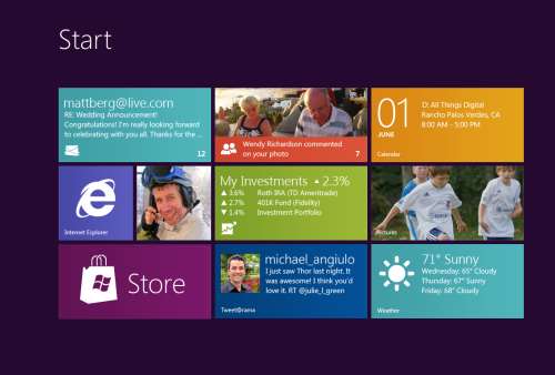
Good design practices still apply here. Appropriate use of whitespace, good layout, clear typography, and consistent UI patterns make a big difference so remember these and use them. A UI checklist might be in order for any app, not just Metro ones. I’ll state this from my experience. Very few business users know what they need and most can’t visualize past what they already have. Know this and learn to adapt from this perspective and I think you’ll go farther with the success factor with your users. Far too many times users are stuck with what they have, perhaps a spreadsheet-like application (where the one and only screen is 8000 rows of data and 300 columns). Anything you present to them, no matter how effective, is just shadowed by that grid in their mind.
I’m a strong advocate of the task oriented UI and think it works. Try to keep this in mind when designing the system and don’t let your user try to do 80 things at once on the same screen. You’ll just run around like a chicken with your head cut off trying to cater to everyone and in the end deliver a mediocre product that works for all cases rather than separate UX instances that are stellar for each situation.
Metro is different. It forces you to think about your application in a different manner. No longer are you trying to get tree view feeding items into list view feeding details into file view. There are still groups and collection of groups and all that but remember your UI now is a functional, breathing, living thing. Minimalism is best here so you want to get out as much information in as effective space as possible. As Microsoft pointed out, a live tile isn’t something you should be posting every detail to. It’s an extension of the application so treat it as a first class citizen, not a UI element that needs to be pretty.
Lists should contain just the right amount of information. Again, go back to your users and push them. Try not to take the route of “What do you need” but rather provide them with a solution that accomplishes the goal they’re aiming for (of course that means you need to establish a goal first). If they’re coming from a giant screen of data saying “We need *this*” then push them to answer what they use it for. What goal are they trying to accomplish? Are they trying to summarize information or are they looking for something (e.g. show me all the users with more than 10GB of storage). If they have a goal, key in on it and that might become the basis of a UI workflow.
Again keep the focus on the goal. You don’t want this thing to get out of hand or you’ll end up with a Frankenstein monster of a UI like this:
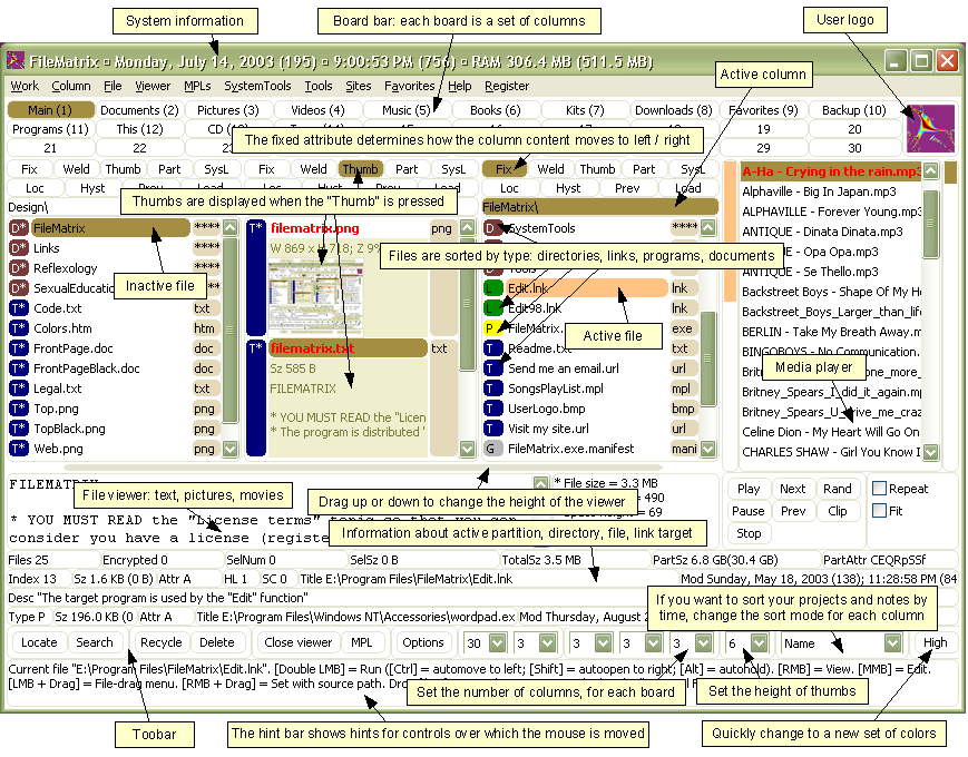
Take them by the hand and show them. Lead by example and show them what is possible. Giving them design documents might not be enough and don’t describe things like “Imagine this window over here with a list of things…”. You’ll probably be met with the deer in the headlight look. You might be thinking that Metro isn’t right for this app and perhaps you’re right. Don’t assume that you *have* to build a new UI in Metro just because it’s there. Photoshop isn’t going to be a Metro app (ever, at least I hope) but your LOB app might. You need to be sure you’re doing the right thing and don’t try to fit a square peg into a non-existent hole. LOB apps *can* be great looking and useful. I highly recommend you check out Billy Hollis’ screencast he did on LOB apps with WPF. While it’s not Metro, it does show that LOB apps can be great looking and functional. A lot of great tips from Billys talk.
Build something. Even if you sit with them in a whiteboard session and draw pictures on the screen it’ll help. Build up the UI using something like Basalmiq is great and easy for them to see quickly. Visio is just too mechanical to fiddle around with and your users will quickly loose interest. Rapid feedback wins over here but then take that back to the development environment and build it. The next day show them it in action on the real website or desktop you’re building it for.
There’s a danger here that I’ve seen of the “It’s done” syndrome. Users will see a mock-up in a website and think that all the work is done. It isn’t so temper your system with that and read your users. Find out if they really believe it’s just some if/then/else statements you have to do to make it work. I would opt to not call this “prototype” or “mockup”. I prefer to call it the working software. It’s what they’ll use in the production release and it’ll just evolve as they provide feedback, new elements are added, and parts of the system become functionally complete.
Look for some re-imaging of “Classic” apps into Metro ones soon as I’m planning on doing a few blog posts about this.
Many thanks to @colinbowern for some great tips on Twitter.
-
Microsoft's Next Move, Split Metro and Classic Mode in Windows 8?
Caveat lector. This is an opinion piece and not something I do often (or probably well) but my thoughts on this were a little more than 140 characters could handle. You have been warned.
Recently Netflix CEO Reed Hastings stood up and, doing his best impression of a half-pregnant Jeff Bezos, announced the physical division of it's DVD lending system and streaming services. This resulted in Internet carnage that continues to this day. The general feeling there is that the separation is going to cause pain and suffering with long time users who now look at it as having to search two separate and distinct places to find the same stuff, get two different bills, two different user experiences, etc. Visionary perhaps, but not fully baked.
Many who went to the recent Build conference (and others like myself who didn't) got their taste of Microsoft's Jekyll and Hyde next operating system, Windows 8. The "alive with activity" (sans spiders and snakes) view of the living tile Metro user interface is almost revolutionary in style, approach, and implementation.
The Metro UX is a new experience (some say a new way of life) in Windows 8 and is all about building an immersive user experience that’s unlike anything we’ve seen for a long time (a pre-cursor was the Metro makeover they gave Windows Phone 7 last year). Users get information from living tiles rather than static icons on a free-flowing desktop devoid of a clumsy arrangement and optimized for fingers, not mice.

Now that the dust has settled, the question that seems to be bubbling up to the surface for me (and some others), is Microsoft making a mistake? Combining the "optimized for touch" interface with the antiquated keyboard and mouse apps looks like it might be. Maybe Microsoft should be following in Apples footsteps and creating an optimized for touch operating system and a classic one.
Don't get me wrong. I'm not actually saying they should ditch what they have but it could potentially be tweaked. The classic interface could be completely removed from the Metro one and vice versa. This I see is a move that might be welcomed by developers and users alike.
The Development Story
Right now the developer story is just shaping up but already it’s causing confusion. Some developers are still asking the question about the Windows Runtime (WinRT). Why can’t we build Metro apps on Windows 7? Why is the WinRT a different API than the classic CLR. The bits are different. The runtime is different. The security is different. Heck, in Windows 8 you can write “desktop” apps using HTML5 and JavaScript for goodness sake. That in itself just says we’re not in Kansas anymore Toto.
It makes sense, if you think about it. Metro WinRT apps have a distinctive style to them and have restrictions you don’t have in the classic development world. Metro apps can’t even access the underlying file system (sans some Isolated storage which is not meant for large amounts of data). The UX is completely different from the classic desktop we’re familiar with and requires you to “re-imagine” your apps. There is no cross-platform compilation here. This isn’t “build a UI for Metro and build a UI for Classic mode”.
While you have to build two different applications anyways, what’s the difference if they’re on the same OS or not? It doesn’t mean you have to rewrite your entire system from scratch for each OS like you have to do today with Apple. A good developer is going to structure his system so the UI is separate and through the use of patterns like MVVM, changes to the back-end stuff, the important stuff, is minimized.
It does however require you to re-think your application, perhaps removing large chunks of the underlying system and changing the way it not only presents itself but what it presents. I’m not just talking about a UI makeover (which needs to happen) but the fact that your ViewModels today are not the same ones you need for Metro.
For example a Movie Catalog app might provide a ViewModel of titles in a single collection with a category attribute. The current UI might present this in a typical tree view, allowing the user to filter on single or multiple categories which then also lazy fetches the list of titles and presents it (through a child ViewModel) in a list view on the same screen. This two or three pane view of your data might be fine in a traditionally designed app but in Metro things might behave differently. Perhaps the categories are already broken down for you in a grouped collection and selecting one takes you to a view where no collection information is needed so only the movie titles and metadata are displayed. The information you show on the screen might be different for each style as well so ViewModels here cannot really be reused. Even the lazy fetching of the data on the back-end might be different in a Metro style app from a classic one.
In any case, the development story might be a little muddy right now and we’re still playing the Sesame Street “One Of These Things” games. Heading it off at the pass might be a good plan and let developers focus on the target platform that suits their purpose.
The User Story
Users are a whole new ball of wax with Metro and Windows 8. The causal user who’s going to use a touch device wants big targets and easy to use minimalistic apps. They’ll bounce around between weather, RSS feeds, Twitter and Facebook so the “flipping through apps like pages in a book” approach works well here. Nobody in the user community I hear is complaining about how you change between apps in Windows 8. Apps are designed for this. By their very nature, Metro apps are all about quick and concise information and not 800 buttons, 300 windows, 150 graphs, 50 tools, and a partridge in a pear tree in a single app here. The user experience for Metro is flipping through items while waiting for a bus or sitting in a meeting or lying on the couch. It’s casual, even for business users.
People are all impressed to Hell about the Metro look and feel. Look how easy it is to find things. Look how fun it is to share things. Look at how fast I can get to my data. This is not for business users who are going to stare at a 70 by 3000 spreadsheet for hours at a time. It’s for users on the go and a step up from having the same information on a 8 inch phone platform.
Business users need the classic look. As Jensen Harris pointed out in his excellent 8 Traits of Metro Apps presentation, apps like Photoshop just don’t fit into Metro. They don’t belong.
Identity
I see an identity crisis here in the making (or perhaps that ship has already sailed). Microsoft keeps touting the Metro look and says “And your classic apps are right here”. Then the user is subjected to a jarring shift from the beautiful typographic world of Metro to the classic desktop we have now, full of chrome and frames and toolbars oh my. It’s like watching the magnificent tranquility of Claude Monet’s “Water Lillies” and then be suddenly thrown into the world of Jackson Pollocks “Composition with Pouring I”.

The experience right now is jarring. Click on any “classic” app and Metro goes bye-bye and you’re back at traditional desktop. Then you look down, see the iconic Start button, click it, and BAM! You’re back in Metro land, wondering how to get back to the comfort zone. Users don’t know how to use shortcut keys. I struggle and watch people who have been “using” computers for years still not use Ctrl+C/Ctrl+V to copy and paste and if I asked 100 people at work right now if they knew they could lock their computers with a single keystroke (Windows + L) they would shake their heads in disbelief.
I know what you’re thinking right now. Two platforms. Two deployments. Two SKUs. Two nightmares. I don’t think so. It’s a choice. Do you really see people complaining they can’t run their iPad apps on their desktops? Yes, it’s more work but I think it’s the right work. While Microsoft continues to say that Metro works just as well with a mouse and keyboard than it does with touch, people continue to look at the “optimized for touch” interface and scratch their heads wondering what this experience is going to be like with a keyboard. It works but it’s not the best. How do you pinch zoom with a mouse? How do you dual scroll with a keyboard? Just because you can do something, doesn’t mean you should.
Your Move Microsoft
I’m just a guy. Some people think I might have some internal influence with Microsoft but I don’t. I bitch, I complain, I praise just like everyone. People at Microsoft possibly (probably) already have the plans in place for Windows 8. That decision was probably baked over a year ago during early design or roadmap sessions.
Is it a good move for Microsoft? I think so. As a developer I would be happy building systems targeting two operating systems. As a developer I might go through the entire Windows 8 lifecycle without building a Metro app and that’s okay. Some developers might bitch and groan that they need to build two different solutions for the same platform so this would fix that problem. Now you’re building one app for one platform (and optionally another app for another platform should you choose to go that route).
-
Adding Ratings and Comments to SharePoint Publishing Pages
One of the cool features that was introduced in SharePoint 2010 was ratings. Ratings allows you, with a simple configuration option, to provide the ability for users to rate individual list items. This includes pages and documents because, after all, a publishing page is just a document in a library which in turn is just a list item.
On almost any news site you might find the ability to rate content. Voting things up by providing a “I like this” type tag to a page or by giving a page rating. This is missing in the out of the box SharePoint for publishing pages and takes a little work to get it going so let’s turn SharePoint up to 11 and get it done.
Tools you’ll need:
- A SharePoint publishing site
- A “Pages” library where new articles are created (any site created with the Publishing site template creates this automatically)
- SharePoint Designer
- A few minutes of your life
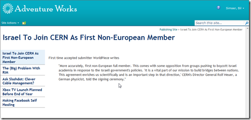
We’ll start with the stock Publishing Site. I’ve added a few articles and just modified the navigation on the side to display pages.
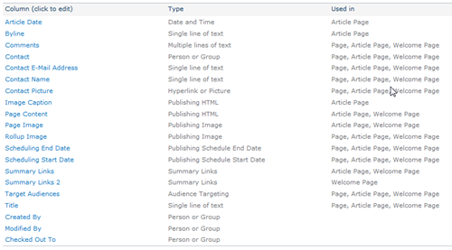
If you navigate to the Pages library (Site Actions > View All Site Content > Pages) and go into the settings for the pages you’ll see the list of default columns for the page library:
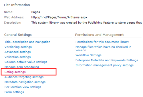
Go into List Settings and click on Rating settings under the General Settings section
You’ll be given the option to turn ratings on. Do this for the Pages library and click OK.
Note: You must have the SharePoint Timer Services running and the User Profile Service configured and started for ratings to work. Why? Ratings for items are updated via timer jobs so when you rate an item it takes up to 15 minutes before the rating are updated and propagated throughout the farm. Part of that propegation is updating your SharePoint “social” profile (things you’ve done like rating items, creating tags, and leaving comments). These functions require the User Profile Service to be configured and working (which is way beyond the scope of this article).
After turning on ratings for the library you can look at the updated columns which are going to capture the rating for each item.
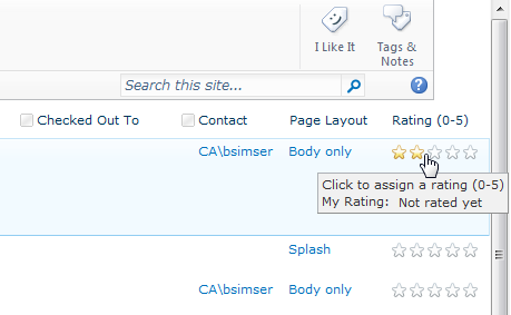
The columns are also completely functional so if you just look at the All Documents view of the Pages library you can rate individual items immediately:
This is great but we want to make it a little more intuitive. We’ll modify the page to allow for ratings on the article page when the user views it. For this we’re going to modify the article layout page. We modify the layout page because we need to store the ratings for each page so having it on the Master page won’t work. This approach is fine but remember two things. First, you’ll need to add this snippet to any layout pages you use. Also remember that when you create a new site (and a new Pages library) that it will continue to use the existing layout pages but the library needs additional work to enable ratings on it.
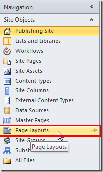
Open the site in SharePoint Designer and select Page Layouts from the Navigation Tree:
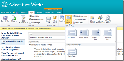
We’re going to modifying the first page layout that we’ve used in the articles so far. If you edit the page the click on the Page tab you can view what Page Layout the page is using (it’s also displayed by default in the All Documents List View). Click on Page Layouts and the highlighted one is the layout the page is using. Below it shows we’re using the Body only layout.
Back in SharePoint Designer we need to find this layout. In the Page Layouts view find the page with the title that matches the layout in the browser.
When you click on it to launch it in SharePoint Designer you’ll be warned that there are no editable regions through this dialog box:
Click OK to open the page in “Advanced Mode” which basically just means “Let me edit the entire page”.
Scroll down near the bottom. You’ll find the ContentTemplate that’s for SharePoint 2010 (UIVersion=”4”). This is the layout that is used to display the article (be careful not to change the UIVersion=”3” section above, it’s a carry over when the system is running in “Make it look like SharePoint 2007 mode”).
We’re going to insert this snippet:
This is the control that you saw in the List View which will render the average rating for the item (compiled from all the votes and updated through the Timer service mentioned earlier).
We’ll add it below our article and wrap it in a div tag using the “article-content” class (which will style it the same as our story)
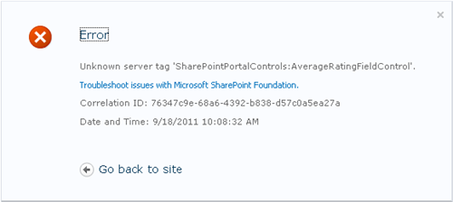
Refresh the page on your site and you’ll probably see this error:
The SharePointControls tag we inserted isn’t known by default in the layout pages so we have to add a declaration to the top of the page. Add this snippet at the top of page:
This just tells the page that when you see the SharePointControls prefix, use this control from this assembly. Insert it at the top of the page like this:
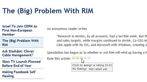
Now go back to the page in your browser and hit F5 to refresh it. You’ll see the rating control added below your article.
Sweet! Go ahead and create a new page (or a few of them) using the Body only layout. You’ll see the rating on each page. Remember that clicking on a rating will take up to 15 minutes before it’s updated so be patient!
Oh, but ratings are not enough. Let’s face it, if we want to foster “social” type of atmosphere with SharePoint in the corporate environment we need social tools. Not only can we add ratings to articles we can also add comments.
Comments are something new to SharePoint (and not stored in lists, don’t get me started on how to do something like aggregate comments). Comments come from the server and are similar to tags (like the “I Like It” tag that you can hit on any page). They’re part of the whole social upgrade SharePoint 2010 got and a very cool thing.
It’s only natural to allow users to comment on articles so let’s do that.
Still in SharePoint Designer insert this snippet below the DIV tag you created for the ratings:
It’s that simple.
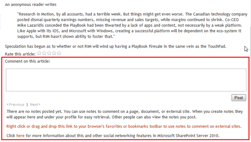
Now view the page in your browser again.
That entire chunk in the red box is what was added with the SocialCommentControl.
Enter a comment and click Post. The comment is saved on the server (in one of the new Social databases) and associated with the article. Go to another page and you’ll see that there are no comments so comments are unique for each article.
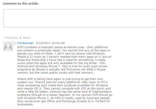
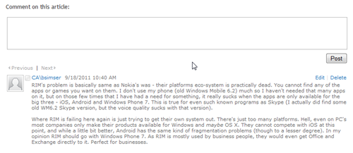
There’s one gotcha with the comments. Here’s a new comment added to the article:
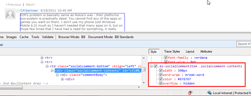
Note the craptastic layout. It’s as if there’s an imaginary box drawn around the comment that’s forcing it to be a certain size. And if you guessed that, you’d be right! Here’s the behind-the-scenes markup for a comment:
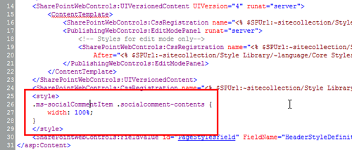
Yup. Comments are rendered inside a DIV tag that’s forced to a width of 390px. If you’re okay with this then you can leave it alone, otherwise insert this into the top of your page layout:
Now refresh the browser to see this:
That’s better. Now the comment takes up the entire width of the screen. We insert the custom CSS onto the page because the default CSS for comments is in a system file (and used on the My Site pages) so we don’t want to screw up that with a global change. If you have a custom CSS file for your site you can add it there too.
Like I said you’ll need to do this on every page layout in the system if you want to enable ratings and comments on article pages. It shouldn’t take more than a few minutes though (probably less time to implement than it took to read this article). Don’t forget to enable Ratings on each Pages Library in your system too. Comments don’t need anything special done to the library as they’re stored centrally (but you do need the My Site functionality setup along with the Social databases it creates).
Hope that helps and have fun! It’s a great feature to enable and a great way to get your users to participate in your corporate content!
Enjoy.
