Fear and Loathing
Gonzo blogging from the Annie Leibovitz of the software development world.
-
Farseer tutorial for the absolute beginners
This post is inspired (and somewhat a direct copy) of a couple of posts Emanuele Feronato wrote back in 2009 about Box2D (his tutorial was ActionScript 3 based for Box2D, this is C# XNA for the Farseer Physics Engine).
Here’s what we’re building:
What is Farseer
The Farseer Physics Engine is a collision detection system with realistic physics responses to help you easily create simple hobby games or complex simulation systems. Farseer was built as a .NET version of Box2D (based on the Box2D.XNA port of Box2D). While the constructs and syntax has changed over the years, the principles remain the same.
This tutorial will walk you through exactly what Emanuele create for Flash but we’ll be doing it using C#, XNA and the Windows Phone platform.
The first step is to download the library from its home on CodePlex. If you have NuGet installed, you can install the library itself using the NuGet package that but we’ll also be using some code from the Samples source that can only be obtained by downloading the library.
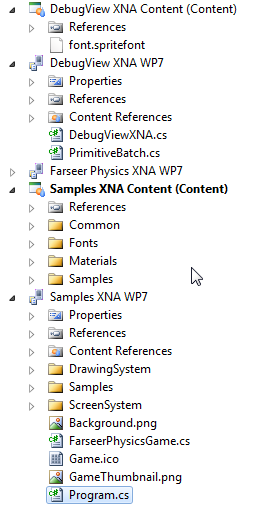
Once you download and unpacked the zip file into a folder and open the solution, this is what you will get:
The Samples XNA WP7 project (and content) have all the demos for Farseer. There’s a wealth of info here and great examples to look at to learn. The Farseer Physics XNA WP7 project contains the core libraries that do all the work. DebugView XNA contains an XNA-ready class to let you view debug data and information in the game draw loop (which you can copy into your project or build the source and reference the assembly).
The downloaded version has to be compiled as it’s only available in source format so you can do that now if you want (open the solution file and rebuild everything). If you’re using the NuGet package you can just install that. We only need the core library and we’ll be copying in some code from the samples later.
Your first Farseer experiment
Start Visual Studio and create a new project using the Windows Phone template can call it whatever you want.
It’s time to edit Game1.cs
Lines 4: Declare the debug view we’ll use for rendering (more on that later).
Lines 8: Declare _world variable of type class World. World is the main object to interact with the Farseer engine. It stores all the joints and bodies, and is responsible for stepping through the simulation.
Lines 12-17: Create the graphics device we’ll be rendering on. This is an XNA component and we’re just setting it to be the same size as the phone and toggling it to be full screen (no system tray).
Lines 34: We create a SpriteFont here by adding it to the project. It’s called “font” because that’s what the DebugView uses but you can name it whatever you want (and if you’re not using DebugView for your production app you might have several fonts).
Lines 37-44: We create the physics environment that Farseer uses to contain all the objects by specifying it here. We’re using Vector2.UnitY*10 to represent the gravity to be used in the environment. In other words, 10 units going in a downward motion.
Lines 46-56: We create the DebugViewXNA here. This is copied from the […] from the code you downloaded and provides the ability to render all entities onto the screen. In a production release you’ll be doing the rendering yourself of each object but we cheat a bit for the demo and let the DebugView do it for us. The other thing it can provide is to render out a panel of debugging information while the simulation is going on. This is useful in tracking down objects, figuring out how something works, or just keeping track of what’s in the engine.
Lines 49-67: Here we create a rigid body (Farseer only supports rigid bodies) to represent the floor that we’ll drop objects onto. We create it by using one of the Farseer factories and specifying the width and height. The ConvertUnits class is copied from the samples code as-is and lets us toggle between display units (pixels) and simulation units (usually metres). We’re creating a floor that’s 480 pixels wide and 50 pixels high (converting them to SimUnits for the engine to understand). We also position it near the bottom of the screen. Values are in metres and when specifying values they refer to the centre of the body object.
Lines 77-78: The game Update method fires 30 times a second, too fast to be creating objects this quickly. So we use a variable to track the elapsed seconds since the last update, accumulate that value, then create a new box to drop when 1 second has passed.
Lines 89-94: We create a box the same way we created our floor (coming up with a random width and height for the box).
Lines 96-101: We set the box to be Dynamic (rather than Static like the floor object) and position it somewhere along the top of the screen.
And now you created the world. Gravity does the rest and the boxes fall to the ground. Here’s the result:
Lines 105: We must update the world at every frame. We do this with the Step method which takes in the time interval. [more]
Lines 108-114: Body objects are added to the world but never automatically removed (because Farseer doesn’t know about the display world, it has no idea if an item is on the screen or not). Here we just loop through all the entities and anything that’s dropped off the screen (below the bottom) gets removed from the World. This keeps our entity count down (the simulation never has more than 30 or 40 objects in the world no matter how long you run it for). Too many entities and the app will grind to a halt.
Lines 125-130: Farseer knows nothing about the UI so that’s entirely up to you as to how to draw things. Farseer is just tracking the objects and moving them around using the physics engine and it’s rules. You’ll still use XNA to draw items (using the SpriteBatch.Draw method) so you can load up your usual textures and draw items and pirates and dancing zombies all over the screen. Instead in this demo we’re going to cheat a little. In the sample code for Farseer you can download there’s a project called DebugView XNA. This project contains the DebugViewXNA class which just handles iterating through all the bodies in the world and drawing the shapes. So we call the RenderDebugData method here of that class to draw everything correctly. In the case of this demo, we just want to draw Shapes so take a look at the source code for the DebugViewXNA class as to how it extracts all the vertices for the shapes created (in this case simple boxes) and draws them. You’ll learn a *lot* about how Farseer works just by looking at this class.
That’s it, that’s all. Simple huh?
Hope you enjoy the code and library. Physics is hard and requires some math skills to really grok. The Farseer Physics Engine makes it pretty easy to get up and running and start building games. In future posts we’ll get more in-depth with things you can do with the engine so this is just the beginning.
I've posted the entire source code for this article on Bitbucket so you can grab the whole package here.
Enjoy!
Introducing SharePointR
Recently there’s been a lot of great press on a async signallying libarary called SignalR. SignalR is the brainchild of Microsoft employee David Fowler and helps you build real-time, multi-user interactive web applications.
The last year I’ve been working with a top team in Redmond on rewriting SharePoint into a complete JavaScript version that runs in the client which we’re now calling SharePointR.
SharePointR is a client side version of SharePoint offers all of the base functionality that SharePoint 2010 has but boasts a 300% improvement in speed and productivity for the Information Worker. Along with key features that can only be offered in a client side product, SharePointR comes out of the box with social media integration so there’s no need to build any third party solution.
Technology
SharePointR is built on top of SignalR, a .NET library for building real-time, multi-user interactive web applications. It’s only natural for SharePointR to use the technology and provide a full blown server product like SharePoint to the client. SignalR makes it dead easy and handles all the heavy lifting for you. SharePointR handles all the heavy lifting of running a SharePoint farm for you by putting it on all the client.
Creator David Fowler sounds a little confusing about the product and had this to say. Not really sure what it means though:
Here’s a production product yesterday and predictive rasterized integration legacy fully operating on leftover server data and yup.
Creating a new instance of SharePointR is a breeze:
1. Create a SharePointR hub:
[HubName("sharePointHub")]
public class SharePointRHub : Hub
{
  private readonly SharePointR _server;

  public SharePointRHub(SharePointR server)
  {
    _server = server;
  }
}
2. Create a connection between the server and your client:
var sharePointRHubClient = $.connection.sharePointRHub;

// Start the connection

$.connection.hub.start(function() {
  sharePointRHubClient.join('domain\user');

};
That’s it! You now have a fully functional SharePointR server running anywhere you want.
How do you interact with it? Simple. It uses all the classes you’re familiar with in SharePoint land, just in SignalR style. Here’s how to get a listing of documents in a document library and display the list name and number of items in a HTML div tag (called output):
var server = $.connection.sharePointR;

server.lists["Shared Documents"].foreach(function(){
  $("#output").append("" + name + " items = " + items.getCount());
});
Bonus BizTalk Integration
In addition to just a SharePoint server at your fingertips, SharePointR also includes a fully baked BizTalk server (based on BizTalk 2010). It’s drop dead easy to integrate with it using SharePointR:
var biztalk = $.connection.sharePointR.bizTalkR;

biztalk.transport.sendPort = 25;
var json = biztalk.send("SELECT * FROM Northwind.Customers").toJson();

$("#datagrid").load(json);
With 4 lines of code I just contacted the BizTalk server, issued a command to submit a SQL query on a send port via SMTP and returned a JSON array that I fed into a jQuery datagrid.
How easy is that?
SharePointR is Open Source
Just as the ASP.NET MVC team recently announced open sourcing the ASP.NET stack, the SharePointR team has open sourced the product in the same fashion. I’m very excited about this because not only does it mean SharePointR is licensed under an open source license (Apache 2.0) but the SharePointR team is now accepting contributions! Yes, now the SharePointR team will ship community code inside the core product.
How do you get involved? Simple.
- Find a bug? Send a unit test or fix it.
- Think our coverage isn’t sufficient? Submit a unit test.
- Got a feature idea? Get involved more deeply with the developers and help write it.
Like every large open source project, every check-in (open source or otherwise) will be evaluated against the existing standards used by the developers. Even better, you’ll get to see our developers' checkins to the product out in the open.
Implementation
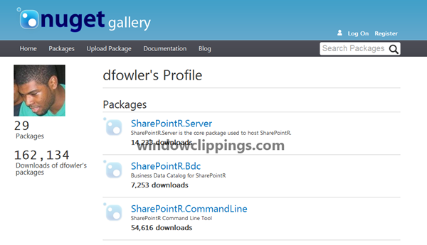
To install SharePointR just use NuGet in your browser by going to http://localhost/nuget then issuing the command:
Install-Package SharePointR.Server
This will bring down the server package and give you everything you need to run SharePointR. Additional packages can be installed via NuGet. These are:
- SharePointR.Bdc – Business Data Catalog
- SharePointR.Publishing – Content publishing subsystem
- SharePointR.PowerPivot – Powerful reporting via Excel
- SharePointR.Social – All the social media elements of SharePointR
Integrated Services
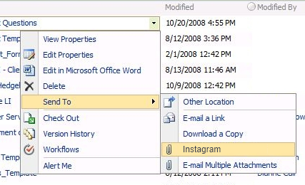
Some of the new features of SharePointR that we’re announcing is complete integration with Instagram, the fast, beautiful, and fun way to share your photos. With SharePointR you’ll be able to upload photos to a SharePointR picture library and in the background the pictures are automatically posted to the Instagram photo service. This is done behind the scenes so there’s nothing you need to do except setup your Instagram account and password in the system settings:
PInterest meets SharePointR
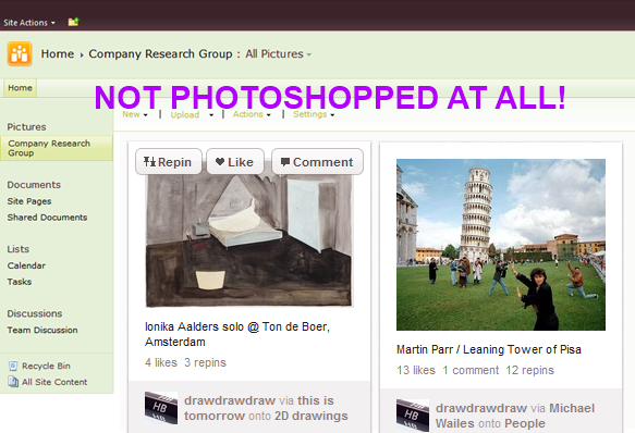
The Like system from SharePoint 2010 has been abandoned in favour of a deep link integration with PInterest. Now users can tag documents, photos, videos, and files in SharePointR and have them immediately posted to PInterest. The integration doesn’t just go one way, it’s two-way with SharePointR pulling in your pins and boards and allowing you to navigate them in the familiar SharePoint UI.
Native QR Code Support
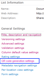
The SharePointR team thought that QR codes are the greatest invention since the modem and felt they had to be natively included in the product. And they are! Now you can configure a Document Library or SharePointR list to produce a QR code automatically.
We’ll be releasing QR code generation on a per-item level in a future Service Pack.
Availability
SharePointR is available now! Just install it via the NuGet package or you can grab the source code off GitHub.
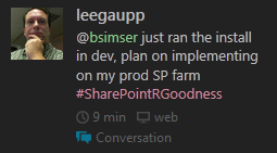
What are people saying about SharePointR? Take a look!
I hope this sheds some light on what’s happening with the next version of SharePoint and that you see this as a benefit to your organization. While it does mean all your server side code has to be redone, the CoffeeScript tool will help with that so migration to SharePointR should be quick and seamless.
Please don’t hesitate to contact me on Twitter (@bsimser) or via comments below on more questions about SharePointR!
Displaying Large Text Files in Windows Phone Apps
Have you ever needed to provide instructions or help for your Windows Phone app and found yourself creating gobs of XAML and writing it in the Visual Studio designer into a TextBlock control? Not very efficient is it? Here’s a technique you can use that might make things easier.
Ingredients
- 1 Text File (preferable something appropriate to your app)
- 1 Phone Application Page
- 30 Lines of Code
Preparation
Create a new Phone Application Page (or use an existing one). Add a ScrollViewer to it like so:
<!--ContentPanel - place additional content here--><Grid x:Name="ContentPanel" Grid.Row="1" Margin="12,0,12,0">
<ScrollViewer x:Name="ScrollingTexFromHell"/>
</Grid>
You’ll need a text file to display so create one in your project. By default it’s type is set as Content so that’s what we want. Just make sure the file is copied to the project (you can choose to copy always or copy if newer, doesn’t matter). I use Bacon Ipsum to get me some sample text because well, it’s bacon baby.
In the code behind add a method like this:
private static StackPanel TextToXaml(string filename)
{
    var panel = new StackPanel();
    var resourceStream = Application.GetResourceStream(new Uri(filename, UriKind.RelativeOrAbsolute));
    if (resourceStream != null)
    {
        using (var reader = new StreamReader(resourceStream.Stream))
        {
            string line;
            do
            {
                line = reader.ReadLine();
                if (string.IsNullOrEmpty(line))
                {
                    panel.Children.Add(new Rectangle { Height = 20.0 });
                }
                else
                {
                    var textBlock = new TextBlock
                    {
                        TextWrapping = TextWrapping.Wrap,
                        Text = line,
                        Style = (Style)Application.Current.Resources["PhoneTextNormalStyle"],
                        FontSize = 22,
                    };
                    panel.Children.Add(textBlock);
                }
            } while (line != null);
        }
    }
    return panel;
}
Finally add a Loaded Event to your page to execute this when the page loads and assign the value of the method above to your ScrollViewer.
// Constructor
public MainPage()
{
    InitializeComponent();
    Loaded += OnPageLoaded;
}

private void OnPageLoaded(object sender, RoutedEventArgs e)
{
    ScrollingTexFromHell.Content = TextToXaml("mytextfile.txt");
}
The Result
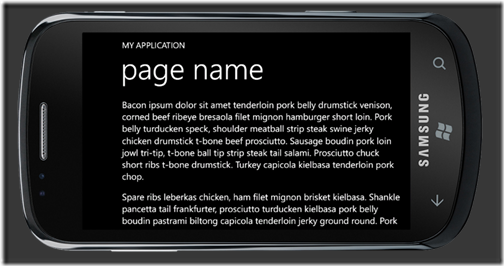
The code is really simple. It just reads in the text file as a stream and reads each line in the text file. A StackPanel is created in our method and whenever the reader hits a blank line it inserts a small rectangle, otherwise it creates a TextBlock control with the content set to the line. You can adjust the height of the space between paragraphs and the font style and size but I picked something that I think looks pretty good when reading long text.
The paragraphs are stacked up in the StackPanel control which is then set as the content to the ScrollViewer we inserted. The user can just scroll through the entire text as they need to.
Enhancements? Of course. You could
- Put this into a Phone Class Library and use it as you see fit (you could even create a NuGet package!)
- Add parameters to the TextToXaml method like font size and spacing
- Do extra things with the reader while processing the text. For example you could recognize a new line and make each new line bold or larger so the first line in each paragraph would be a heading.
Have fun with it. It’s simple and I find it’s better than entering the text into the XAML page directly.
Official and unofficial apps in the iOS, WP7, and Android marketplaces
The last few months have seen people complaining about the lack of "official" apps in the Windows Phone marketplace. In fact a couple of months ago I wrote about this very thing here and if we really needed these official apps or could get by with third-party solutions.
Recently a list of "Top 100 Mobile Apps" crossed my desk and it was curious. 40 iPhone apps, 40 Android apps, 10 WP7 apps, and 10 BlackBerry apps. Really? 10 for WP7? So I wondered if the media was just playing this up and maybe continuing to do what I think most vendors are doing which is treating Windows Phone as the red-headed step-child you keep in the basement while all along there's nothing wrong with them.
I put together the list and went digging to see how many of the top 40 iOS and Android apps were also on the Windows Phone platform (sorry BlackBerry, you should just shut your doors right now). Here's the results. Note, these are all *free* apps. There might be other pay apps that have official representation across all mobile devices, I just chose to hunt these ones down because I'm cheap.
In the top 40, I easily plucked out 20 that had official apps on all three platforms. These were: Amazon Mobile, ESPN Score Centre, Evernote, Facebook, Foursquare, Google Search, IMDB, Kindle, Shazam, Skype (yes, I know, in beta on WP7), SlackerRadio, The Weather Channel, TripIt, Twitter, Yelp, Flixster, Netflix, TuneIn Radio, Dictionary.com, Angry Birds, and Groupon.
Hey, that's pretty good IMHO. 20 or so apps, all free, and all fully functional and supported (and in some cases, even better looking on the Windows Phone platform than the other platforms).
A dozen or so more apps had official apps on some platforms but not all, so yes, there are gaps here. Here's a rundown of the hangers-on:
Adobe Photoshop Express
This looks great on the iOS platform and there's even an official version on droid. Hope Adobe brings this to WP7. There are other photo editing programs though if you go looking (maybe we can get Paint.NET to be ported to the phone?)
BBC News
A few apps offer news feeds but nothing official on the Windows Phone. The feeds are good but without video this app needs some WP7 love.
Dropbox
Again Windows Phone looses out here with no official app. There are a few third party ones that will help you along and offer most of the functionality that you need but no integration that an official app might bring.
Epicurious
Droid seems to be the trailer here as there are apps for it but nothing official (from what I can tell). Both iOS and WP7 have them.
Flipboard
It's sad with Flipboard as it's such a great newsreader. The only offiical app is for iOS but frankly the iPhone version looks horrible so without a tablet the experience here isn't that hot. Maybe with WP8. Currently there's nothing even remotely similar to this on the other platforms.
Google+
Is anyone still using this? No official app for WP7 but some clones. Apparently there's no API so people are just screen scraping. Ugh.
Mint.com
This app has all kinds of buzz and a lot of votes on the application requests site. Official apps for iOS and droid. No WP7 love (yet).
TED
Quite a few TED apps on WP7 but nothing official. I think the third party ones suffice and some are pretty nice looking, taking advantage of the Metro interface and making for a good show.
WebMD
There's a third party app on WP7 here but nothing official. It seems to contain all the same information and functionality the official apps do so not sure if an official one is needed but its here for inclusion.
The other apps in the top 40 were either very specific to the platform (for example all three of them have a "Find my Phone" app). There are others that are missing out on the WP7 platform like ooVoo, Words With Friends, and some of the Google apps (Google Voice for example). Since you can integrate your GMail account right into the Windows Phone (via linked inboxes) I'm not sure if there's a need for an official GMail app here.
Looking at the numbers Windows Phone still gets the worst of the deal here with half a dozen highly popular "offical" apps that exist on the other mobile platforms and in some cases, nothing even remotely similar to the official app to compare. This doesn't include things like Instagram, PInterest, and others (don't get me started on those).
Still, with over 20+ highly popular free apps all represented on all three mobile platforms I don't think it's a bad place to be in. The Windows Phone platform could get a little more love from the vendors missing here, or at least open up your APIs so the third party crowd can step in and take up the slack.
P.S. these are just my observations and I might have got a few items wrong. Feel free to chime in with missing or incorrect information. I am after all human. Well, most of me is.
PrairieDevCon 2012 Sessions
As a follow-up to yesterdays note about my Windows Phone Developer Workshop (there's still room for more peeps!) here's a list of regular sessions I'm presenting at PrairieDevCon 2012.
SharePoint Client Object Model: Accessing SharePoint Externally Using JavaScript

In SharePoint 2010 there are a number of object models that can be used by developers to access the server. The Client Object Model (Client OM) is a unified model which uses the same or similar programming concepts as the Server Object Model (Server OM). The Client OM can be accessed via web services, via a client (JavaScript) API, and via REST. Everything from enumerating sites and lists, displaying list items, adding and creating content, and getting user information can be done all from the Client Object Model. In this session we'll explore the Client Object Model and create examples accessing SharePoint data using JavaScript and jQuery.
Application Design for Windows Phone

In the past year, we’ve worked with hundreds of developers and designers interpreting the "Metro" design system for their own purposes. We’ve seen great interpretations, and others that aren’t so great. In this session, we’ll share with you the foundations of great Metro application design for Windows Phone, and how to use them to build outstanding applications that will stand out and get noticed… for good reasons. We will also be providing some general best practices for building great mobile experiences.
The Marketplace – What Makes a Successful App on Windows Phone?

If you are a developer and have even thought about developing Windows Phone lately, you likely already know that every app and game that is installed on consumer Windows Phone 7.5 devices comes from the Marketplace. This is new to the traditional Windows Phone ecosystem prior to version 7, and while in some cases this does introduce a change for developers and users, there is a lot of reasons why this change is a great one. In this session, we go through both the consumer and developer/publisher experience on the Marketplace and strategies for distributing your app and game both publicly and privately. We will also provide an overview of our Marketplace presence around the world and what new countries have been introduced with the release of the new 7.5 (formerly codenamed “Mango”) update. Finally, we will provide you with strategies on how to increase the popularity of your applications and games and (if you are charging a price for your masterpiece) how to make more money.
Get Juiced with me and 10,000 friends at Prairie Dev Con West
I”m happy to say that Prairie Dev Con West 2012 is almost upon us. In just over a week geeks from the five corners of the planet will get together and talk about D’Arcy Lussier’s hair and hope that the Mad Mexican doesn’t crash their session.
 For me there’s a few sessions I’m presenting including a day long workshop on Windows Phone Development. If you’re looking to learn hands-on development with a Jedi Master then you’ll need to find a different conference. If however you want to try your hand at learning with me and watch me stumble through trying to run Windows on a MacBook Pro, then bring it. Here’s a rundown of what we’ll be covering with the Windows Phone Developer Workshop.
Start your engines and we’ll go from 0-11 in 60 minutes with building more Hello World apps you’ve ever seen. They’ll be a Hello app, a World app, and even a Hello World app. Everything you need to know to get started with Windows Phone development. After a series of Hello World apps you’ll be ready to build anything (well, anything with the words Hello and World in them)
- Everyone talks about the Model-View-ViewModel (or as we experts say MVVM) pattern when it comes to data binding on the Windows Phone. We’ll explore every concievable angle to using the MVVM pattern, tools that make it less painful to implement the pattern, and different ways we can spell MVVM (like MVMV, MVCM, and the ever popular MCMXXVII)
- For me I’m all about the bling and love to criticize apps that make my eyes bleed. Help me make my eyes bleed less by learning the Metro design language. We’ll just randomly pick ones in the marketplace and rip them a new one. If you like watching Gordon Ramsay yell down at people that cook like donkeys then you’ll fit right into this part of day. I guarantee you’ll know the Metro ways after this or I’ll beat your with your own skull.
- Mango introduces about 800,000 new API features and we’ll look at every one of them in detail. There are some cool tools that will help you debug and work with apps in the emulator and we’ll go over the new and old stuff in Mango. This part of the session may extend the day so bring a sleeping bag and some Red Bull to keep you going through the night.
- Expression Blend is the most complex piece of software ever known to man. We’ll try to figure it out. Barring that, we’ll just sit around and sing Kumbaya and make jokes about people from Edmonton.
I’m also presenting a session on using the JavaScript Client Object Model with SharePoint 2010. We’ll build some funky stuff and learn how to iterate lists, sites, and build alternate UIs for SharePoint without writing a single line of C# code. There are also two additional sessions on Windows Phone that I’m planning on doing which is a deep dive into marketing and design. Oh yeah, there are other people doing sessions at the conference too.
The 10,000 friends? Okay, so I think the attendance for Prairie Dev Con West is only a few hundred, but I like to use my imagination and pretend I can see ten times more people than there really are. Same effect when I drink.
In any case, if you haven’t registered already please consider it. D’Arcy puts on a damn good show and the quality being presented here (sans me) is top notch and there’s a huge diversity of sessions to take in.
Also remember the pre-con day-long workshops are there. If all you want to take in is a workshop, that’s cool too and you’ll get a full day earful of Agile, Windows Phone Development, and TFS Build sessions. Still an absolute cheapskate like me? Then there’s a day long Windows Azure Boot Camp you can come out to that absolutely free (as in beer, but space is limited) and even includes breakfast and lunch (sorry, the Microsoft IT Virtualization Boot Camp is sold out).
Come on down and get smart(ish).
Metro Style Site Directory for SharePoint Using EMCAScript
I’ve always been trying to come up with a useful and clever way to allow users to navigate around SharePoint sites. Recently I put together an “Application Directory” which basically displayed a menu system to navigate around apps. Using the JavaScript Class Library for SharePoint to pull values out of SharePoint I quickly put together something that normally would be a lot of C# code and a web part.
The EMCAScript object model is powerful in that you can quickly pull data out of SharePoint sites and lists and make a pleasant user experience with just a little JavaScript, CSS, HTML, and jQuery. It still will make a call back to the server to fetch the data but it’s done asynchronously so the perception to the user is almost seamless.
This post walks you through building a site directory of sorts. It could be used as a landing page on a top level site collection or as a web part sitting on a team site (to show the contents below the site). It’s up to you but the net result is a nice navigation system (done with a little “Metro” styling) all done in a hundred lines of JavaScript.
Here’s what we’re building:
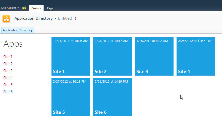
Let’s start with the simplest thing possible. A script that we’ll insert into the page using the Content Editor Web Part via a Content Link. This is my preferred way of doing lightweight adds to SharePoint (like JavaScript or even just raw HTML). The Content Link points to a file in my SiteAssets library in the site and since it’s a link it just gobbles up the content and serves it up. If you try adding HTML to a Content Editor Web Part you’ll find a nice message after saving “Your HTML may have been modified”.
WTF?
Yeah, SharePoint deliciously will go in after you save your nicely formatted content and do some neat things like rename your CSS entities. Oh yeah, it’ll also strip away your JavaScript if it doesn’t like it.
Trust me. Just include the file and you’ll be much better off in the end. Having the file located in the SiteAssets library also lets me just crack it open in SharePoint Designer and while the editor isn’t the greatest, it does give you some Intellisense but the real advantage is saving it in SPD then hitting refresh on your page to see the effect. The file will contain the CSS, JavaScript, and HTML markup. I like putting everything together so I don’t have to worry about files all over my system but you can just as easily use multiple files if you want.
Alright, back to business. Create a new file in your SiteAssets library (you get a SiteAssets library when you create a new site regardless of what template you use or what feature you activate, it’s always there and accessible through SharePoint Designer).
Name the file SiteDirectory.js or something. Doesn’t really matter and you can call it ISavedTheWorldUsingPork.HowAboutThat if you want, but leaving it with a .js extension will give you some semblance of Intellisense inside of SPD.
Drop a Content Editor Web Part on the home page of your site (or wherever you want to put this). This could be a Wiki Page (the Home.aspx page is a wiki page if you activate the Wiki Home Page Feature on a site) or a Web Part Page. There are a few small tweaks you should do depending on what type of page you put this on but just adjust the CSS we’ll be building as you see fit.
Starting simple we're going to just enumerate the child sites and display them in an unordered list. The list is easy to style and works well with jQuery later to be able to animate or attach plugins to.
Here’s the initial code that we’ll put into the SiteDirectory.js file:
Like I said, all this is doing is a) enumerating through the list of subsites then b) spitting them out into an unordered list. Here’s a breakdown of how this works:
Line 1-2: We’ll include some CSS styles here later
Line 4: We include jQuery so we can a) make it easy to replace elements on the page and b) support plugins later. You can choose to use pure JavaScript or omit this if your site already includes jQuery.
Line 8: We declare a variable we’re going to use to hold the list of sites
Line 10: We wait until the core JavaScript files are loaded by SharePoint. This ensures the ClientContext is setup for us when we need it.
Line 12-23: This is the function that calls the Client Object Model to get our web then get the subwebs for the current user. Finally on lines 19-21 we execute the call (which is where we talk to the server) and define the success and failed methods.
Line 25-46: We define the success function to call with our list of subwebs. Here we’re getting an enumerator to the web collection and iterating through them, grabbing the url and title of the site then creating our unordered list using regular HTML markup. Finally on line 45 we find the DIV tag we’re replacing and substitute the HTML we just created.
Line 55-57: This is the HTML markup we’re going to replace in our JavaScript. We initially set the text to “Loading…” so users will see this when the page loads then *magically* it’ll get replaced with our content.
Here’s the result:
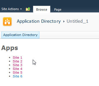
Looks good and lets us know we’re on the right track. If there are any failures you’ll see them here because our failed function will get called and output the error message. This could be anything from a JavaScript error to not calling a known method. Also note that this is already security trimmed since we’re using the getSubwebsForCurrentUser method so we’ll only see sites the user has access to.
Let’s add another list and DIV tag so we have two lists to use:
Not much to explain here, just added a new DIV tag and built up the HTML just like the original. Now we have two unordered lists. We also wrapped up each list in its own DIV tag.
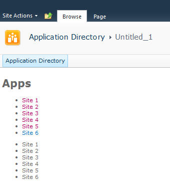
Now we’ll do some simple styling by floating the list of sites down the left hand side and the second list on the right and applying a little styling to the text.
Here’s the updated output:
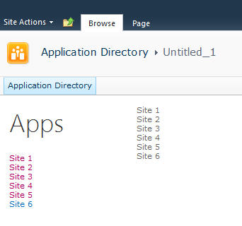
Now it’s starting to look like our target. Let’s style the menu list with a larger font. We’ll also just make one line of code change in our markup in the onSuccess method. Find the line that says menuNavContent += ‘<ul>’ and change it to read menuNavContent += ‘<ul class=”apps”>’. This will style just the unordered list of items on the left.
Here are the new styles to add to the CSS
Now that we have the list done lets focus on the second list which will form our tiles. They’re not as live and vibrant as they could be but they do show some metadata from the site so are at least a little more informative than just navigation boxes.
First we’ll apply some styles to the list to make them into boxes and space them apart. It’s just CSS markup here to add and a couple of small changes in the construction of the HTML for the second list.
We’re just adding some new styles here. There’s a class called theme_blue set to the Metro blue (#1ba1e2) which we set as the background colour for each tile. In addition we set the entire tile to be clickable to the same url as the site. This lets the user click anywhere on the tile (or the list one the left) to launch the site rather than having to click on the title.
Here’s the updated output.
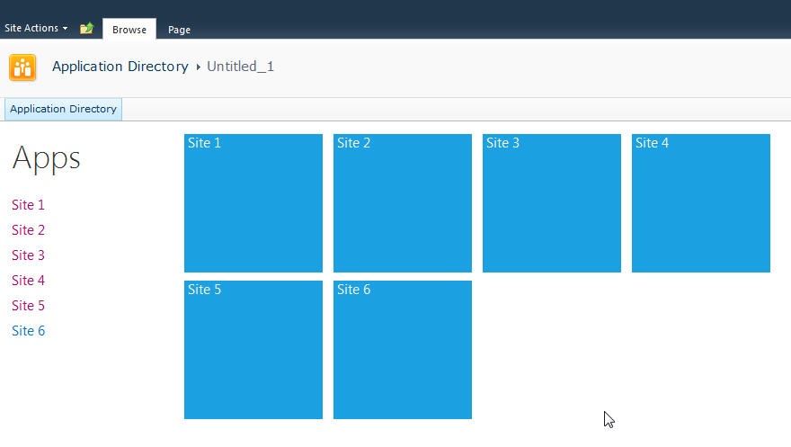
Now that we have our tiles we can add some dynamic metadata to them. This will be pulled from the website itself and give us a navigation system that’s more information than just links.
We wrap the title in a DIV tag with a class of tileTitle which lets us style it to place it at the bottom of the tile and give it a larger font. You do need to be careful of the length of the titles of your sites as this doesn’t work for all scenarios but just adjust it to fit your needs.
We also pull the last modified item date from the web properties. Every site tracks whatever the last item that was modified is and holds onto the date for that item. So now users can see when some content on the site was last changed.
Also we parse out the date from SharePoint into a JavaScript Date object and build a formatted date to display on the tile.
The final image:

That’s it! You now have a single script that you can just drop onto any site to create a Metro style navigation to the subsites. New sites can be added and will automatically show up and users can see when the content on the site was last modified and be able to click on the site to visit it.
Here’s the full source code for the page for you play with.
Remember, this is just a start. There are some fun things you can do with this. For example create custom styles for different colours (for example blue for team sites, red for wikis, etc.) and style them accordingly. Other ideas are to pull other data from the site like description, etc. and put that on a bigger tile. Enumerate the number of subsites in a site and display that. There are other properties you can access off the Web object like if RSS is enabled, etc. so you might want to display different icons on the tile to reflect that. The list of properties on the SP.Web class can be found here.
If you’re following the “Metro” style then remember to keep the UI light and simple. Content over chrome. You don’t want to be dumping all kinds of information here, just enough that your users need to make it useful.
Enjoy!
InstaCam MetroMakeover - Spacing, Margins, and Polish for your Windows Phone App
In the spirit of a recent article that Jeff Wilcox posted on his blog about the MetroRadio app, I thought I would do something similar for the InstaCam app.
InstaCam is a 3rd party app written by Dmitry Manayev to bring Instagram functionality to the Windows Phone platform. I contacted Dmitry about this post to get his permission. Here are a few tweaks that you can keep an eye out for in your own apps.
First up is the Popular Page. This has small square images of the most popular pictures currently posted on Instagram. The page is built on the Panorama control so the title is the default. It’s the pictures that are off a bit here. If they were indented 14 (or maybe 15) pixels then the edge of the pictures would line up with the pano title. Part of Metro is about lining things up and keeping it clean. You should see an invisible line down the left side of your pages that align things up. I saw the same margin issue on the search results page.

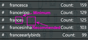
Next up is the search results page. I found the spacing to be a little tight so after measuring it I found that the spacing was in line with the minimum recommended target size from Microsoft, 7mm (check the guidelines here for target sizes). In the recommendations they suggest a target size of 9mm rather than the minimum of 7mm. The idea with Metro is to open up the design and make liberal use of white space. Don’t crowd things together if you can avoid it. There's plenty of space so hitting the target of 9mm (with perhaps a larger font) might open up the page a little more.
On the feed page there are a few little tweaks I would look at. First is the title for the app. The unwritten rule is that a page title should be in all CAPS. Hey, it’s a style. Check out (most) of the core apps and you’ll see the style applied there. Next is spacing. Jeff Wilcox mentioned there’s no hard and fast rule with vertical spacing (I really wish there was so we could all follow it, hint, hint) but he does say he tends to use 4, 6, 12, or 24 pixels. The default vertical on some of the initially generated XAML you get from Microsoft pegs some vertical space at 17 pixels so the message here can be confusing. For the title spacing I thought a 14px top margin would work here (but 12 would be fine too).
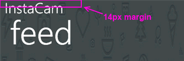
The thing about spacing is be consistent! I don’t think it matters if it’s 12, 17, or 24 but keep it the same on every page. That should be your mantra. Consistency. With vertical spacing (and especially page titles) watch out for the top margin where the system indicators are. If you leave them turned on, you lose 22 pixels. If you turn them off you get that back but remember to turn them on or off across your entire app (or compensate for pages where you have it turned on). For example Panorama pages have the system tray turned off by default so if your app goes from a Pano to a single page (or a pivot) then you might notice a slight “jump” with the title as it moves from a page without the system tray to one with.
Down in the details for a single picture it shows the user who took it, some information about them, and the likes and comments for that photo.
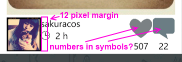
The name and when the picture was taken is a little crowded here and butts up against the profile picture. The suggestion here is to apply a 12 pixel margin to the left of the name (or the right of the picture) to open things up. In addition I would personally put the like and comment counts inside of the symbols (using white to offset the colour). That’s just a personal preference but it might make it a little tighter and gives you more space to be able to use larger symbols. There is a gotcha here of course with numbers inside of symbols. Some images will have 0 comments, other will have 10,000. I have seen a situation where the font scaled based on the width of the number so that might be an option. For sure when testing something like this you should consider ranges like this and try out the extremes. You might not be able to catch every scenario but don't just design for say 4 digits when the possibility of 8 exists for example.
When you view a single image I noticed a few things that a slight adjustment would fix. Again, a lot of these changes here are just minor tweaks to the UI, nothing major. I think this is the case for a lot of applications out there. A couple of hours going over things and moving a few items around goes a long way.
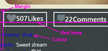
Here again the margin issue rears it’s ugly head. The margin for the Like button is fine (and bleeding the picture itself to the edge of the phone is a nice touch, lets you see more of the image). It’s the tags and detail labels. The colour doesn’t work against a dark background. Whenever you’re looking to highlight something consider using the PhoneAccentBrush colour (but use it sparingly). Dmitry did mention in the latest update that he fixed the colour to the blue phone accent colour. I took these sceenshots from the marketplace so maybe that hasn't been updated. On my phone the text does look better than here but again, watch out for themes when deciding on using accent colours, especially with fixed colour or image backgrounds.
As for the buttons, they’re a little off so as your eye moves horizontally across you see text jump up or down. It’s only a few pixels but a design technique mentioned by Arturo Toledo, a Senior User Experience Designer at Microsoft. On his UX blog he recently talked about the design process for Metro apps. In it he talks about Redlines, marked up screenshots of your app with lines drawn across and up to show alignment and spacing. This is something everyone should incorporate into their release process. Yes, my lines are magenta but that was just for clarity. Red, yellow, magenta, whatever works for you.
For the buttons themselves I would consider doing something with the extra space. Split the buttons (either using a Grid or a StackPanel with the Orientation set to Horizonal) so they’re evenly distributed (Width = 0.5* in the case of a grid). Then regardless of how much the content takes up, they’re consistent and not as jarring to the eyes. Again here I might consider putting the counts inside the symbols (to be consistent with the other views if you did that) but leave the words “Likes” and “Comments” so people know what it refers to. Here the words work because you’ve got the entire width of the phone to display them (vs. the previous image where there’s only room for the symbol).
Finally the user profile page. I would suggest a few small changes here just like the other pages.
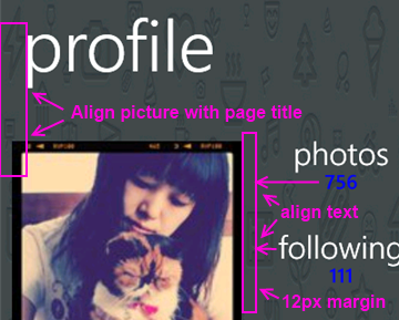
For this page:
- Align the profile picture with the page title
- Align the counts and count labels (photos, following, etc.) on the left. This tends to be the norm rather than centered text which sometimes looks like its floating without an anchor. Again refer to the core apps for some guidance here, for example take a look at a persons profile page (your own or someone else). They’re a good model to follow.
- The colours here are awkward again and hard to read. If you use the PhoneAccentBrush colour then pay attention to how the light and dark themes work against your backgrounds. Sometimes when using background images you need to adjust the Opacity dynamically. When testing, just go through all of the Theme colours in both light and dark mode. It takes an hour or so with a few screens and all of the combos but you’ll cover all the bases.
That’s it. Hopefully that helps you in your own application development and gives you a few little things to look out for. They’re all minor tweaks but things that you can add to a final checklist of things to go over before you submit your app to the marketplace. Thanks for Dmitry for letting me write this post and perhaps he’ll put some of these suggesting in a future release.
Calgary! SharePoint! Workflows! Pigs! Action!
Join me and a cast of thousands as we do an interpretive dance version of Lord of the Flies.

Oh yeah, and Jason Kaczor will also be presenting on custom workflow actions and SharePoint.
From the marketing blurbage:
This presentation is about Custom actions which are .NET components. I will also be presenting some best practice framework code as well for trace logging/etc. I will also talk about Event Receivers – they tie closely to the concept of “something executing based on something else changing” like workflows, but are occasionally the better choice to use.
Registration is preferred for this event. Those that register will be given an extra cookie. Please register at either EventBrite or Microsoft ClickToAttend.
Does the world really need "official" apps?
The "buzz" exploded a few days ago with this site. "Official" application requests for Windows Phone 7, vendors and services that don't have a presence (an official one anyway) on the Microsoft phone platform. I have to ask though, do we really need an "official" app?
Okay, let's take a few steps back before we go forward. What exactly is an "official" app. I would say it's a) an app written by the service owner (Instagram, Pinterest, Twitter, etc.) or maybe b) an app officially endorsed by the service owner. In any case it's considered sanctioned, blessed, whatever. Foursquare, Flickr, Groupon, Twitter, YouTube, etc. all have apps like this. In the case of apps like YouTube and Twitter you'll see the application publisher is Microsoft. These guys might have deferred the creation of the apps to Microsoft or the publishing or both.
People see these apps as *the* app they should get if they want to use that service on their phone. Apps turn into verbs and users are told to use Evernote to use their service on their phone. With the moniker of being an official app I suppose it carries a bit of levity as far as stability and reliability.
Or does it?
In the case of longevity it might be the case. As long as ESPN is on the air, they'll have an ESPN ScoreCenter app. Or will they? Budgets come and go so if I was a manager and looked at "trimming the fat" I might consider lopping off the mobile developers and abandoning that early. After all, how much revenue does a free app on a phone get you? I do think once the genie is out of the bottle that organizations will at least try to keep that division running and we haven't seen too many apps fall by the wayside. So yeah, it's probably a safe bet that "official" apps will stay around as long as the service is there.
On the reliability side it's a different story. What's the number #1 request on the user voice site right now? Facebook. Wait, that has an "official" app doesn't it? It was built by Clarity Consulting but looking at the comments on the uservoice site and on the marketplace you see things like "They need to fix this", "Add some new features", and "Need a lot of work!!". The Twitter app, IMHO, is another fine example of an "official" app generally gone wrong. No live tiles, it's been out for 16 months and it's only on version 1.3 and last time I used it I couldn't even do a "reply all" on a tweet. Frustrating.
Official apps may be no better than 3rd party ones out there so don't be fooled by the "official" title. Indie apps are built by developers with a passion, official apps might in some cases be considered an IT expense.
The first thing you have to look at, does the vendor or service have an app? On any platform. If they don't then the next question (besides should they) might be, is there a way to get one on there? Are there any data sources available. Obviously if they have a web presence then they have data but it may not be publicly consumable. If they do have an app, is it good enough. What are the reviews like? Is it meeting the needs of the many and providing a way to access their services to do everything. Is that the purpose of the app? Sometimes apps are supplements to the on-site services they have available and not a substitute. Aside from services, does the app work correctly, doesn't crash, is quick to respond, is updated frequently to align to new features the service offers, etc.
If they do have an API is it a) publicly consumable and b) is it full featured? One stumbling block I hit with producing an Instagram app for Windows Phone was that they didn't provide a way for users to register new accounts or upload photographs, a cornerstone to the service itself. This can be frustrating so before you embark on perhaps building something check to see if you can do it.
So what's the value-add for you building an application, either as the only application on that platform or a supplement to a broken or limited-functional "official" app? Are you making it better or filling in the gaps the official app is missing? What happens when the official app maybe catches up and delivers that functionality. Now you're playing a game with the official team and you might not win that battle. Something interesting with something like Foursquare is that the reviews are not too horrible (some good, some bad) but looking at the reviews and functionality of something like 4th & Mayor is that the official app came out long after Jeff Wilcox's version. Was it too little and too late? Jeff constantly updates the app not only for stabilization but new features. The reviews, UX, and stability of this "unofficial" app outweighs the popularity of the "official" one, although I think this an exception to the rule. Again, this is a good example of a labor of love vs. an IT project.
I think it's great we have the official apps on the Windows Phone but I think it's even better that we have public APIs, a nice development platform, and a passionate community that wants to do better. If all we do is accept the official apps then we're not pushing the envelope. Sometimes that's just not good enough and we as a community deserve better. Support it by showing your voice on sites like the Marketplace Request site, by blogging about it, and by pushing services to provide the ability for developers to step in and help out.
As for vendors and service owners, please do us a favor by exposing your APIs and letting developers do what they do best, develop. Focus on your service if you want and put it out there for others to pick up the ball and run with it. Keep on top of what's out there, help us by helping you, and you might be surprised in what we might be able to accomplish. It's like I tell game studios, focus on building your game. The development community will stand up and provide the supplemental tools that will build the community for you, you just have to give us the tools to do what we're passionate about.

