Metro Style Site Directory for SharePoint Using EMCAScript
I’ve always been trying to come up with a useful and clever way to allow users to navigate around SharePoint sites. Recently I put together an “Application Directory” which basically displayed a menu system to navigate around apps. Using the JavaScript Class Library for SharePoint to pull values out of SharePoint I quickly put together something that normally would be a lot of C# code and a web part.
The EMCAScript object model is powerful in that you can quickly pull data out of SharePoint sites and lists and make a pleasant user experience with just a little JavaScript, CSS, HTML, and jQuery. It still will make a call back to the server to fetch the data but it’s done asynchronously so the perception to the user is almost seamless.
This post walks you through building a site directory of sorts. It could be used as a landing page on a top level site collection or as a web part sitting on a team site (to show the contents below the site). It’s up to you but the net result is a nice navigation system (done with a little “Metro” styling) all done in a hundred lines of JavaScript.
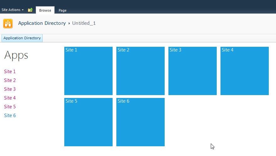
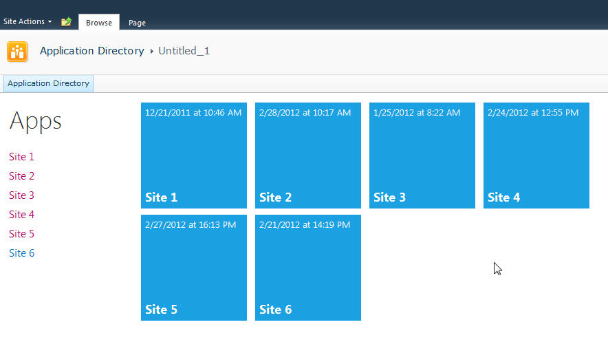
Here’s what we’re building:
Let’s start with the simplest thing possible. A script that we’ll insert into the page using the Content Editor Web Part via a Content Link. This is my preferred way of doing lightweight adds to SharePoint (like JavaScript or even just raw HTML). The Content Link points to a file in my SiteAssets library in the site and since it’s a link it just gobbles up the content and serves it up. If you try adding HTML to a Content Editor Web Part you’ll find a nice message after saving “Your HTML may have been modified”.
WTF?
Yeah, SharePoint deliciously will go in after you save your nicely formatted content and do some neat things like rename your CSS entities. Oh yeah, it’ll also strip away your JavaScript if it doesn’t like it.
Trust me. Just include the file and you’ll be much better off in the end. Having the file located in the SiteAssets library also lets me just crack it open in SharePoint Designer and while the editor isn’t the greatest, it does give you some Intellisense but the real advantage is saving it in SPD then hitting refresh on your page to see the effect. The file will contain the CSS, JavaScript, and HTML markup. I like putting everything together so I don’t have to worry about files all over my system but you can just as easily use multiple files if you want.
Alright, back to business. Create a new file in your SiteAssets library (you get a SiteAssets library when you create a new site regardless of what template you use or what feature you activate, it’s always there and accessible through SharePoint Designer).
Name the file SiteDirectory.js or something. Doesn’t really matter and you can call it ISavedTheWorldUsingPork.HowAboutThat if you want, but leaving it with a .js extension will give you some semblance of Intellisense inside of SPD.
Drop a Content Editor Web Part on the home page of your site (or wherever you want to put this). This could be a Wiki Page (the Home.aspx page is a wiki page if you activate the Wiki Home Page Feature on a site) or a Web Part Page. There are a few small tweaks you should do depending on what type of page you put this on but just adjust the CSS we’ll be building as you see fit.
Starting simple we're going to just enumerate the child sites and display them in an unordered list. The list is easy to style and works well with jQuery later to be able to animate or attach plugins to.
Here’s the initial code that we’ll put into the SiteDirectory.js file:
Like I said, all this is doing is a) enumerating through the list of subsites then b) spitting them out into an unordered list. Here’s a breakdown of how this works:
Line 1-2: We’ll include some CSS styles here later
Line 4: We include jQuery so we can a) make it easy to replace elements on the page and b) support plugins later. You can choose to use pure JavaScript or omit this if your site already includes jQuery.
Line 8: We declare a variable we’re going to use to hold the list of sites
Line 10: We wait until the core JavaScript files are loaded by SharePoint. This ensures the ClientContext is setup for us when we need it.
Line 12-23: This is the function that calls the Client Object Model to get our web then get the subwebs for the current user. Finally on lines 19-21 we execute the call (which is where we talk to the server) and define the success and failed methods.
Line 25-46: We define the success function to call with our list of subwebs. Here we’re getting an enumerator to the web collection and iterating through them, grabbing the url and title of the site then creating our unordered list using regular HTML markup. Finally on line 45 we find the DIV tag we’re replacing and substitute the HTML we just created.
Line 55-57: This is the HTML markup we’re going to replace in our JavaScript. We initially set the text to “Loading…” so users will see this when the page loads then *magically* it’ll get replaced with our content.
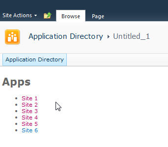
Here’s the result:
Looks good and lets us know we’re on the right track. If there are any failures you’ll see them here because our failed function will get called and output the error message. This could be anything from a JavaScript error to not calling a known method. Also note that this is already security trimmed since we’re using the getSubwebsForCurrentUser method so we’ll only see sites the user has access to.
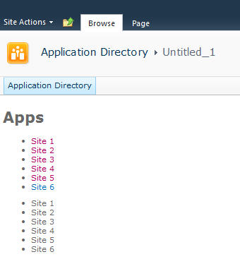
Let’s add another list and DIV tag so we have two lists to use:
Not much to explain here, just added a new DIV tag and built up the HTML just like the original. Now we have two unordered lists. We also wrapped up each list in its own DIV tag.
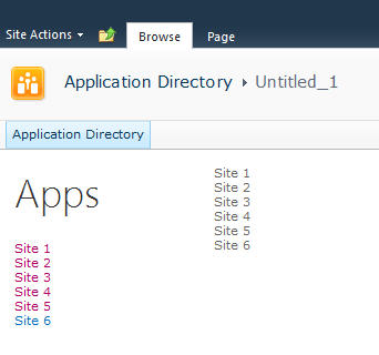
Now we’ll do some simple styling by floating the list of sites down the left hand side and the second list on the right and applying a little styling to the text.
Here’s the updated output:
Now it’s starting to look like our target. Let’s style the menu list with a larger font. We’ll also just make one line of code change in our markup in the onSuccess method. Find the line that says menuNavContent += ‘<ul>’ and change it to read menuNavContent += ‘<ul class=”apps”>’. This will style just the unordered list of items on the left.
Here are the new styles to add to the CSS
Now that we have the list done lets focus on the second list which will form our tiles. They’re not as live and vibrant as they could be but they do show some metadata from the site so are at least a little more informative than just navigation boxes.
First we’ll apply some styles to the list to make them into boxes and space them apart. It’s just CSS markup here to add and a couple of small changes in the construction of the HTML for the second list.
We’re just adding some new styles here. There’s a class called theme_blue set to the Metro blue (#1ba1e2) which we set as the background colour for each tile. In addition we set the entire tile to be clickable to the same url as the site. This lets the user click anywhere on the tile (or the list one the left) to launch the site rather than having to click on the title.
Here’s the updated output.
Now that we have our tiles we can add some dynamic metadata to them. This will be pulled from the website itself and give us a navigation system that’s more information than just links.
We wrap the title in a DIV tag with a class of tileTitle which lets us style it to place it at the bottom of the tile and give it a larger font. You do need to be careful of the length of the titles of your sites as this doesn’t work for all scenarios but just adjust it to fit your needs.
We also pull the last modified item date from the web properties. Every site tracks whatever the last item that was modified is and holds onto the date for that item. So now users can see when some content on the site was last changed.
Also we parse out the date from SharePoint into a JavaScript Date object and build a formatted date to display on the tile.
The final image:
That’s it! You now have a single script that you can just drop onto any site to create a Metro style navigation to the subsites. New sites can be added and will automatically show up and users can see when the content on the site was last modified and be able to click on the site to visit it.
Here’s the full source code for the page for you play with.
Remember, this is just a start. There are some fun things you can do with this. For example create custom styles for different colours (for example blue for team sites, red for wikis, etc.) and style them accordingly. Other ideas are to pull other data from the site like description, etc. and put that on a bigger tile. Enumerate the number of subsites in a site and display that. There are other properties you can access off the Web object like if RSS is enabled, etc. so you might want to display different icons on the tile to reflect that. The list of properties on the SP.Web class can be found here.
If you’re following the “Metro” style then remember to keep the UI light and simple. Content over chrome. You don’t want to be dumping all kinds of information here, just enough that your users need to make it useful.
Enjoy!
10 Comments
Comments have been disabled for this content.
