Archives
-
No-code SharePoint Menus
A few years ago I wrote up an article about creating custom SharePoint-style menu for your own Web Parts. Today on the call with the SharePoint Experts (a fun time!) someone had created a series of Data View Web Parts and wanted some way to navigate between them.
I suggested to build a custom menu, similar to the Views pull down you get in the stock List View page. You know the one I'm talking about?
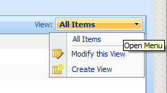
So here's the snippet to do this. It's actually based on some old stuff I did in the 2003 version, but works perfectly fine in the 2007 verison. Just modify the <menu> section with your own entries. I've added the stock list from a typical list view to get you started.
1: <table>
2: <tr>
3: <td class="ms-listheaderlabel">View:</td>
4: <td class="ms-viewselector">
5:6: <div class="ms-HoverCellInActive"
7: onmouseover="this.className='ms-HoverCellActive'
8: onmouseout="ths.className='ms-HoverCellInActive'>
9:10: <a id="MSO_MyMenuLink" title="All Documents" style="CURSOR:hand"
11: onclick="MSOWebPartPage_OpenMenu(MSO_MyMenu, this);" tabindex="0">
12: All Documents13: <img alt="All Documents" src="/_layouts/images/menudark.gif" align="absBottom">
14: </a>
15:16: <div>
17:18: </td>
19: </tr>
20: </table>
21:22: <menu id="MSO_MyMenu" class="ms-SrvMenuUI">
23:24: <ie:menuitem id="MSO_MyMenu_Link1" title="All Documents"
25: onMenuClick="javascript:window.location.href='AllItems.aspx';">
26: All Documents27: </ie:menuitem>
28:29: <ie:menuitem id="MSO_MyMenu_Link2" title="Explorer View"
30: onMenuClick="javascript:window.location.href='WebFldr.aspx';">
31: Explorer View32: </ie:menuitem>
33:34: <ie:menuitem id="MSO_MyMenu_Link1" title="Modify this View"
35: iconSrc="/_layouts/images/edititem.gif"
36: onMenuClick="javascript:window.location.href='ViewEdit.aspx';">
37: Modify this View38: </ie:menuitem>
39:40: <ie:menuitem id="MSO_MyMenu_Link1" title="Create View"
41: iconSrc="/_layouts/images/newitem.gif"
42: onMenuClick="javascript:window.location.href='ViewType.aspx';">
43: Create View44: </ie:menuitem>
45:46: </menu>
And here's what it looks like:
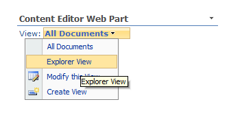
Like I said, just modify all the <ie:menuitem> elements with your own text, replacing the onMenuClick locations with whatever you want. Then drop this snippet into a CEWP, slap it on a Web Part Page, add your Data View Web Part, lather, rinse, repeat for each page.
You can also use this just about anywhere you want to provide SharePoint looking navigation to your users.
-
Spreading some SharePoint Love to EditorPart
EditorPart. Such a lonely guy in SharePoint land. Back in the 2003 era (remember that?) we had this thing called ToolParts. You would create a class to handle your custom property editors and then hook it back up into your Web Part. Well, times are a changing and in 2007 land we use these things called EditorParts now.
By default when you add a property and expose it for editing by the user, a set of default EditorParts built into SharePoint kick in. These will handle basic types (text, boolean, enums). Here are the properties in code:
1: [Personalizable(PersonalizationScope.Shared)]2: [WebBrowsable(true)]
3: public string MyProperty { get; set; }
4:5: [Personalizable(PersonalizationScope.Shared)]6: [WebBrowsable(true)]
7: public bool MyOtherProperty { get; set; }
and you get something like this in SharePoint for editing properties:
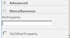
You can name the group (default is "Miscellaneous") and all is well in the world. However what if you want to use a Color Picker? Or a Rich Text Editor? Or something even more customized than that? That's where the EditorPart comes in.
Briefly you add the IWebEditable[link] interface to your WebPart[link], implement the CreateEditorParts method and WebBrowsableObject property and then create a class to do your property editing for you. This new class will inherit from EditorPart and basically handle a) creating all the controls for editing propert(ies) and sync the data back to your Web Part.
No big deal right? Here's the CreateChildControls for our custom EditorPart:
1: protected override void CreateChildControls()
2: {3: Controls.Add(new Label { Text = "MyProperty"});
4: Controls.Add(new TextBox());
5: Controls.Add(new CheckBox());
6: Controls.Add(new Label { Text = "MyOtherProperty" });
7: }and the resulting UI is something like this (I've added a couple of breaks):
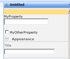
Functional yes, but the form is somewhat lacking. The labels are not the right colours and there's no dotted separator between items. It's not bad but still not the *seamless* effect we might want and frankly, trying to match SharePoint styles is like trying to birth a baby without a uterus (sorry, I'm just all out of good analogies today).
I thought it would be nice to put together some simple controls that mimicked the SharePoint 2007 UI a little closer. This was for a bigger project (which the blog is in the works for shortly) but it's a fairly simple process to format your controls so you can have something like this instead:
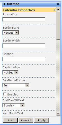
Here's how you do it. First add the IWebEditable interface to your Web Part. Now you can override/implement the one method and property to get this:
1: #region IWebEditable Members
2:3: EditorPartCollection IWebEditable.CreateEditorParts()4: {5: var editors = new List<EditorPart>
6: {7: new SPCalendarExWebPartEditorPart(ID)
8: };9: return new EditorPartCollection(editors);
10: }11:12: object IWebEditable.WebBrowsableObject
13: {14: get { return this; }
15: }16:17: #endregion
The naming isn't really hot so come up with something more appropriate. In this case we've got an EditorPart that's going to allow us to set properties on a Calendar (this is for the second post that has yet to come). The WebBrowsableObject just returns the currrent Web Part so nothing special there.
The EditorPart requires and ID to work so we pass it in from the parent into the constructor and give it a prefix. This allows you to have multiple instances of your Web Part on the same page. We also set the Title property which will appear in the Editor Pane.
1: public SPCalendarExWebPartEditorPart(string id)
2: {3: ID = "SPCalendarExWebPartEditorPart" + id;
4: Title = "Calendar Properties";
5: }Finally we override the EditorPart's CreateChildControls method. Here's where the fun begins. The method starts off with a table but then a series of new controls are added:
1: protected override void CreateChildControls()
2: {3: Controls.Add(new LiteralControl("<TABLE border=\"0\" cellSpacing=\"0\" width=\"100%\">"));
4:5: Controls.Add(new LiteralControl("<TBODY>"));
6:7: Controls.Add(new SPTextBoxEditorPartControl("AccessKey", "Keyboard shortcut used by the control."));
8: Controls.Add(new SPDropDownListEditorPartControl("BorderStyle", "Style of the border around the control.", typeof(BorderStyle)));
9: Controls.Add(new SPCheckBoxEditorPartControl("Enabled", "Enabled state of the control."));
10:11: Controls.Add(new LiteralControl("</TBODY>"));
12:13: Controls.Add(new LiteralControl("</TABLE>"));
14: }What the heck is a SPTextBoxEditorPartControl you ask?
It's a custom control that I created to encapsulate the look and feel and bits and pieces that SharePoint uses to display it's own controls in the same style. I hunted around to see if there was a way to do this through the API and just leveage what SharePoint gives you but it's a typical story. The code in there is overly complicated and there are so many dependencies it's hard to tell what to call to get the same look and feel or effect. (if anyone has figured this out and thus making all this junk redundant I would love to hear it!).
In any case here's the text box control wrapped up in a table row and surrounded with a few DIV tags from the UserXXX classess you can find in core.css. This matches the HTML output that the SharePoint default EditorPart controls emit (or at least come pretty close) so you can get a seamless UI.
1: public class SPTextBoxEditorPartControl : Control, INamingContainer
2: {3: public string Label { get; set; }
4: public string ToolTip { get; set; }
5:6: public SPTextBoxEditorPartControl(string label, string toolTip)
7: {8: Label = label;9: ToolTip = toolTip;10: }11:12: protected override void CreateChildControls()
13: {14: Controls.Add(new LiteralControl("<TR>"));
15: Controls.Add(new LiteralControl("<TD>"));
16: Controls.Add(new LiteralControl("<DIV class=\"UserSectionHead\">"));
17: Controls.Add(new Label { Text = Label, ToolTip = ToolTip });
18: Controls.Add(new LiteralControl("</DIV>"));
19:20: Controls.Add(new LiteralControl("<DIV class=\"UserSectionBody\">"));
21: Controls.Add(new LiteralControl("<DIV class=\"UserControlGroup\">"));
22: Controls.Add(new LiteralControl("<NOBR>"));
23: Controls.Add(new TextBox { CssClass = "UserInput", Width = 176 });
24: Controls.Add(new LiteralControl("</NOBR>"));
25: Controls.Add(new LiteralControl("</DIV>"));
26: Controls.Add(new LiteralControl("</DIV>"));
27:28: Controls.Add(new LiteralControl("<DIV class=\"UserDottedLine\" width=\"100%\"/>"));
29: Controls.Add(new LiteralControl("</TD>"));
30: Controls.Add(new LiteralControl("</TR>"));
31: }32: }I've wrapped these up into a simple control that takes in what it needs via the constructor. It's a couple dozen lines of code, but something you can put away for a rainy day and makes it quick to just grab when you want to blend in with the SharePoint look and feel. As for branding, since everything is using SharePoint styles, just modify those and everything will (should) [might?] fall into place.
There are a couple of other control wrappers here, one for a CheckBox and one for a DropDownList. All of these follow the same pattern as the TextBox (inherit from Control and INamingContainer, override CreateChildControls with SharePoint-y look and feel magic).
The CheckBox is pretty much the same as the TextBox. The DropDownList is kind of fun as you pass in the enumerated type you want to pick from and it adds the items to the control. For example, here's the call to create a dropdown control for the DayNameFormat of a Calendar control:
1: Controls.Add(new SPDropDownListEditorPartControl("DayNameFormat", "Format for day header text.", typeof(DayNameFormat)));
Here's the drop down wrapper (Choices is an autopropty and set from the third parameter in the constructor):
1: public SPDropDownListEditorPartControl(string label, string toolTip, Type choices)
2: {3: Label = label;4: ToolTip = toolTip;5: Choices = choices;6: }7:8: protected override void CreateChildControls()
9: {10: Controls.Add(new LiteralControl("<TR>"));
11: Controls.Add(new LiteralControl("<TD>"));
12: Controls.Add(new LiteralControl("<DIV class=\"UserSectionHead\">"));
13: Controls.Add(new Label { Text = Label, ToolTip = ToolTip });
14: Controls.Add(new LiteralControl("</DIV>"));
15:16: Controls.Add(new LiteralControl("<DIV class=\"UserSectionBody\">"));
17: Controls.Add(new LiteralControl("<DIV class=\"UserControlGroup\">"));
18: Controls.Add(new LiteralControl("<NOBR>"));
19:20: var list = new DropDownList();
21: foreach (var choice in Enum.GetNames(Choices))
22: {23: list.Items.Add(choice);24: }25: Controls.Add(list);26:27: Controls.Add(new LiteralControl("</NOBR>"));
28: Controls.Add(new LiteralControl("</DIV>"));
29: Controls.Add(new LiteralControl("</DIV>"));
30:31: Controls.Add(new LiteralControl("<DIV class=\"UserDottedLine\" width=\"100%\"/>"));
32: Controls.Add(new LiteralControl("</TD>"));
33: Controls.Add(new LiteralControl("</TR>"));
34: }And the result that provides a dropdown of all the values of the enum provided:
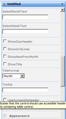
Features of this code over the OOTB properties? It's fairly simple to use (just add the controls, specifying the name, tooltip, etc. in the constructor). Seamless look and feel integration with the regular SharePoint properties. Tooltips for labels. This is just a sampling but any control could be used here for more sophisticated property editing.
That's it. I'll post the full source along with something special coming later that utilizes this, but there's enough here to get you going should you want to roll your own. Feel free to leave comments, suggestions, and "What the hell are you doing Bil?" notes with me.
Here's a bunch of great links on writing your own custom EditorParts:
-
Speaking at TechDays 2009, Me

TechDays, the all-Canadian all-knowing all-seeing Microsoft conference is kicking off in a couple of weeks in Vancouver. To the disappointment of the street walkers of Gastown, I won’t be there. I will however be in Calgary in November. Here are the two talks I’m giving:
Developing and Consuming Services for SharePoint
The world gets more service-oriented every day, and with that comes the demand to integrate all kinds of services, including those from SharePoint. This session introduces SharePoint as a developer platform and provides an overview of how you can build and deploy custom services with it. The focus will be on developing ASP.NET and Windows Communication Foundation services for SharePoint as well as building a Silverlight client to consume them.
Versioning and Upgrade of SharePoint-based Solutions
Now that you've deployed your first SharePoint application, you will probably get a long list of enhancement requests and maybe some bugs to fix. However it is not at all obvious how to update various site elements. For example, adding a field to a content type, requires a completely different process than updating Web Part pages. In this you will learn how to update these and other elements including workflows, Web Parts, and list item event handlers based upon best practices . Thorny problems abound when it comes to making a change. Learn what strategies to apply and what behaviours to expect for different types of artifacts in SharePoint. In this session you'll see what the Patterns & Practices team put into their guidance for SharePoint-- and why.
TechDays is a great conference for us Canadians. It’s two days of fun-filled talks on all sorts of Microsoft Evil Doings. Make sure you get the early bird special as it’s $299 (that’s *Canadian* dollarinos, none of the this American crap) for a limited time (then you get to pay through the nose and shell out $599, and really, is it worth listening to me speak for that amount of money?).
Have you got a TechDays badger yet? If not, drop by here to see them then slap that cap, err… badger onto your website somewhere inconspicuous (like right at the top over your blog logo). If you’re looking for the individual badger rather than the full logo sheet, then go here (I was confused at first until I actually read the page). I went for the hanging badger just because the maple leaf seemed *too* Canadian and the stickman, well, let me tell you about stickmen!

If I had some time tonight, I would make my very own customized Justice Gray stickman badger, but alas I have work to do. I’m sure D’Arcy or someone will come up with something creative.
Should be a blast so hopefully you’ll drop by and see how much Sesame Street content a guy can stuff into two presentations on SharePoint.
This blog post was brought you by the letters “S”, “P”, and the number “2010” which won’t be making an appearance at TechDays 2009 but we still like Microsoft anyways.
P.S. The website lists 200+ level sessions. I’ve lost track of what level I try to present at so let’s just kick this puppy up a bit and crank the SharePoint sessions up to 1100, k?