Contents tagged with Windows 8
-
Windows 8 and the Lethbridge Technology User Group
Join me and 83,517 screaming nerds (everyone in the city is attending and a geek right?) on Thursday February 21st from 3-5pm to talk about building Metro style apps for WIndows 8. Here's what we'll be covering.
Windows 8 Platform for Metro Style Apps
Windows 8 is Windows re-imagined. Join this session to learn about the new platform for building Metro style apps. Get an understanding of the platform design tenets, the programming language choices and the integration points with the operating system and across Metro style apps
Everything Web Developers Must know to build Metro Style Apps
Learn how you can use your web skills to build Windows 8 Metro style apps using HTML5, CSS3 and JavaScript. In this session you’ll discover how to harness the rich capabilities of Windows 8 through JavaScript and the Windows Runtime. You will learn about navigation, user experience patterns and controls, inherent async design and the seamless integration with the operating system that will let you create great Metro style apps.
I promise fun times, chaos monkeys, and live kitten juggling as per my usual presentations.
-
Microsoft's Next Move, Split Metro and Classic Mode in Windows 8?
Caveat lector. This is an opinion piece and not something I do often (or probably well) but my thoughts on this were a little more than 140 characters could handle. You have been warned.
Recently Netflix CEO Reed Hastings stood up and, doing his best impression of a half-pregnant Jeff Bezos, announced the physical division of it's DVD lending system and streaming services. This resulted in Internet carnage that continues to this day. The general feeling there is that the separation is going to cause pain and suffering with long time users who now look at it as having to search two separate and distinct places to find the same stuff, get two different bills, two different user experiences, etc. Visionary perhaps, but not fully baked.
Many who went to the recent Build conference (and others like myself who didn't) got their taste of Microsoft's Jekyll and Hyde next operating system, Windows 8. The "alive with activity" (sans spiders and snakes) view of the living tile Metro user interface is almost revolutionary in style, approach, and implementation.
The Metro UX is a new experience (some say a new way of life) in Windows 8 and is all about building an immersive user experience that’s unlike anything we’ve seen for a long time (a pre-cursor was the Metro makeover they gave Windows Phone 7 last year). Users get information from living tiles rather than static icons on a free-flowing desktop devoid of a clumsy arrangement and optimized for fingers, not mice.
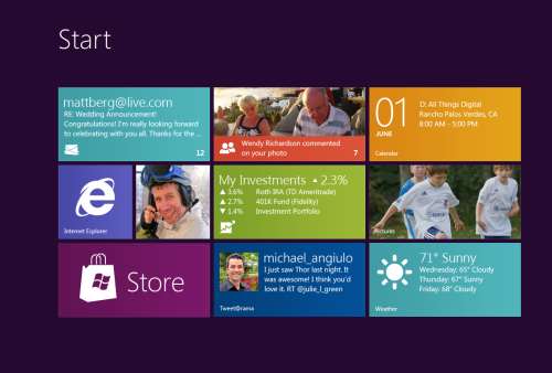
Now that the dust has settled, the question that seems to be bubbling up to the surface for me (and some others), is Microsoft making a mistake? Combining the "optimized for touch" interface with the antiquated keyboard and mouse apps looks like it might be. Maybe Microsoft should be following in Apples footsteps and creating an optimized for touch operating system and a classic one.
Don't get me wrong. I'm not actually saying they should ditch what they have but it could potentially be tweaked. The classic interface could be completely removed from the Metro one and vice versa. This I see is a move that might be welcomed by developers and users alike.
The Development Story
Right now the developer story is just shaping up but already it’s causing confusion. Some developers are still asking the question about the Windows Runtime (WinRT). Why can’t we build Metro apps on Windows 7? Why is the WinRT a different API than the classic CLR. The bits are different. The runtime is different. The security is different. Heck, in Windows 8 you can write “desktop” apps using HTML5 and JavaScript for goodness sake. That in itself just says we’re not in Kansas anymore Toto.
It makes sense, if you think about it. Metro WinRT apps have a distinctive style to them and have restrictions you don’t have in the classic development world. Metro apps can’t even access the underlying file system (sans some Isolated storage which is not meant for large amounts of data). The UX is completely different from the classic desktop we’re familiar with and requires you to “re-imagine” your apps. There is no cross-platform compilation here. This isn’t “build a UI for Metro and build a UI for Classic mode”.
While you have to build two different applications anyways, what’s the difference if they’re on the same OS or not? It doesn’t mean you have to rewrite your entire system from scratch for each OS like you have to do today with Apple. A good developer is going to structure his system so the UI is separate and through the use of patterns like MVVM, changes to the back-end stuff, the important stuff, is minimized.
It does however require you to re-think your application, perhaps removing large chunks of the underlying system and changing the way it not only presents itself but what it presents. I’m not just talking about a UI makeover (which needs to happen) but the fact that your ViewModels today are not the same ones you need for Metro.
For example a Movie Catalog app might provide a ViewModel of titles in a single collection with a category attribute. The current UI might present this in a typical tree view, allowing the user to filter on single or multiple categories which then also lazy fetches the list of titles and presents it (through a child ViewModel) in a list view on the same screen. This two or three pane view of your data might be fine in a traditionally designed app but in Metro things might behave differently. Perhaps the categories are already broken down for you in a grouped collection and selecting one takes you to a view where no collection information is needed so only the movie titles and metadata are displayed. The information you show on the screen might be different for each style as well so ViewModels here cannot really be reused. Even the lazy fetching of the data on the back-end might be different in a Metro style app from a classic one.
In any case, the development story might be a little muddy right now and we’re still playing the Sesame Street “One Of These Things” games. Heading it off at the pass might be a good plan and let developers focus on the target platform that suits their purpose.
The User Story
Users are a whole new ball of wax with Metro and Windows 8. The causal user who’s going to use a touch device wants big targets and easy to use minimalistic apps. They’ll bounce around between weather, RSS feeds, Twitter and Facebook so the “flipping through apps like pages in a book” approach works well here. Nobody in the user community I hear is complaining about how you change between apps in Windows 8. Apps are designed for this. By their very nature, Metro apps are all about quick and concise information and not 800 buttons, 300 windows, 150 graphs, 50 tools, and a partridge in a pear tree in a single app here. The user experience for Metro is flipping through items while waiting for a bus or sitting in a meeting or lying on the couch. It’s casual, even for business users.
People are all impressed to Hell about the Metro look and feel. Look how easy it is to find things. Look how fun it is to share things. Look at how fast I can get to my data. This is not for business users who are going to stare at a 70 by 3000 spreadsheet for hours at a time. It’s for users on the go and a step up from having the same information on a 8 inch phone platform.
Business users need the classic look. As Jensen Harris pointed out in his excellent 8 Traits of Metro Apps presentation, apps like Photoshop just don’t fit into Metro. They don’t belong.
Identity
I see an identity crisis here in the making (or perhaps that ship has already sailed). Microsoft keeps touting the Metro look and says “And your classic apps are right here”. Then the user is subjected to a jarring shift from the beautiful typographic world of Metro to the classic desktop we have now, full of chrome and frames and toolbars oh my. It’s like watching the magnificent tranquility of Claude Monet’s “Water Lillies” and then be suddenly thrown into the world of Jackson Pollocks “Composition with Pouring I”.

The experience right now is jarring. Click on any “classic” app and Metro goes bye-bye and you’re back at traditional desktop. Then you look down, see the iconic Start button, click it, and BAM! You’re back in Metro land, wondering how to get back to the comfort zone. Users don’t know how to use shortcut keys. I struggle and watch people who have been “using” computers for years still not use Ctrl+C/Ctrl+V to copy and paste and if I asked 100 people at work right now if they knew they could lock their computers with a single keystroke (Windows + L) they would shake their heads in disbelief.
I know what you’re thinking right now. Two platforms. Two deployments. Two SKUs. Two nightmares. I don’t think so. It’s a choice. Do you really see people complaining they can’t run their iPad apps on their desktops? Yes, it’s more work but I think it’s the right work. While Microsoft continues to say that Metro works just as well with a mouse and keyboard than it does with touch, people continue to look at the “optimized for touch” interface and scratch their heads wondering what this experience is going to be like with a keyboard. It works but it’s not the best. How do you pinch zoom with a mouse? How do you dual scroll with a keyboard? Just because you can do something, doesn’t mean you should.
Your Move Microsoft
I’m just a guy. Some people think I might have some internal influence with Microsoft but I don’t. I bitch, I complain, I praise just like everyone. People at Microsoft possibly (probably) already have the plans in place for Windows 8. That decision was probably baked over a year ago during early design or roadmap sessions.
Is it a good move for Microsoft? I think so. As a developer I would be happy building systems targeting two operating systems. As a developer I might go through the entire Windows 8 lifecycle without building a Metro app and that’s okay. Some developers might bitch and groan that they need to build two different solutions for the same platform so this would fix that problem. Now you’re building one app for one platform (and optionally another app for another platform should you choose to go that route).
-
Demystifying the Windows 8 Grid Application
If you’re looking to “re-imagine” your apps on the Windows 8 platform in Metro style you can start with the Grid Application template that’s provided in the Visual Studio 2011 preview.
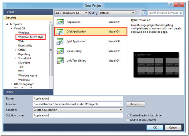
From Visual Studio choose New Project and select Grid Application under Windows Metro Style in the template tree:
When you start you’ll get a fully blown Windows 8 Metro application, ready to begin filling in with your own content.
How did all that stuff get there and where does it go?
First open up the Sample Data folder in the solution. In there you’ll find a file called SampleDataSource.cs. This contains some sample data to work with and is bound to the Xaml pages in the solution at runtime. You’ll of course replace this with runtime data but the sample helps you visualize your app along with understanding where stuff goes on the screen.
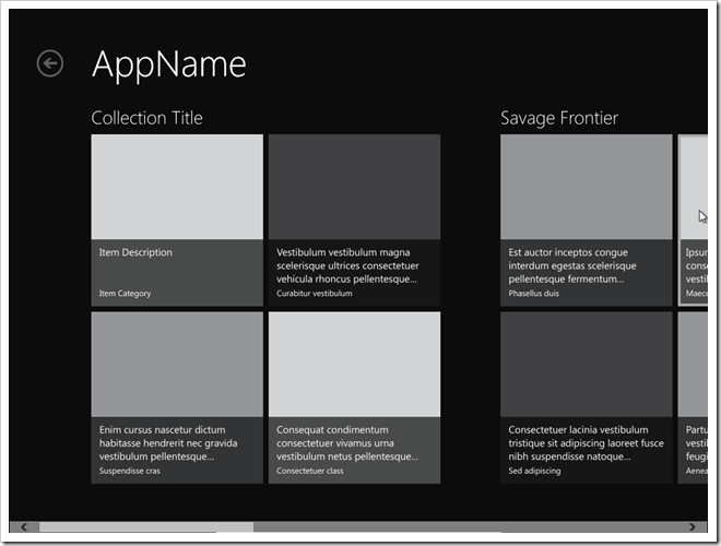
Or does it? The default app is all in Lorem Ipsum speak and while this is great for visualizing a fully populated application, I thought it was a little confusing to know how it fit together. To make it clearer where everything goes I’ve modified the first collection and item in the SampleDataSource.cs calls with more descriptive labels. Here’s a better picture of the GroupedCollectionPage.xaml, the “Home” page in the app:
Note the collection title appears above the group but only the description and category for the item appears for each item. So if you’re relying on users finding things by the item title (maybe it’s the title of a recipe or a newsfeed) then you might want to modify the layout for this to bind the title somewhere. You can get creative for example and overlay the title on top of the image.
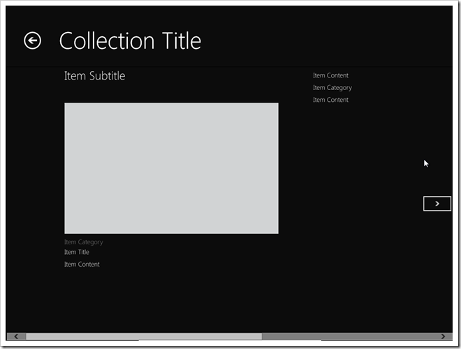
And here’s the DetailPage.xaml, what you see when the users clicks on a single item in the collection:
The Collection Title is the prominent title here but it does show the Item Subtitle. Again this might not be the desired location for titles. For example the Item Title is a small item below the image and category. Personally I would swap out the Item Title and Item Subtitle here or even use the Item Title in place of the Collection Title and leave the Item Subtitle alone (removing the Item Title below the image).
There may be some Metro guidelines coming out to help understand the reasoning behind this positioning and maybe my brain isn’t thinking “Metro” just yet, but it doesn’t make a lot of sense to me the way the default locations are.
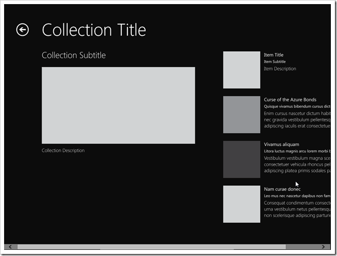
And here’s the CollectionSummaryPage.xaml, you would navigate to this if you clicked on the Back Arrow in the screen above (next to Collection Title).
Interesting to note with this is that the Collection Content isn’t used here, only the Collection Description. I would probably modify this to include the content or drop that property entirely and just use the description.
You don’t necessarily need to follow all of the structures the default Grid Application layout offers but do keep true to the Metro style and keep things consistent. I urge you strongly to watch Jensen Harris’ keynote on the 8 traits of a Metro app and realize that by using the default setup they give you, you’ll achieve a consistent look to your app that will fit harmoniously within the Windows 8 operating system.
Make more sense now?
Enjoy.
