Visual Studio Code first impressions
This morning, Microsoft made a surprise announcement (or two): a new cross-platform code editor named Visual Studio Code. It runs on Mac, Linux, and of course Windows. It’s lean, fast, it has IntelliSense, supports multiple languages and dev platforms, has debugging and git built-in. You can get it from the following link:
https://code.visualstudio.com/Download
I like to try new IDEs, and I commonly switch from C# to JavaScript, and Python. For C#, I use exclusively Visual Studio Pro. For Node development, I use WebStorm, but the new version 10 seems very slow (a common problem with new *.*.0 releases from JetBrains). The Node tools for VS are not bad, but WebStorm is more focused on the integrated Node experience. For Python, I use Python Tools for VS. None of those are especially lightweight, which is where Code could shine. Others than me may be more enthusiastic about Mac and Linux support, but as I do all my coding on my Windows box, the lightweight aspect is one of the most important for me.
The installation experience couldn’t be better: a 58MB download, one splash screen, and… done. That’s really refreshing when you know the nightmare that the full Visual Studio, or SQL Server installation experiences are. And once it’s done, it’s just one single entry in the Programs and Features control panel (as opposed to about 674 for VS, including 71 different C++ runtimes, and 327 for SQL Server). Finally, something from Microsoft that I can uninstall in one operation, and in less than 4 hours.
![]()
By default, the app uses a dark theme (you can switch to light or high contrast from the View menu). And that’s the first slightly weird thing: it also has light menu and title bars.

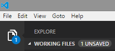
The app uses a modern toolbar on the left, with big icons that each switch a second pane with details open and close. It’s clean, consistent, convenient, and stays out of the way when you don’t need it. The application does a good job overall of reducing clutter. So why does it still have a menu bar from the 90’s? I would expect that menu to be merged into the left toolbar in future releases. Good news is that F11 will take you to full-screen mode, where you can focus entirely on your code.
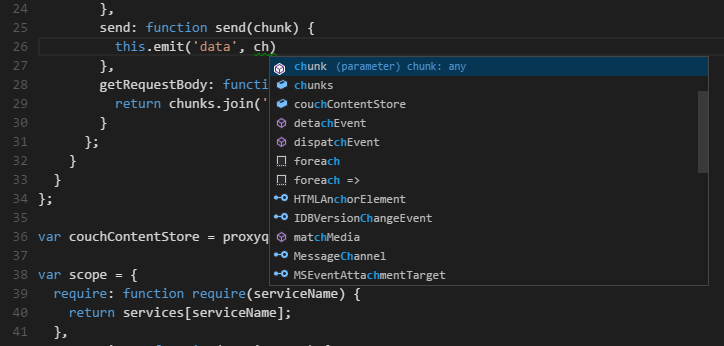
The left toolbar has four icons. The first is your project explorer. The total lack of icons in the tree view is surprising and a little unsettling, but that’s not completely crippling. Once you’ve open a file, you’ll get very decent code coloring, error underlining, and most importantly IntelliSense (code completion).

The second icon is for search. It’s not super-fast, but it has this nice feature where you can remove a file from the list of results. WebStorm has that too, and it’s something that I use a lot in order to be able to focus on the meaningful hits. Wait for the search to be over before you use that however: there is a little bug that will make deleted results come back otherwise.
Then we have the Git icon. The integrated git client is minimalist, but sufficient to enable you to examine your current changeset without having to switch context. I really like it, especially as compared to the full Visual Studio’s equivalent feature, which is a horrible mess that not only can bring a powerful dev box to its knees by entering file watching ping-pong matches with anti-virus and other git clients, but is also impossible to permanently disable.
Finally, there is the debug icon. Debugging seems promising. It’s configured using a very simple json file, which is an approach to configuration that I really like: it makes the tool itself more lightweight by avoiding the requirement to ship huge settings UI, it is also very convenient for us programming types. Funny how few IDEs realize that their audience is freaking programmers who know how to type, and who can read and write JSON fluently. Well done. Except that…
Except that I hit a bug, apparently, and was unable to make debugging work. I got an error message, and no clue about how to troubleshoot. Just pointing me to a log file would probably have been enough to find what the problem was, but no such thing was provided. If I had been able to make debugging work, I would have probably taken the tool for a longer spin, but as it is, this is a giant showstopper.
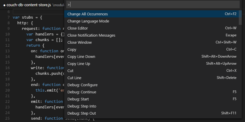
Other nice features include a mini-command-line à la Emacs that you can access through CTRL+P (who prints code anyway?). I would prefer to have a real interactive command-line, in order to be able to npm, grunt, and gulp without switching context, but that’s a nice feature.

Finally, the Markdown support is quite good: you get code coloring in the editor, and can have a split view with a preview that updates in real time as you update in the editor window.
In conclusion, this is a very promising tool, that should hit that sweet spot where it does enough that you don’t need to switch to other tools all the time (it’s a real IDE, not just a code editor like Emacs, Vim, or Sublime), but it remains lightweight enough that it’s still super fast to install, launch, and run. I really, really like it, and hope the initial glitches can be fixed soon (Microsoft has been very secretive about this, so this is some of the first feedback they are getting). Try it, you might like it.
