Goodbye Ribbon–Going Full Screen Metro Style with SharePoint
Having some fun with a previous post I did about generating a Metro-style menu from a Custom List in SharePoint for the purpose of building something like an Application Directory. It’s a great navigation system and by adding something like Live Tiles (that pulls information from each site) via JavaScript it can be an informative dashboard rather than a pretty menu. You can read the previous write-up I did on this here.
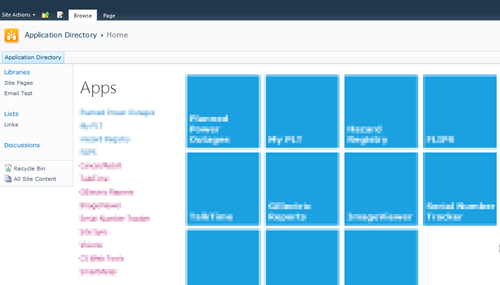
Here’s what my Application Directory looks like:
Nice, but all that SharePoint chrome isn’t needed for the purpose of navigating the directory.
The answer is simple. Just a few CSS styles you override to hide everything.
Here’s the CSS markup you need:
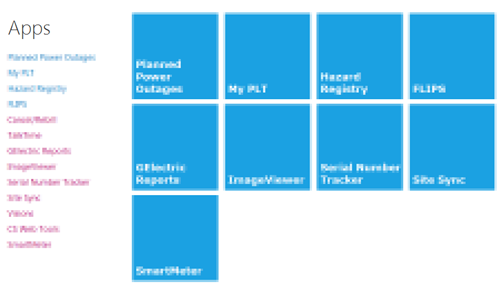
And here’s the result:

Nice and clean.
If your admins need to get to the underlying system pages just navigate to “/_layouts/viewlsts.aspx” and they can navigate around normally from there. You could also create a link on the main page for that, even wrap it in a security token so only admins can see it!
I have a blog post in the works on turning those pretty Metro icons into Live Tiles with data from the subsites, but that’s for another day.
Until then, enjoy!

