3D before GPUs Part 1: Dungeon Master
In this series, I'll reverse-engineer algorithms from video games dating back to that time when the CPU was all you had. Today, we're looking at Dungeon Master, a fantastic game by FTL that set the gold standard for RPGs for the years to follow. It looked amazing, and still does to this day. It changed everything.
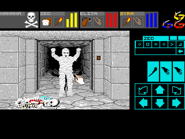
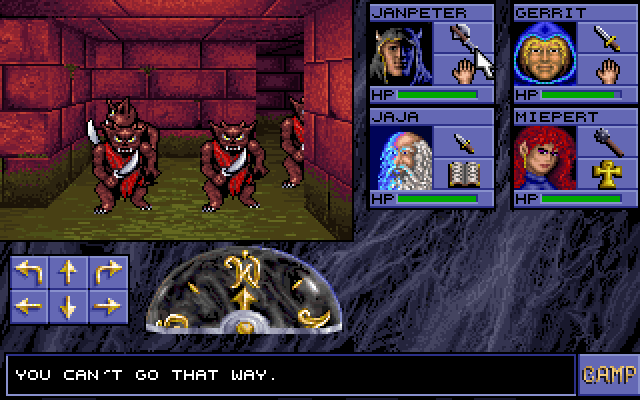
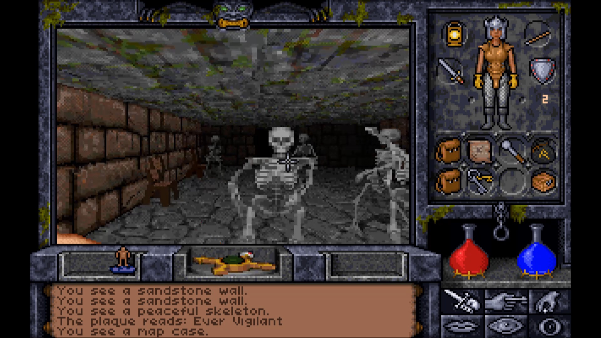
Eye of the Beholder and Ultima Underworld are examples of later games that owe almost everything to Dungeon Master.
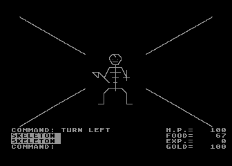
Before Dungeon Master, dungeon crawlers existed of course, but were often limited to crude wireframe graphics.
The way Dungeon Master rendered the walls of its dungeons was by cleverly overlaying and clipping bitmaps for the floor, ceiling and walls. There were of course many other objects to compose, such as monsters, doors, fountains or scrolls, but for the purposes of this post, we'll limit ourselves to the corridors and leave the rest to your imagination.
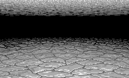
For this, we need only one tile for the background, ceiling and floor, that will be the background that we'll fall back to when no other object is in front:
We also need three tiles for the front wall at the three distances where the wall is still visible: the dark corridors of Dungeon Master are dimly lit, and everything farther than 3 units conveniently fades into darkness...
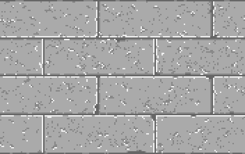
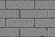
Also note that these wall textures don't need to be the full width of the screen, they just need to tile, so repeating the texture appears seamless.
Then we have one tile for the left wall and one tile for the right wall, that we'll clip as needed:
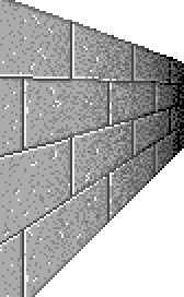
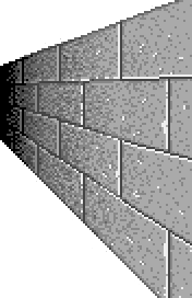
And finally we need two tiles for the second row of walls on the left and right that are sometimes barely visible in the distance:


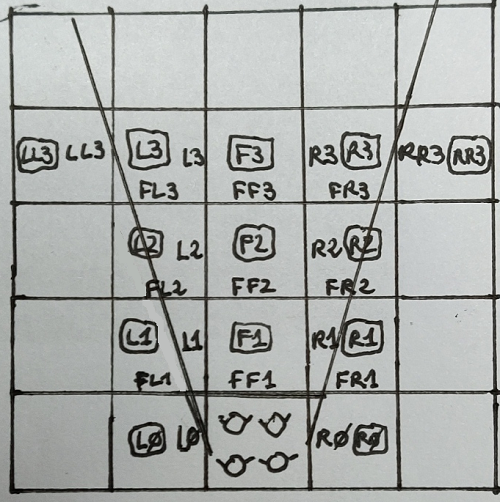
Here's a drawing of what those panes correspond to, when viewed from above:
The HTML for the whole setup is extremely simple:
Each potentially visible pane of wall is represented by a div with classes enabling their precise targeting by CSS. The divs are ordered from back to front so we don't have to worry about depth and closer walls naturally occlude the ones behind them.
CSS is then used to dimension, position, texture and clip each pane. Here's for example the style for the middle-left wall:
JavaScript is used to make panes visible or hidden based on the map data for the level:
We first peek at the map locations in view of the party, then set the visibility of the corresponding wall panes.
There's one last trick that Dungeon Master uses to make its levels feel more real at a very low cost: every time the party moves, all textures are flipped horizontally to their mirror image. This is important because it gives the illusion that something changed without costing anything since the images stored in memory are exactly the same, just rendered flipped. The textures have actually been designed so that what you see one square away looks like the mirror image of what's immediately around you. So flipping the textures gives a semi-realistic illusion of movement despite the fact that everything moves square by square rather than progressively and smoothly.
In my reverse-engineered web version, I was able to reproduce this very easily by toggling an additional CSS class, "alternate", on the parent viewport element, every time the party moves or rotates:
The CSS for the alternate viewport just applies a transform that applies a horizontal scale of "-1". Tile elements have a reversed version that adjusts the clipping of the texture if necessary:
That's pretty much all you need to reproduce the rendering of Dungeon Master walls and get a result that is very close to the original.
In the end, Dungeon Master's rendering of its levels is about as simple and low-cost as it gets, but still manages to create an immersive and great-looking environment.
Here's the final result, that you can use from your browser, right here (the level is that Hall of Champions, the first level of the game):
Go ahead, click on the arrows and play, it really works from this post!
If you want to see some gameplay from the original, here's a video I recorded a few weeks ago where I go through the first couple of levels of the game, and proceed to die a horrible death:
Like and subscribe!
In the next post, I'll look at Rescue on Fractalus, the first game from LucasFilm that introduced a very innovative fractal rendering technique for mountain ranges.
The full code for this demo is on GitHub: 3d-junkyard/DungeonMaster at main · bleroy/3d-junkyard (github.com)