Looking back at MicrosoftPDC.com (from the inside)
I had the privilege of working on the MicrosoftPDC.com website as lead developer for the past several months. The process hasn’t been kind to my blogging schedule lately, but the experience definitely taught me quite a bit: working with the top-notch Microsoft developer evangelism team, setting up a site for maximum flexibility, setting up the Silverlight experience, and troubleshooting some interesting issues during the conference. I’m going to run through several of these at a high level and may dig into some of these in more detail later (so comment if you want to hear more about something).
As I’m describing some of these, remember that while I was the lead developer, these sites were built by a team. The project and UI experience were managed by the Microsoft Developer Evangelism team, the visual design was based on the overall conference visual design concept. I lead the development team which included some of our super-awesome developers and designers here at Vertigo1. So I’ll take some of the credit for what went well and most of the blame for what went wrong. Also, while the experiences were kept in sync, we didn’t do any of the work for the the registration and live conference session information (including video links, evals, etc.). register.microsoftpdc.com and sessions.microsoftpdc.com didn’t even live on the same server as the rest of the micorosoftpdc.com site.
This site used ASP.NET Webforms rather than ASP.NET MVC. We built the first release of the PDC2008 site in April - May 2008, and ASP.NET MVC was at a Preview 2 release stage back then. I love new and shiny, but I couldn’t in good conscience recommend that we launch the PDC site on MVC so early on. As I worked on it, though, I continually asked myself, “Will this be the last ASP.NET Webforms site I’ll deploy?”
Reuse Through Simplicity
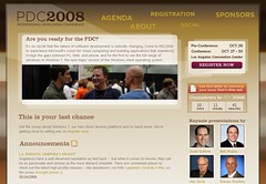
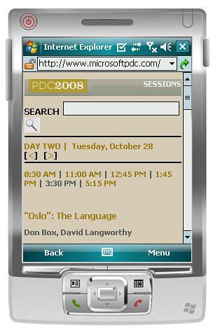
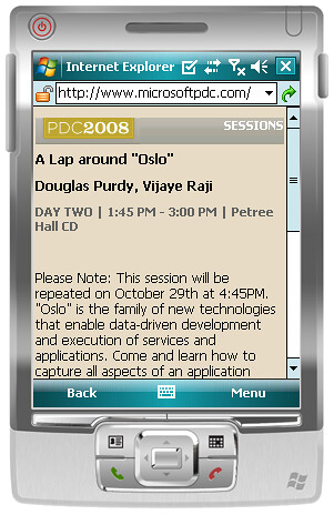
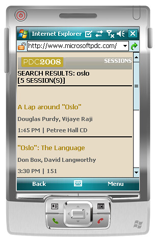
We originally built a single site – microsoftpdc.com – but it’s turned into quite a bit more than that. The original microsoftpdc.com site was a pretty simple “brochure” site, designed to give people the information they needed to get to the PDC conference. The week before the conference, we shifted to a “live experience” mode that included a re-skin and changes to the sitemap to present information that was relevant to people attending the conference or keeping up with it online. That same week, we launched two other sites: m.microsoftpdc.com (a mobile site for PDC attendees) and 2009.visitmix.com, an information site for the MIX09 conference. While all these these sites looked pretty different, they all ran on the same code base. As I look back at things that went well, I think this is one thing we got right - we struck a good balance on the design so that we were able to heavily reuse the site code without having to tell the client that simple changes would take days because our system was too complicated.
Here are some of the things that helped keep us flexible:
- CSS based design
- Resisting the urge to premature generalization
- A great client – we were able to be involved in the user experience planning at a level which allowed us to define some consistency across the site
- Feed-based content as an ultra-lightweight CMS
- Master pages used on all pages in the site except the home page – for a while, the same site would display in “PDC Classic”, “PDC Live”, and “MIX” modes with a querystring switch (disabled in production)
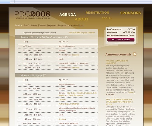
The master-page / CSS switching worked surprisingly well – for instance, here’s the same agenda page shown before and after the theme switch:
We didn’t use the built-in theme system for ASP.NET, as it unfortunately doesn’t play that well with CSS based design and conditional stylesheets.
Look, Ma! No database!
One interesting thing about these sites is that they pulled their dynamic content from a variety of feeds. I built out a control which basically piped an RSS feed through an HTML cleaner to a ListView control. The ListView control just output the content in unstyled HTML, so it was reused all over the place. The HTML cleaner did a few things – stripped ugly HTML (including Word HTML markup) and did a “smart truncation” of the HTML content so we’d a desired character length with adjustments so we split at word boundaries and didn’t leave unclosed tags. I used the Html Agility Pack to handle the HTML parsing so I could focus on the logic.
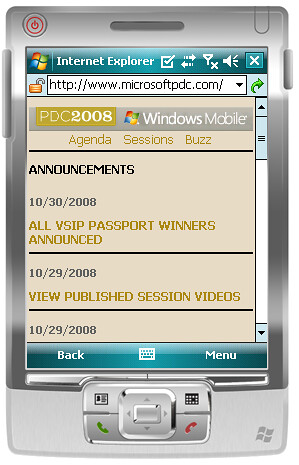
The Mobile Site – m.microsoftpdc.com
While I set the technical direction and took care of some polish areas here, I really can’t take too much credit for what I consider to be one of the best features of the microsoftpdc.com site. David Shadle, the (awesome) creative director for the PDC online experience, designed a mobile experience exactly how I’ve always thought they should be done – as a focused mini-site specifically created for attendees at the conference. Then Jim Lin built it. I helped with some polish by following Scott Hanselman’s iPhone webdev tips (adding the iPhone home screen icon and adjusting the viewport), but mostly I just got out of the way and let it happen.
Here’s that fancy iPhone home screen icon. Phear my graphics skillz!!!
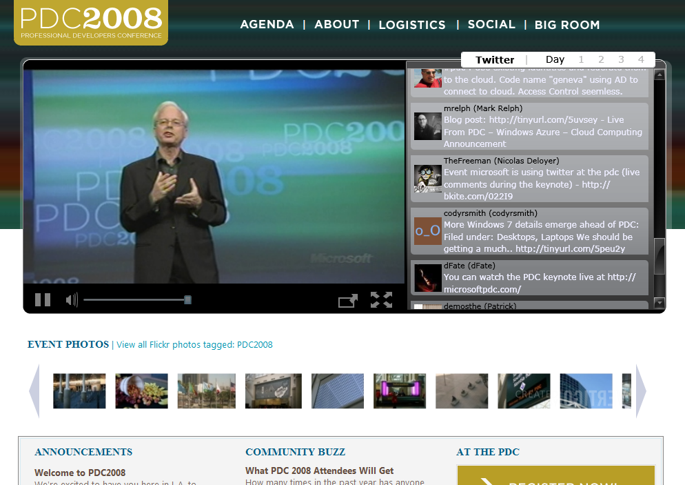
The Silverlight Live Experience
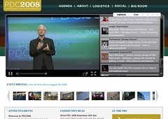
I put a lot of work into this, and it was probably one of my favorite features despite the fact that it was only live for 4 hours or so (during the webcast keynotes). We thought about how we watched conference keynotes – frantically switching between the video and Twitter – and we tried to set up an experience that would make people like us – geeks who love keynotes - really happy. We built a tiny Twitter client in Silverlight which pulled directly from search.twitter.com, and fortunately everything (Twitter included) held up well during the keynotes.
You know what took way more time than you’d expect? Styling the scrollbar in the Twitter area.
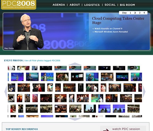
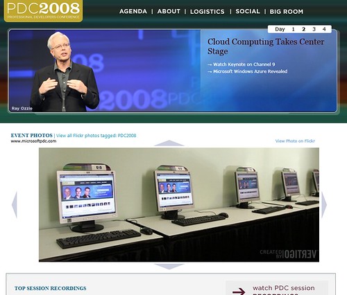
Hovering over the event photo thumbnails expanded to a Silverlight Deep Zoom photo explorer thing…
… and clicking on the thumbnails or spinning your mouse’s scroll-wheel would of course zoom you in on the photos, in all their Flickr medium-resolution glory! Of course, there were some dangers – if you zoomed in on the wrong photos, you could get stuck in a Deep Zoom recursion situation which has been known to collapse the very fabric of spacetime:
We leveraged a system Vertigo has developed to enhance and manage Deep Zoom experiences. It’s called Big Picture, and it powers some other cool Deep Zoom projects like the Mojave Experiment site and this page which displays all the newspaper headlines with the news of the Obama’s recent election victory. In addition to handling UI details like laying out the photos in a nice justified rectangle, there’s a server piece running behind the scenes that builds the photo collections. We used the Big Picture server’s Flickr integration system, which ran a scheduled build process against the latest Flickr photos with the PDC2008 tag. That task took some management as the collection grew during the conference, but fortunately Jay Walters (the developer who did most of the work implemented the PDC / Deep Zoom experience) was on the ball, scaling our build times to match the photo collection size.
What did you think? What did we get right? What did we do wrong?
1 I mentioned that I work at Vertigo, I love my job, and we’re hiring, didn’t I? Yes? Great!
