ASP.NET website redesign: Now with less Beta, more Live
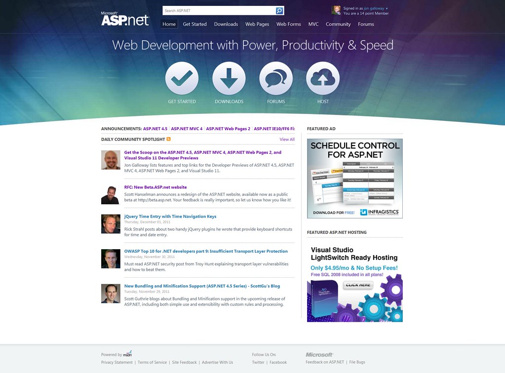
Back in October, I posted about the beta release of the ASP.NET website redesign at beta.asp.net. Since then, we've listened to a lot of great feedback, ruthlessly evaluated a huge catalog of content, and continued to reorganize things so you can more easily find useful content. That redesign just graduated from beta to live today.
This redesign was focused on the following goals:
- A newer Information Architecture (IA) that scales with different types of content. Trying to get you somewhere useful quickly.
- Content organized into relevant topic areas (Overview, Videos, Tutorials, etc.) to make information easier to find and to learn a technology.
- Improved on boarding experience – Developers new to ASP.NET should find it easier to get started and download what they need.
- Important Samples and Tutorials are positioned prominently in the structure of the site so that they are easier to find.
- Textual Tutorials are as important as videos - We've heard people want text tutorials more than videos, so we're finding balance between these two kind of content.
- Improved Social Integration – Community info, pulling from Twitter, Facebook and blogs.
- A less cluttered user experience to get you where you need to go in fewer clicks.
- Open Source and Samples - We're looking for new ways to showcase great open source projects and excellent samples.
Scott Hanselman's and I planned that his blog post would cover the site overview and I'd focus on some specific details, so about the new site blog covers the overview of what we did, so be sure to read Scott's post for the big picture.
Note: It's going to sound like I'm taking credit for actually doing all this work. I've been very busy, but there were a lot of people involved. There's a dedicated development team working on it, and the closest I got to code or production access at any time was when I updated content in the CMS admin interface (yes, still Umbraco, and I'm very happy with it).
Information Architecture focus
Back in the early 2000's (maybe as early as 2004?) someone pointed me at some online workshop materials from Adaptive Path which explained the process restructuring a website's navigation so that it's focused on the user's needs rather than the business's content. This was a revelation to me, and incredibly helpful as I was a tech lead on a project which moved a 20,000 website (comprised of 20,000 classic ASP pages, each a separate file) to a home-grown CMS running on ASP.NET 1.1.
The point is that what's behind the curtain - the different business units involved, the work that went into producing some aging content a few years ago, the work (administrative and development) involved in changing the navigation structure - none of it matters to me when I'm trying to find information I care about. When I was interviewing for this job two years ago, I had plenty of experience - and frustration - with the ASP.NET site. I actually suggested that if the site couldn't be significantly improved, it was time to get rid of it completely. They still hired me, so I've continued to approach the ASP.NET site in that way - it needs to be useful, or it's not worthwhile.
The steps:
- Get the site on a modern CMS (Umbraco, powered by ASP.NET of course) which could allow us to begin efficiently moving and editing content.
- Restructure the site navigation around user tasks rather than how our content had been historically grouped.
We took the first step with a site update in May 2010, and began on the second step. We broke out separate content around different technology focus areas (Web Pages, Web Forms, MVC) and started putting content maps on the landing pages for each of those technology areas. Those evolving content maps began to define how the site should be structured.
So, here's a look at how the actually useful content in a page on the ASP.NET site has evolved over the past year, leading up to this new release
Note: Phase 2 below is not the final state, so hang on a second.
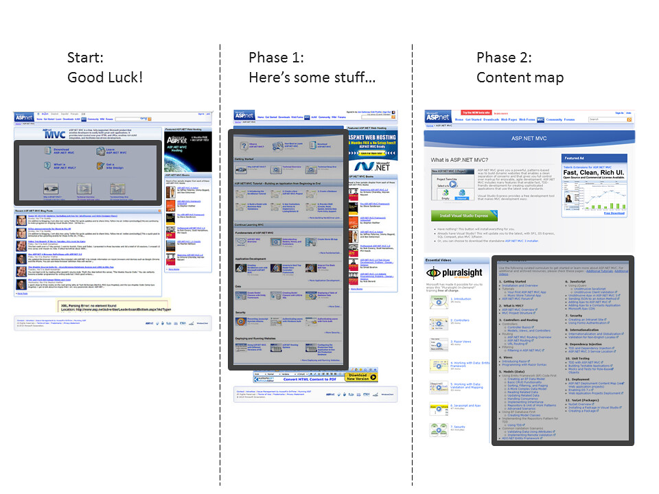
- Start: Seven links at the top, each of which took you to pages with lists of content, usually organized in a way that made them hard to navigate.
- Phase 1: Surfacing some top links across several categories, but if you click on a "more" link, you go to a huge list of stuff, often hard to navigate. Cluttered with a lot of thumbnails which don't really add any value.
- Phase 2: Content map added, which is kind of a wall of text, but at least lists out some of the top content by topic.
The content map was kind of a band-aid - it tried to show the structure we wished the site had, but once you clicked through on any of the links the dream collapsed, and there was no real way to navigate around through the pretend structure.
We refined at that pretend structure while it was just content in a page, focusing it on subject matter in a context (e.g. Security in ASP.NET MVC, Performance and Caching in ASP.NET Web Forms). Then, with this new release, we've made that pretend content the real content structure.
The Navigation Tab Structure
The information architecture starts with a common tab format across the three technology focus areas:

Within each of these sections, we've divided content by use:
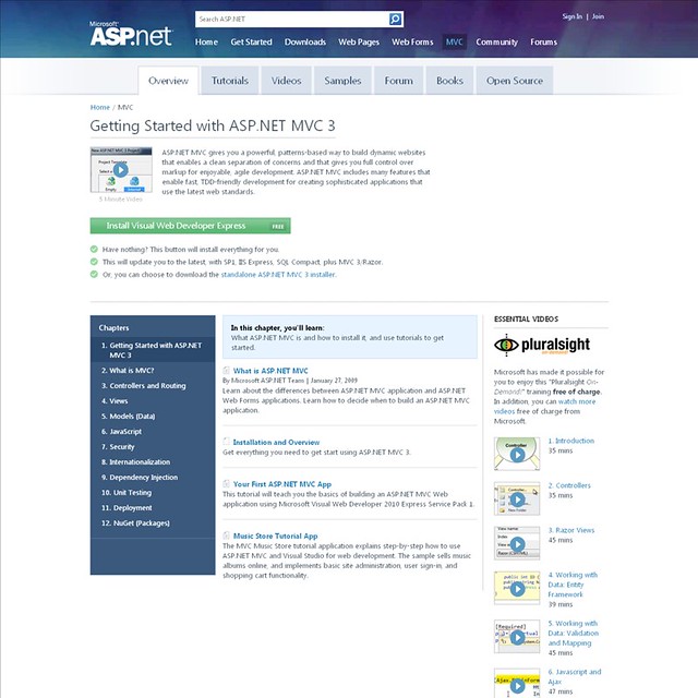
- Overview - This provides the main content map, linking to content in other tabs if appropriate (e.g. if you're interested in MVC Security and there happens to be an MVC Security section in the video tab, we'll link you to it. This content map also links to top content on MSDN as appropriate.
- Tutorials - These are generally multi-part walkthroughs which will teach a subject step by step.
- Videos - We separated videos out for each technology area, because we consume video differently than we consume textual content. If I'm looking for reference information on a topic and am in skim mode, videos aren't relevant. If I have some time to sit back and watch as someone demonstrates something, I only want to see videos. So, we separated them out, but we linked to them from the overview where appropriate.
- Samples - This tab lists sample applications with working source code, so you can see things in context. The samples include content from both inside and outside of Microsoft as appropriate, so we include popular open source applications which we think are useful as samples.
- Forum - The ASP.NET forums have been a great way to discuss issues and get help for a long time, but they've been a bit buried. I'll confess I don't think about them as the resource they are until I stumble across them in search results. We've included a tab which shows the dedicated forum for each technology area.
- Books - The books section was kind of off on its own before, too. I updated our books list and broke it into chapters which I thought were useful. Since this is now quick to update, I can go in and add new books as the become available.
- Open Source - We listed some top open source resources in each technology area which will help you in building your applications. This isn't a listing of open source applications running on ASP.NET, it's libraries and tools which will help you as you build your applications. It's of course not complete and can't include every open source resource available, but Scott Hanselman made a best effort at listing open source resources we'd recommend to fellow developers.
Oh, and the structure isn't pretend anymore
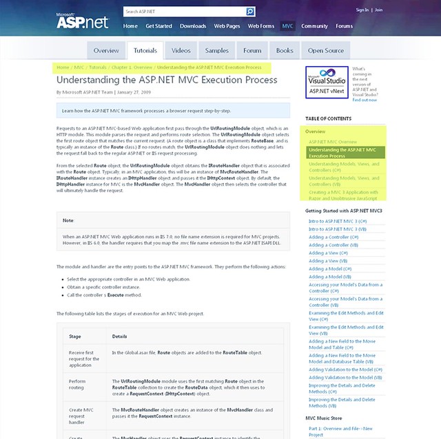
The landing page for a technology focus is the Overview tab, and you can see that we've subdivided the content in these areas into Chapters. Here's that same MVC page with that change:
You can really see it as you click into the content, though. That structure follows you around through the site, visible in the breadcrumb and table of contents in the right rail (highlight added to the image to point it out).
Multi-Part Article Navigation
For most of the content, the chapter format worked just fine. For a page showing a video about a Web Pages Security topic, we'd show the Web Page TOC in the right rail with that part of the Security section highlighted. There was one place where we needed a third navigational level, though: multi-part articles.
Most of the multi-part articles are in the tutorials section, since tutorials are often broken into a series of pages. As you work through one of these tutorials, you'll find that your breadcrumb looks something like this: Home/MVC/Tutorials/Chapter 4. Getting Started with EF using MVC/Creating a More Complex Data Model for an ASP.NET MVC Application (4 of 10)
In this case we're in the MVC technology area, in the Tutorials tab, in the Chapter 4. Getting Started with EF using MVC section of the Tutorial table of contents, and we're on the 4th page of that tutorial.
To make the context clear, we mark that kind of content as multi-part, which shows a different kind of navigation in the right rail:

This shows that you're in a multi-part article, and clearly shows your context.
Content Review
The next step was mapping a lot of content to this new structure and adjusting the structure when we found gaps or additional good content to surface. The site dates back to 2002(!) and has hosted a ton of content during that time. Some of that old content is irrelevant or obsolete, but some of it continues to be useful to developers who are maintaining sites running on previous versions. Additionally, there was useful content which had become orphaned - unreachable via the site navigation - as a result of previous redesigns. We had literally thousands of pages of content, some filled with long lists of content, to evaluate.
My thought process was this:
- Is this information useful? If a developer were asking me for information about this subject today, would I recommend this particular page / video / tutorial? If not, delete it.
- Where does it fit in our site structure? If it doesn't, does the site structure need to change?
- Is this information complete, or would I recommend more information? If there's some available - including on MSDN - should we reference it?
I worked with Scott Hunter, Scott Hanselman, ASP.NET team PM's for each of the focus areas, and the excellent writers and editors on the Web Platform & Tools Content Team (who contribute to and curate content both on MSDN and ASP.NET) to evaluate literally thousands of pages. We did this in two passes:
- We split up the lists and evaluated each of the individual pages, recommending cut or keep, and if we were to keep it, where it should go.
- After completing that step, we had a series of bug bashes, in which individuals walk through a content area and report everything they thought should be changed. This was iterative - bug bash / fix /repeat.
The site was open during this whole cycle, and we got a lot of good feedback via social networks, the dedicated ASP.NET website UserVoice forum, and from MVP's and ASP.NET Insiders. There's a lot of content here, and it will always be a work in progress, but we think the combined effort has helped to surface a lot more useful content in a way that's easier to find. Please let us know how we're doing - this site's only useful if it's providing you the content you're looking for.
Cleaner Markup, Faster Page Loads
The site was already pretty highly optimized, but we paid attention to the site performance and were happy to see page load times improve across the board.
More Semantic Markup
The previous design had a lot of dated (quaint?) design elements, like rounded corners and gradients, which at the time required a lot of extraneous markup for support across a wide range of browsers. There was a lot of wrapper divs which were there only for styling - kind of ignoring the most important element in HTML: text!
Side note: I find it funny that, now that modern standards natively support rounded corners and gradients, they're not cool anymore.
You can see a big difference in the markup just by looking at beginning of the body tag through the end of the header items. Here's the old design:
<body>
<form method="post" action="/webmatrix/tutorials/15-caching-to-improve-the-performance-of-your-website?"
id="form1">
<div class="aspNetHidden">
<input type="hidden" name="__VIEWSTATE" id="__VIEWSTATE" value="/wEPDwUENTM4MQ9kFgJmD2QWAmYPZBYCZg9kFgJmD2QWAgIFEGRkFgICD
Q9kFgJmD2QWAmYPZBYCZg8WAh4HVmlzaWJsZWdkZKrDY1NG1HjNDVKzlZSX2Dy7poMS" />
</div>
<div id="content_container" class="content_container">
<div class="header_container">
<div class="header_top">
<div class="header_top_right">
</div>
</div>
<div class="header_content">
<div class="header_content_right">
<a href="http://www.asp.net" title="Home Page">
<img class="logo" style="border-width: 0px;" alt="" src="http://i2.asp.net/common/header/logo.png?cdn_id=22"
title="Microsoft ASP.NET" />
</a>
<div id="WLSearchBoxDiv">
<div id="WLSearchBoxPlaceholder">
<input class="search_box" id="WLSearchBoxInput" disabled="disabled" name="WLSearchBoxInput"
value="Search" /><input class="search_button" id="WLSearchBoxButton" type="button"
value="" name="WLSearchBoxButton" /></div>
</div>
<div id="mainnav">
<ul class="nav_main">
<li class="first"><a href="/home">Home</a></li><li><a href="/get-started">Get Started</a></li><li>
<a href="/downloads">Downloads</a></li><li><a href="/web-pages">Web Pages</a></li><li>
<a href="/web-forms">Web Forms</a></li><li><a href="/mvc">MVC</a></li><li><a href="/community">
Community</a></li><li><a href="http://forums.asp.net">Forums</a></li></ul>
Yes, that was a bit of VIEWSTATE in there... Also, entire page was full of wrapper divs which were there just for formatting, and if you accidentally messed them up when editing content (oops) the whole page got wacky.
Here's the header markup for that same page with the redesign:
<body class=''>
    <div class='allcontent '>
        <div class="header-wrap">
            <div class="header">
                <a href="/" class="logo" title="The Official Microsoft ASP.NET Site">The Official Microsoft
                    ASP.NET Site</a><ul class="nav-main">
                        <li><a href="/">Home</a></li><li><a href="/get-started">Get Started </a></li>
                        <li><a href="/downloads">Downloads </a></li>
                        <li><a href="/web-pages" class="selected">Web Pages </a></li>
                        <li><a href="/web-forms">Web Forms </a></li>
                        <li><a href="/mvc">MVC </a></li>
                        <li><a href="/community">Community </a></li>
                        <li class="last-child"><a href="http://forums.asp.net">Forums</a></li></ul>
I see that three goals are achieved in unison here:
- Cleaner design means less HTML, so the pages load and render faster
- Less junk/formatting HTML means the content is easier to maintain
- A focus on content over superfluous design elements usually mean that the content is easier to read, as well
Better Performance, YSlow Improvements
Again, the focus on this redesign was really about information architecture and design refresh, but we did pay attention to site performance and best practices throughout because... well, it's the ASP.NET site and we care about this stuff. We want to be proud of this site, and we want you to be proud of it, too.
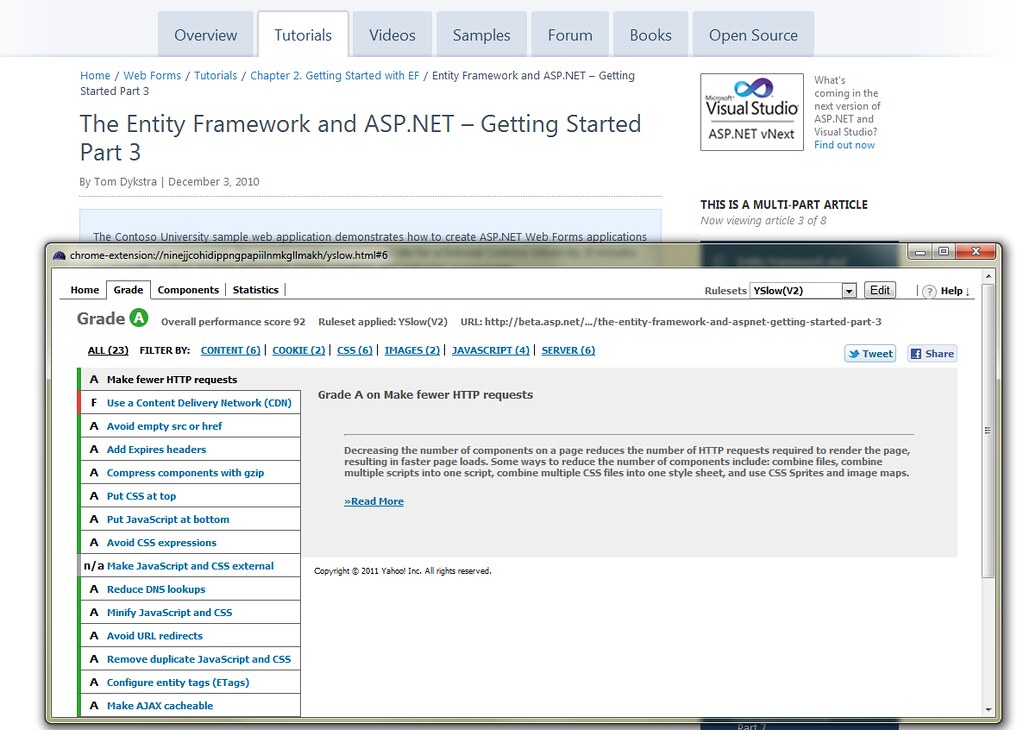
Scott Hunter, Scott Hanselman, and I were on several calls with the development team every week, and we constantly badgered them about performance tweaks, practices, etc. We started with a B YSlow rating, which is actually pretty good as far as most sites are concerned.
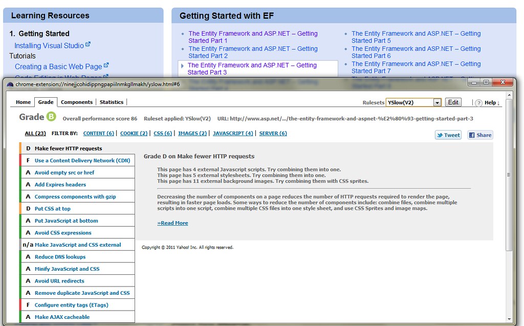
We ended up with an A, with a discussion about any recommendation we couldn't meet. The only mark against us in the page below is due to some local (non-CDN) images, which was a measured decision to allow content editors to edit them in the CMS. Check the YSlow marks across the site yourself - it's a fun exercise.
Looking at better performance and best practices ensured we were doing things like setting correct headers, using sprites effectively, minimizing and bundling resources, etc. Again, I did absolutely none of that development work, I just sent e-mails about it. ;-)
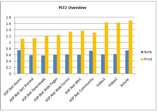
We had a team doing weekly performance testing across the site and making recommendations on best practices and opportunities to improve. Here's one of the pretty graphs in one of them showing the page load time was significantly reduced site-wide, often cutting the load time by 50% or more.
What's Next?
We're definitely not done. We put a lot of things on the post-launch list, many of which are now possible as CMS edits. I mentioned that we've been asking for feedback and using your input to tell us what's most important. Here are some of the things we're tracking:
HTML5 Video
It's highly requested, and it's important to us, too. I prototyped a Silverlight with HTML5 fallback video solution which is in the "works on my machine" state. I went back and forth on which to make primary and which to make fallback, but since it's leveraging standard HTML content fallback (no Javascript or server logic required) it's easy to switch.
As written, this would continue to use the existing player (along with features like time based commenting and cross-browser full screen support), but if Silverlight's not installed or is disabled, the content's shown using native HTML5 video support. If that's not available, we'll show some sort of message that indicates you need Silverlight or a newer browser.
We know this is important so that the content's available across as many devices as possible, and it's high on the list.
Better Mobile and Smaller Device Support
I've blogged recently about how ASP.NET MVC 4 will use CSS media queries and adaptive layout to work well on different sized browsers, and adding adaptive layout is in the works for the ASP.NET site, too.
Fewer / smaller ads
Yes. We hear you, and we're pushing for it. Keep voting for it, it means a lot more when you ask for it than when I do.
Bring back old content
Aha! We've done that! Done. Taking the rest of the week off.
Your Feedback, give it to us
While we do watch for blog comments, by far the most effective way to get us feedback is to vote on our www.asp.net website feedback page on UserVoice. Let us know how we can continue to improve!