Introduction to Layout Controls in Silverlight 2
Arranging controls on a user interface in a flexible manner is key to building successful applications. Silverlight 2 provides three main controls that can be used for layout management:
· Canvas Control
· StackPanel Control
· Grid Control
In this post I'll provide an introductory look at these controls and show how they can be defined in XAML. Future articles will use the layout controls to arrange controls that are capable of displaying data retrieved from remote sources. Let's start out by examining the Canvas control.
The Canvas Control
HTML developers use various types of container tags to group related content in a Web page. The div element is especially popular now days since it can be combined with CSS to provide a flexible layout for Web pages without requiring tables. Although Silverlight 2 doesn't support the div element, it does provide a Canvas element that can be used to group related content. The Canvas element acts like the div element in many regards and can have children nested inside of it. It's typically used when children need to be positioned at exact x and y coordinates.
The Canvas object derives from a base class called Panel and exposes several properties such as Name, Background, Cursor, Height, Width, HorizontalAlignment, VerticalAlignment, Opacity, OpacityMask, RenderTransform and Visibility (to name a few). Children can be positioned within a Canvas by using attached properties such as Canvas.Left, Canvas.Top and Canvas.ZIndex. An example of using a Canvas to arrange two TextBlock controls and a Rectangle is shown next:
<Canvas x:Name="ShapesCanvas" HorizontalAlignment="Left" VerticalAlignment="Top"
    Height="200" Width="600" Background="LightGray" Margin="20">

    <TextBlock Canvas.Top="20" Canvas.Left="5" FontSize="40" Foreground="Navy"
        Text="Canvas Text" />

    <Rectangle Canvas.Top="50" Canvas.Left="50" Height="100" Width="200"
        Fill="Yellow" Canvas.ZIndex="-1" />

    <TextBlock Canvas.Top="150" Canvas.Left="300" FontSize="30" Foreground="Green"
        Text="More Text..." />

</Canvas>
The Canvas object shown here is positioned to the top left of its parent container, is 200 X 600 pixels in size, has a LightGray background and a margin of 20 pixels applied uniformly to its left, top, right and bottom margins. The children within the Canvas are positioned using the Canvas.Top and Canvas.Left attached properties. Because Rectangle is defined after the first TextBlock it would normally be positioned above the text. By using the Canvas.ZIndex attached property, however, you can change how items are arranged and place objects above or below other items quite easily. By moving the Rectangle before the TextBlock in the XAML code the Canvas.ZIndex property could be removed though.
Figure 1 shows how the Canvas and its child objects render at runtime in a Silverlight application.
Figure 1
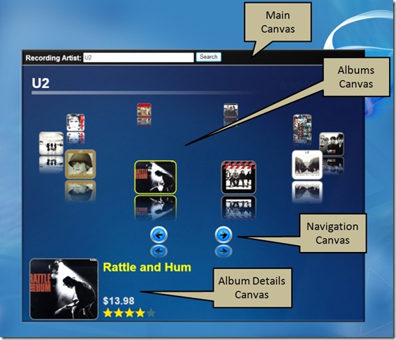
Multiple Canvas objects can be defined in a XAML file just like multiple div tags can be placed in a HTML file. The XAML code that follows shows how multiple Canvas objects can be used as place holders for controls that are created during runtime:
<UserControl x:Class="AlbumViewer2.Page"
    xmlns="http://schemas.microsoft.com/client/2007"
    xmlns:x="http://schemas.microsoft.com/winfx/2006/xaml"
    Width="800" Height="650">
    <Canvas x:Name="MainCanvas">
        <Canvas.Background>
            <ImageBrush ImageSource="Images/NavyBg.jpg" Stretch="Fill" />
        </Canvas.Background>

        <!-- Search controls go here -->

        <Canvas x:Name="LoadingCanvas" Canvas.Top="225" Canvas.Left="150"
         Background="Red">

            <!-- Loading data info objects go here -->

        </Canvas>

        <Canvas x:Name="AlbumsCanvas" Canvas.Top="50" Visibility="Collapsed">

            <!-- Albums go here -->

        </Canvas>

        <Canvas x:Name="NavCanvas" Canvas.Top="425" Canvas.Left="300" Width="300"
          Visibility="Collapsed">

            <!-- Navigation controls go here -->

        </Canvas>

        <Canvas x:Name="AlbumDetailsCanvas" Canvas.Top="495" Canvas.Left="15"
          Visibility="Collapsed">

            <!-- Album details controls go here -->

        </Canvas>
    </Canvas>

</UserControl>
Figure 2 shows how the Canvas objects and associated child objects are rendered at runtime.

Figure 2
The StackPanel Control
The Canvas control can be used when child objects need to be absolutely positioned. While absolute positioning may be useful in some Silverlight 2 applications, others can benefit from having controls that are dynamically laid out based upon the size of the Silverlight interface. By using dynamic control layout you allow users to switch to full-screen mode without writing a lot of code to adjust control coordinates. Silverlight 2 provides the StackPanel control that can be used to stack objects horizontally or vertically and provide more flexible layouts. By using the StackPanel you can arrange controls on an interface without defining absolute positions for each control.
The StackPanel control acts much like the ASP.NET DataList control. Data can be displayed horizontally or vertically by assigning a value to the DataList control's RepeatDirection property. RepeatDirection accepts one of two enumeration values including Horizontal and Vertical. The StackPanel control provides an Orientation property that is used to determine how to layout controls on an interface (the default layout is vertical). Like the DataList control's RepeatDirection property, the Orientation property also accepts Horizontal and Vertical values
Although StackPanel and DataList are similar in some ways, they differ in the way data is wrapped when child controls exceed the size of the parent container. The DataList control provides a RepeatColumns property that determines how many columns are displayed before creating a new row. The StackPanel doesn't provide that functionality unfortunately. As a result, child controls that exceed the bounds of the StackPanel will not display properly on the user interface.
WPF provides a WrapPanel control that handles wrapping child controls when they exceed the size of the parent container. Silverlight doesn't provide a built-in WrapPanel control, however, several WrapPanel controls have been created by members of the Silverlight community that can be found using your favorite search engine.
The code that follows shows how to arrange two TextBlock controls horizontally by setting the StackPanel control's Orientation property to Horizontal.
<StackPanel Orientation="Horizontal" Background="LightGray" Margin="10">

    <TextBlock Text="Horizontal StackPanel - First Control" FontSize="20"
        Foreground="Navy" Margin="10" />

    <TextBlock Text="Horizontal StackPanel - Second Control" FontSize="20"
        Foreground="Red" Margin="10" />

</StackPanel>
Controls can also be arranged vertically by changing the Orientation property to a value of Vertical:
<StackPanel Orientation="Vertical" Background="LightGray" Margin="10">

    <TextBlock Text="Vertical StackPanel - First Control" FontSize="20"
        Foreground="Navy" Margin="10" />

    <TextBlock Text="Vertical StackPanel - Second Control" FontSize="20"
        Foreground="Red" Margin="10" />

</StackPanel>
Figure 3 shows the result of the horizontal orientation while Figure 4 shows the result of the vertical orientation. Both figures demonstrate how a StackPanel control automatically fills the width of its parent container. This default behavior can be changed by assigning a value to the control's Width property.
Figure 3
Figure 4
The Grid Control
Web designers have been accustomed to arranging data and controls in tables for years. Although there's been a general shift to CSS and div tags for page layout, table tags are still quite popular. If you're coming from a Web development background you'll find Silverlight's Grid control easy to use and quick to comprehend since it's similar to what you've already been using. It acts much like HTML's table tag and allows data and controls to be arranged in a tabular-style view.
The Grid control allows rows and columns to be defined much more concisely compared to HTML. With the HTML table tag you're forced to repeat multiple tr and td tags to create rows and columns. The Grid control allows rows and column information to be defined in one location using RowDefinition and ColumnDefinition tags. An example of XAML code that creates a simple Grid with 2 rows and 2 columns is shown next:
<Grid x:Name="myTable" Background="White" ShowGridLines="True">
    <Grid.RowDefinitions>
        <RowDefinition Height="100" />
        <RowDefinition Height="*" />
    </Grid.RowDefinitions>|

    <Grid.ColumnDefinitions>
        <ColumnDefinition Width=".25*" />
        <ColumnDefinition Width=".75*" />
    </Grid.ColumnDefinitions>
</Grid>
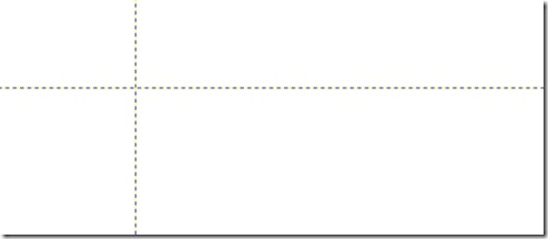
This example sets the Grid's ShowGridLines attribute to True which is nice for seeing the initial layout of a Grid control. Figure 5 shows how the Grid looks in Visual Studio 2008 when ShowGridLines is set to True.
Figure 5
The XAML code also sets the first row's height to 100 pixels and the second row's height to the remaining space available in the user interface When you use the * character to define a row height you're essentially telling the Grid to assign the row 100% of the remaining space. You could also omit the Height attribute entirely in this case and achieve the same affect. In addition to the row definitions, the two columns defined have widths of 25% and 75% respectively.
It's important to note that the ColumnDefinition tag's Width attribute and RowDefinition tag's Height attribute do not accept the typical values assigned to HTML tr and td tags. For example, assigning the Width attribute a value of 25% will result in an error. If you've spent a lot of time creating Web pages you may struggle with this initially (I know I did!) since using the % character is so common in HTML and CSS. In Silverlight, percentage based widths are assigned by defining a decimal value between 0 and 1 followed by the * character. However, you can also assign whole numbers such as 1* and 9* for 10% and 90% respectively. In addition to numeric values, the Height and Width attributes also accept a value of Auto which causes the appropriate row or column to automatically figure out its size based on available space.
Once rows and columns are defined, controls can be placed inside of a Grid using Grid.Row and Grid.Column attributes. The following XAML shows how 4 TextBlock controls can be defined and assigned to different rows and columns of a Grid:
<Grid x:Name="myTable" Background="White" ShowGridLines="True">
    <Grid.RowDefinitions>
        <RowDefinition Height="100" />
        <RowDefinition Height="*" />
    </Grid.RowDefinitions>

    <Grid.ColumnDefinitions>
        <ColumnDefinition Width=".25*" />
        <ColumnDefinition Width=".75*" />
    </Grid.ColumnDefinitions>

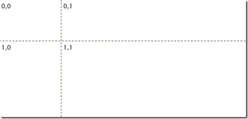
    <TextBlock Text="0,0" Grid.Row="0" Grid.Column="0" Margin="5" />
    <TextBlock Text="0,1" Grid.Row="0" Grid.Column="1" Margin="5"  />
    <TextBlock Text="1,0" Grid.Row="1" Grid.Column="0" Margin="5"  />
    <TextBlock Text="1,1" Grid.Row="1" Grid.Column="1" Margin="5"  />
</Grid>
Figure 6 shows what the Grid control and associated child controls look like at runtime:
Figure 6
In situations where you need a control to span multiple rows or columns you can use the Grid.RowSpan or Grid.ColumnSpan attributes. For example, the following button would be placed in the first row and span two columns:
<Button Content="Button" Grid.Row="0" Grid.ColumnSpan="2" />
In summary, Silverlight 2 offers several different controls that can be used to layout data and child controls on a user interface. The Canvas control allows for exact positioning whereas the StackPanel control provides more flexible control layout. The Grid control provides a simple way to arrange controls in a tabular-style on a user interface. In cases where you need additional layout flexibility such as arranging controls vertically or horizontally within a Grid cell, you can also combine layout controls such as the StackPanel (covered in a previous article) or Canvas with a Grid.


