How to create your own Visual WebGui Silverlight theme
In this “How to” we are going to learn how to create your own Visual WebGui Silverlight theme using our default theme.
You should be familiar by now with What is Visual WebGui and What is Visual WebGui over Silverlight. It is recommended that you read “How to create a Visual WebGui Silverlight application” and other articles in our “Get Started with Silverlight” section.
Visual WebGui (VWG) SDK supplies you with a default theme to your application. This theme holds the default display specification to all the VWG controls.
The VWG silverlight installation adds a new project type “Visual WebGUI Silverlight Theme”. This project allows you to take the default theme and design it according to your needs.
Lets open one of the previous application that we created in one of our previous “How to”. I’ve opened “How to embed HTML inside a Visual WebGui Silverlight application”.
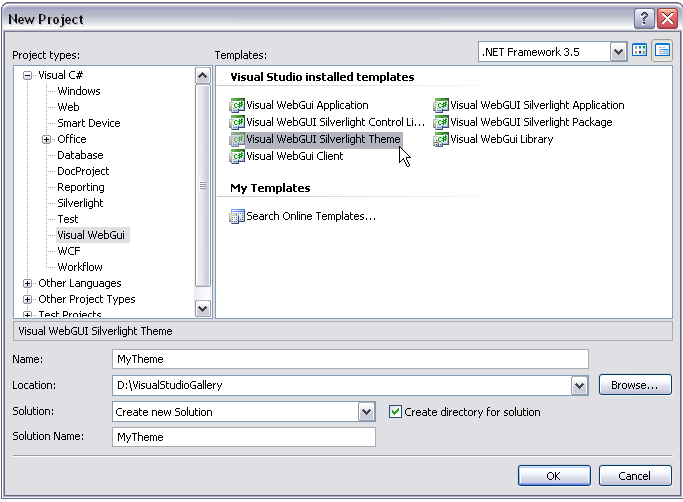
Now, add a new project to our solution. Select a project type Visual WebGui Silverlight theme
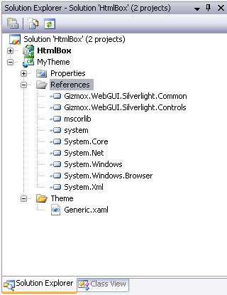
Our new theme project should look like this. The Generic.xaml file holds the the XMAL styles of all the VWG Silverlight controls.
Let’s look at one of them. This is the Window Background Style. This style defines the style of a window in a Silverlight application.
<!-- Default style for WindowBackgroundStyle -->
<Style x:Name="WindowBackgroundStyle" TargetType="Control">
<Setter Property="Template">
<Setter.Value>
<ControlTemplate TargetType="ContentControl">
<Grid>
<Rectangle>
<Rectangle.Fill>
<LinearGradientBrush StartPoint="0,0" EndPoint="0.2,1">
<GradientStop Color="#FFBFDBFF" Offset="0"/>
<GradientStop Color="#FF6591CD" Offset="0.8"/>
</LinearGradientBrush>
</Rectangle.Fill>
</Rectangle>
</Grid>
</ControlTemplate>
</Setter.Value>
</Setter>
</Style>
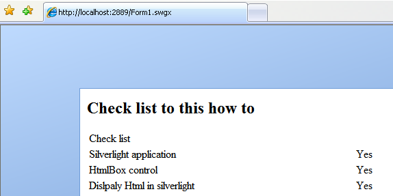
This How it looks like.
Now, let’s change the gradient color of the rectangle to a different color.
<!-- Default style for WindowBackgroundStyle -->
<Style x:Name="WindowBackgroundStyle" TargetType="Control">
<Setter Property="Template">
<Setter.Value>
<ControlTemplate TargetType="ContentControl">
<Grid>
<Rectangle>
<Rectangle.Fill>
<LinearGradientBrush StartPoint="0,0" EndPoint="0.2,1">
<GradientStop Color="Yellow" Offset="0"/>
<GradientStop Color="Orange" Offset="0.8"/>
</LinearGradientBrush>
</Rectangle.Fill>
</Rectangle>
</Grid>
</ControlTemplate>
</Setter.Value>
</Setter>
</Style>
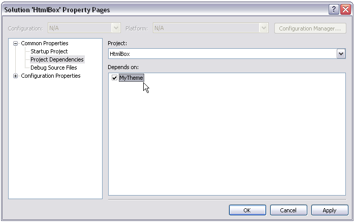
Next we will set the build order of our application. Right click on the solution and select properties. Open project dependencies and set HtmlBox to depend on MyTheme project.
Now, let’s build our application. If this is the first time you build your application you will see the packager application. Make sure that the new theme is included in the main package.
After the build has completed open the web.config, the theme section should look like this
<Themes Selected="Default">
<Theme Name="Default" Assembly="Gizmox.WebGUI.Themes.Vista" SilverlightAssembly="Gizmox.WebGUI.Silverlight.Themes.Default, Version=1.0.0.0, Culture=neutral, PublicKeyToken=null" />
<Theme Name="MyTheme" Assembly="Gizmox.WebGUI.Themes.Vista" SilverlightAssembly="MyTheme, Version=, Culture=, PublicKeyToken=" />
</Themes>
Set the selected theme to MyTheme Selected="MyTheme" save and close the web.config file.
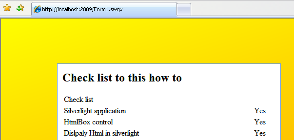
Let’s rerun the application it will look like this
This will be our default window theme in our application, You can reuse this theme project in any VWG application by just adding a reference to the Dll in the package manager and setting the theme to the default theme.
Next we will edit another style but use Expression blend this time.
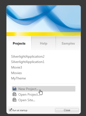
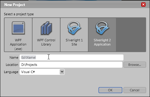
So let’s open the Expression blend and create a new Silverlight2 project.
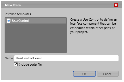
Add a user control to the project.
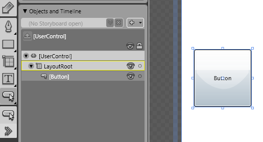
Add a button to the user control.
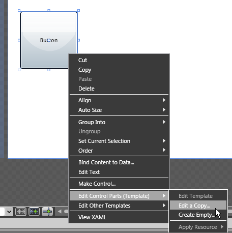
Right click on the button and select “Edit Control Parts(Templates)” –> “Edit a Copy”
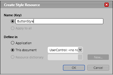
Click ok to create the ButtonStyle resource.
Let’s get back to our VWG theme project and locate the “ButtonStyle” style and copy it.
Now, go back to the Expression blend and replace the button style with our style.
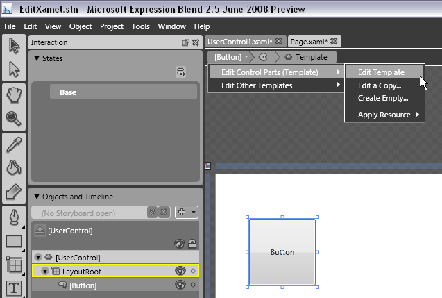
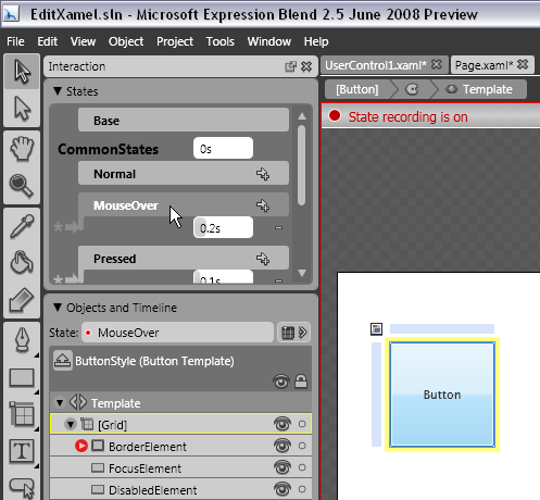
Click on the button and select “Edit control Parts(Template) “ –> “Edit Template” option.
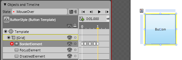
Select the “MouseOver” event
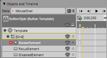
Open the Timeline panel and set the time to 0.25 sec.
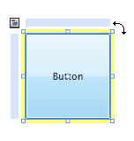
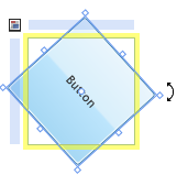
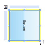
Now, we’ll rotate the button to the point that it is 90 degrees.
On the 0.5 sec rotate anther 90 degrees
And once again at 0.75 sec
Last time make it complete a 360 degrees turn.
Now, open the XAML and copy the button style back to the generic.xaml in our theme project.
On the “MouseOver” event of the “ButtonStyle” set the “RepeatBehavior” property to forever so our new affect will last forever as long as the mouse is over the button.
<vsm:VisualState x:Name="MouseOver">
<Storyboard RepeatBehavior="forever">
Let’s add a button to the form.
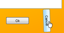
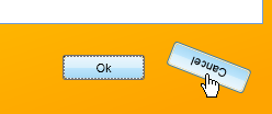
And run the application.
To summarize:
We have seen how to use Visual WebGui Silverlight theme project to customizes and to design your application. We used Expression blend to edit the default xamel and created an animation to the button “MouseOver” event.
-- Eyal Albert @ Eyal.Albert (at) Gizmox.com
You can read the original how to here
