Reducing Comments Clutter with GitHub Reactions
Last week GitHub has introduced what seems like a small feature, but a huge comments de-clutter if you ask me: reactions. I've been using Slack for quite a while and among the feature that slack has had for a while was reactions for comments. From the UI perspective, reactions allow to provide the needed feedback w/o taking too much of the vertical space.
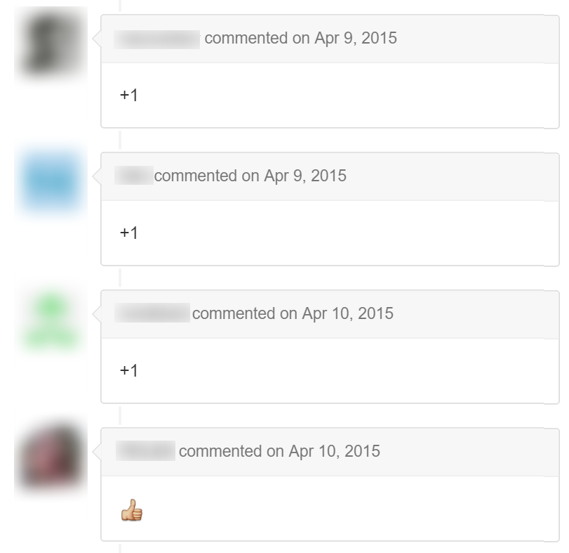
When a discussion is taking place, situation when people agree or disagree and desire to make sure that their voice is heard and counted is quite a norm. This how it would look like with GitHub so far:

Problem with this approach was that it was inflating comments and each +/-1 or thumb up/down would trigger unnecessary notifications.
Now you can simple react. No notifications, no infinite scrolling just because a bunch of people agree or disagree. No guilty feeling that you're extending a list of comments just with a silly +1 to show that you're standing for a proposal (or -1 if you stand against it).

If there's one thing I'd like to add to make it even better is to have a shortcut. Yes, a shortcut. Who knows, maybe that will happen soon. And, to even greater surprise, be Ctrl-Shift-| :)
Happy reacting on GitHub!