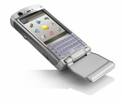
Mobile Phone Design Challenges...
So what are the challenges
Facts.
- Typing on a soft keyboard is not ergonomic at all. Hard keyboard is required "qwerty" or otherwise
- The "qwerty" (if there) keyboard should have buttons big and wide enough to make typing ergonomic.
- Screen has to be wide so browsing, emails and other icons can be fitted into the screen comfortably
Challenges:
- How do we fit in the keyboard and a wide screen into a phone and keep it compact.
- How do we make it look sleek so it sells. Nobody would want to buy a clunky phone.
Attempts:
- Nokia Communicator: Too clunky.

- Sony Ericsson P800: No "qwerty" keyboard, but pretty promising

- Sony Ericsson P910i: "qwerty" keyboard too small and un-ergonomic to be useful.

- Sony Ericsson P990i: Very Very Promising. Reduced screen size, but "qwerty" keyboard very ergonomic, though not any bigger.

- HTC Touch: No "qwerty" keyboard, but with the touch flow and wide screen, pretty good

- HTC Touch Dual: Getting closer. Slider "qwerty" keyboard and touch flow makes it ergonomic, compact and sleek.

And the best ones until now:
- HTC Tytn II: Full Slider "qwerty" keyboard, big enough to be ergonomic to type in long emails, sleek and compact enough to sell and Windows Mobile OS makes it Hot cakes.


- Sony Ericsson Experia X1: The "arc slider phone" the "arc design" means the side screen slider. Not only does it make this phone the most ergonomic and fully featured phone, it has 2 main edges. It is Super compact and sleek (The geek value, the gizmo touch, et al) and Windows Mobile. Yes Sony Ericsson comes out with a phone with Windows Mobile 6.1 for the first time. Take a peek http://www.sonyericsson.com/x1/?lc=en&cc=IN and http://www.expansys.com/d.aspx?i=163411


